My first attempt at this exercise, for which I have no copies of the photos because I wiped the memory card before checking that I’d copied the images off, was of two of my neighbours cats sitting on top of the garages next to my house.
Reviewing the images I could see that I’d done what the exercise had called for, positioned a point at various points within the frame, in this case one of the cats, using the Rule of Thirds.
The resulting photos were extremely boring. A cat on top of the roof of a beige garage wall with no features does not make for an interesting image. No matter how you move around the image is still going to be the same, just with a cat in a different position.
With this in mind I decided that for the next attempt I would have to take in to consideration the rest of the scene so that moving the point around would still allow for an interesting scene.
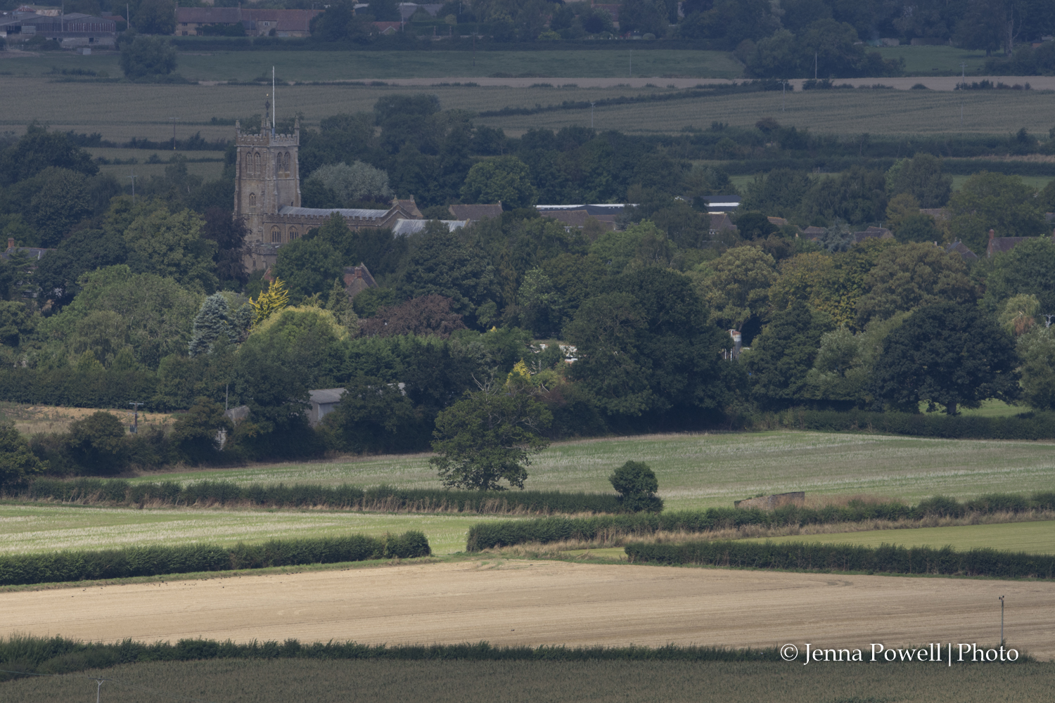
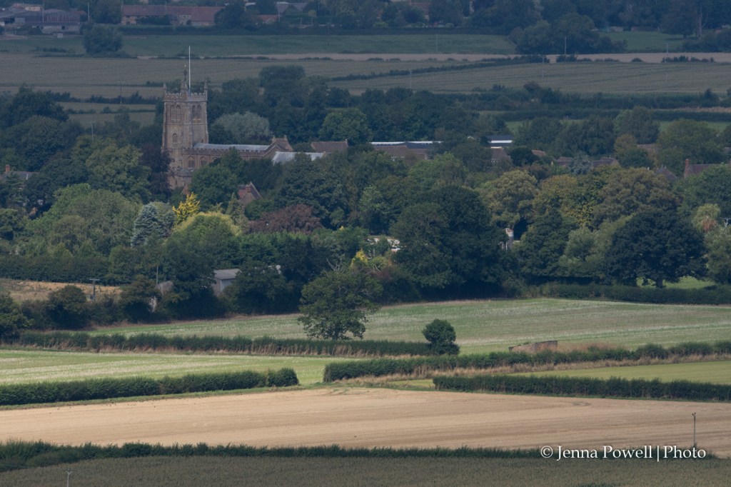
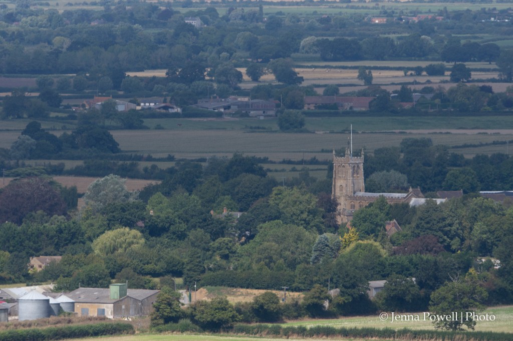
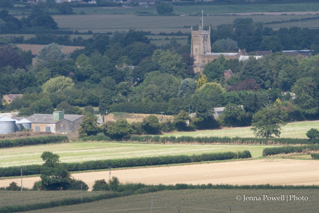
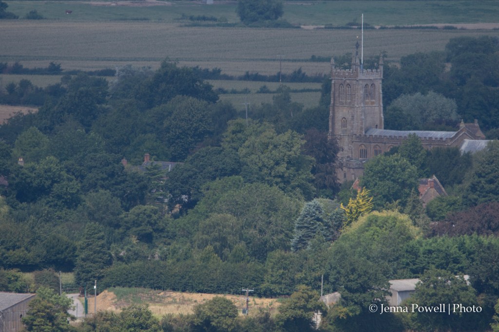
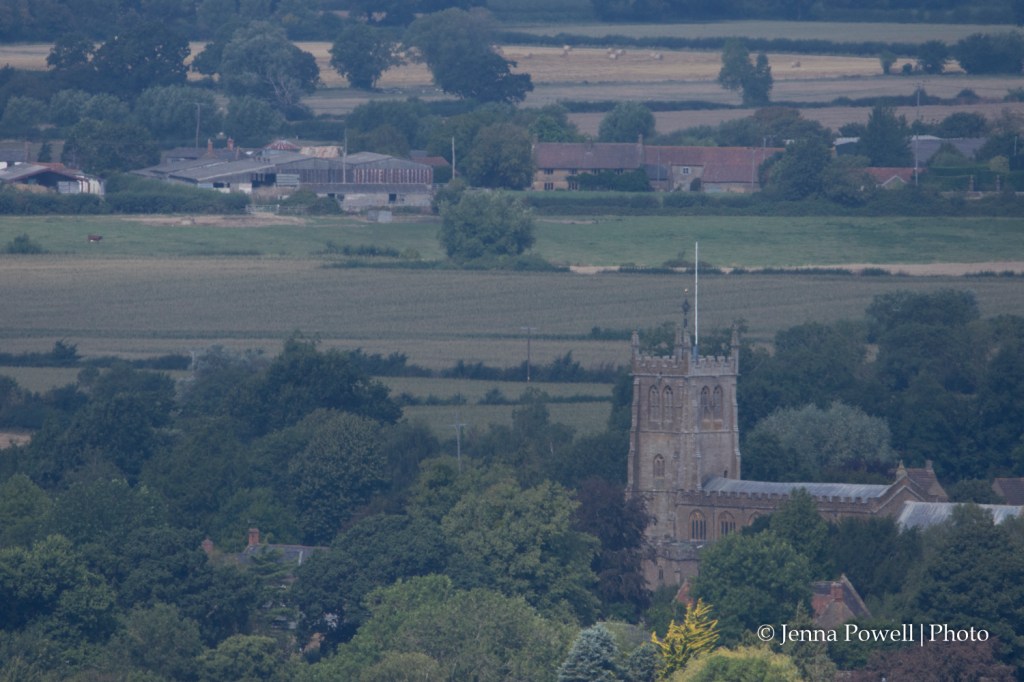
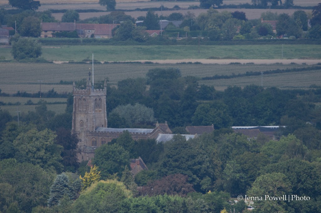
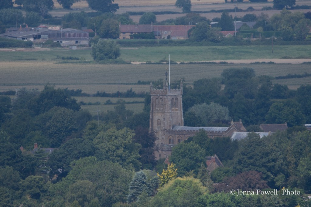
The images below were selected from the entire sequence of photos based on how they appeared when loaded into Lightroom. All of the images were captured using my Nikon D7200 with it’s grid turned on. Unfortunately the Nikon D7200 grid is in quarters and not thirds so the photos I spent time aligning with the grid ended up with the points, in this case the church, not conforming to the Rule of Thirds. However, Lightroom has a crop that does conform to the Rule and so it was possible to find some images that met this part of the brief for the exercise.
Another lesson learned. Make sure that you are familiar with your camera when it comes to applying composition rules.
Although the above images conform to the Rule of Thirds when it comes to composing them, I feel that the first of the three is the best because with the church tower being at the left of the main building, there is more space for the whole church building. In the other two images I feel that the church is crowded into the image.
Within the above four images I again feel that the best one is the one where the church tower is to the left of the image (bottom right photo). There is more of a sense of space around the church than there is in the other images. In fact with the top two of the set the roof and chimney of a building to the left of the church draws attention away from the church as it is about a third of the way from the left of the image. As the focus of the image is the church, having this second point is distracting.

