
For this exercise the brief was to take a number of shots using lines to create a sense of depth. The set of images below are where I’ve attempted to do this.
Part 1
Take a number of shots using lines to create a sense of depth.
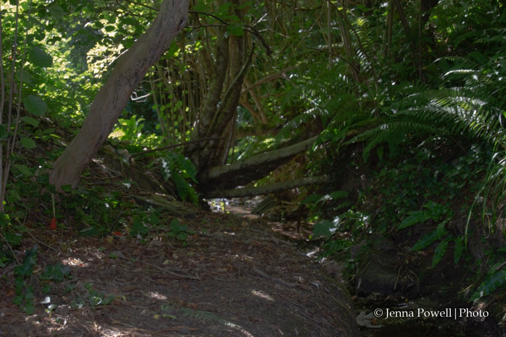
In “Wood and stream“, the path of the stream leads the eye to the centre of the picture where the trees and branches allow the eye to move around the image, including leaving it. The stream also provides a sense of depth to the image by leading from the edge of the photo into the middle.
Once the eye reaches the centre of the image, the branches and trees provide it with a way to move around the image in multiple ways, some staying within the image, others leading out of the frame.
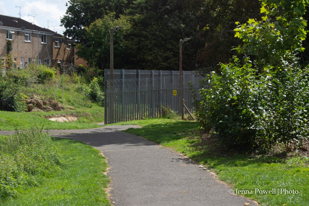
In “Path to power supply station“, the eye is led through the image by the footpath. It can then leave at the middle left of the image or can move perpendicular along the bars of the fence. The narrowing of the path as it moves through the image provides a sense of depth because of the changing perspective.
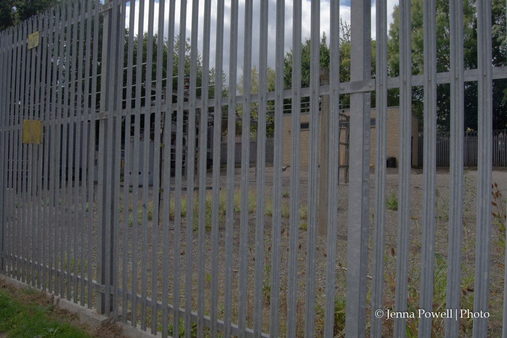
In “Supply station fence” the bars of the fence being parallel to the viewer don’t aid in a sense of depth but the way that the top of the fence is out of shot on the right hand side but visible on the left gives the sense that it is further away because we know that fences are usually the same height and don’t get smaller as you move along them.
Within this image, the perpendicular metal bars do not affect how it is viewed. The horizontal bars and the way the fence gets smaller towards the left, however, do cause the eye to move out of the frame.
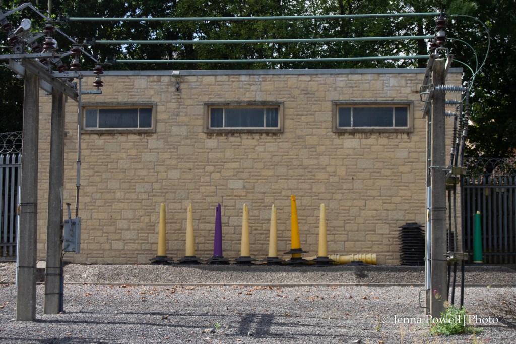
With “Inside the fence” the majority of the lines are perpendicular to the viewer and so don’t provide a sense of depth. However, there are a number of shadows on the ground which move away from the viewer, towards the building at the back, thus providing an indication that the building is further away.
The purple cone and green bollard add points of interest within what is otherwise a two colour image. The bollard I hadn’t noticed when taking the photo, the purple cone I’d spotted and wanted to include because it stood out.
The horizontal and vertical lines of the pillars, cables and roof of the building keep the eye within the frame by moving the eye in an almost circular motion.
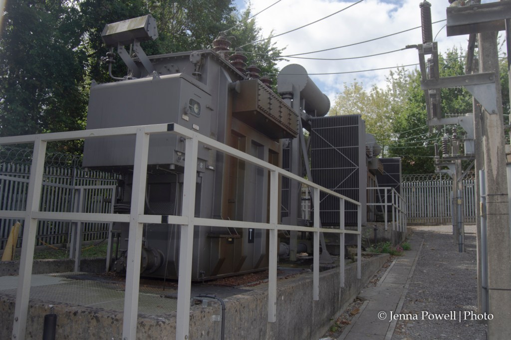
In “Generator” there are a number of lines, on the railings, the paving, the concrete block and even the generator itself that lead the eye into the picture. The convergence of these lines provide the sense of depth.
The perspective lines formed by the railings, generator and blocks lead the eye out of the picture, depending on how they are viewed. If the eye follows these lines into the image then the fence at the back provides a way for the eye to move to the top of the image where the overhead cables lead it back to the generator and the front of the image.
Part 2
Now take a number of shots using lines to flatten the pictorial space.
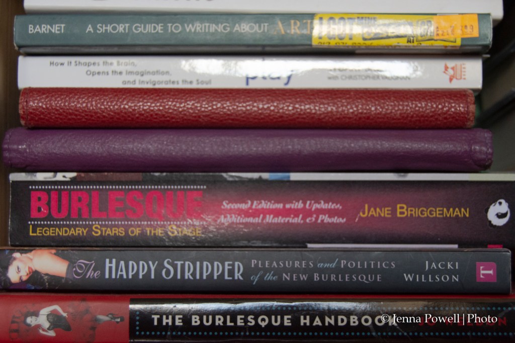
In “Happy Stripper” I’ve achieved the aim of the second part of the exercise by flattening the image. There is no sense of depth when looking at the books. It’s only when the eye moves to the edge of the frame that a sense of depth begins to form. However, even then it doesn’t aid the viewer in gauging depth when it comes to the books.
In reality the books are actually sloping backwards from the bottom of the image to the top.
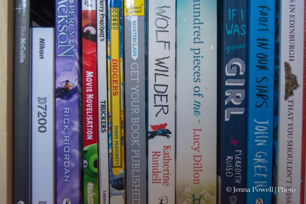
In “Wolf Rider” I’ve managed to flatten the image with the exception of the area above the Nikon manual where it’s possible to get a sense of depth because of being able to see more of the cover of the McCullin book.
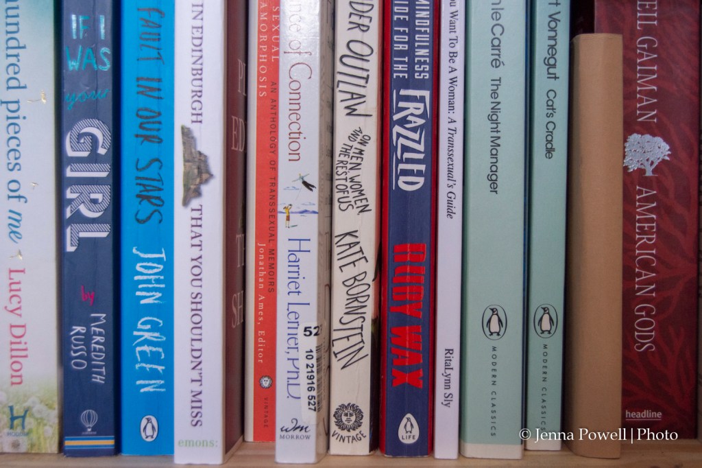
Again, with “Frazzled” I’ve managed to flatten the image, with some small exceptions giving a slight sense of depth.
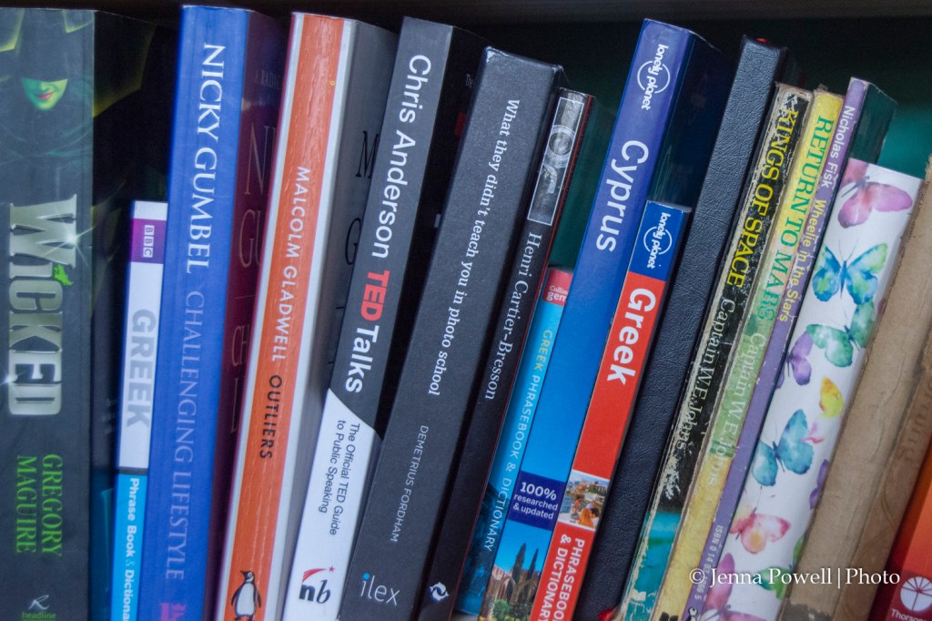
With “Kings of Space” there is a definite sense of depth. However, the way the books are positioned gives a sense of a curve. If a line was drawn through each of the books then the lines would meet very close to each other, if extended out of the frame.
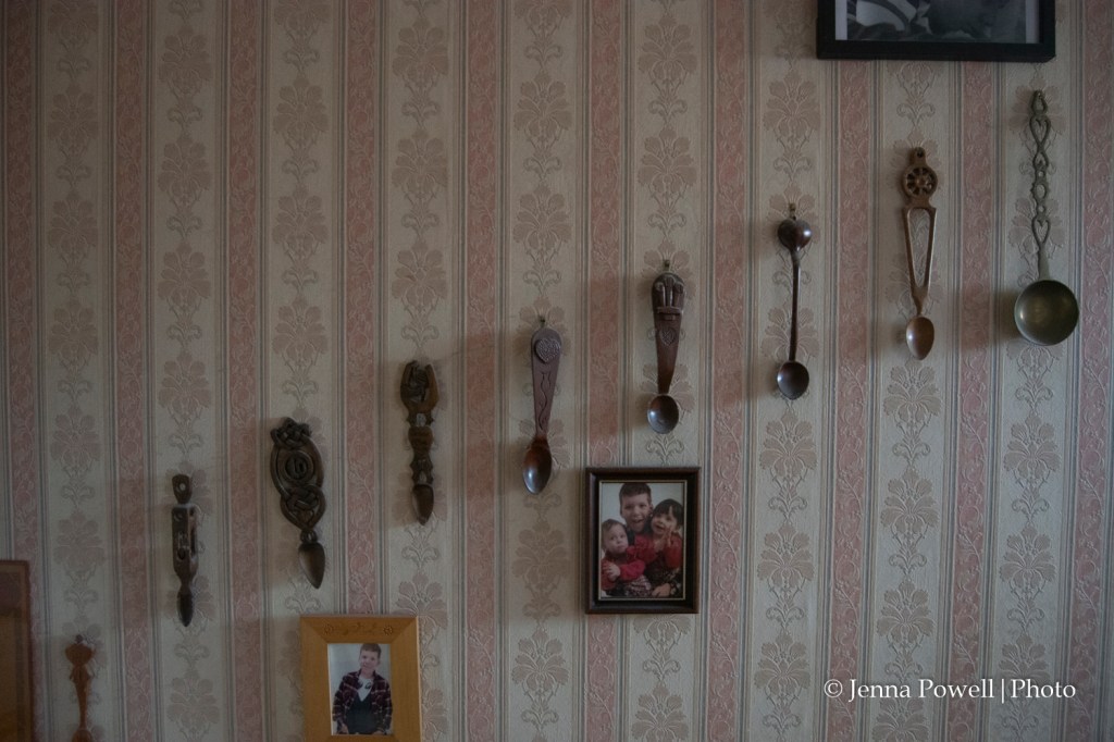
In “Love Spoons” the perpendicular lines in the wallpaper don’t distract from the rest of the image. However, the diagonal lines that flow through the row of love spoons and also through the two pictures at the bottom of the image lead the eye out of the image, particularly the former.
The line through the two photos does lead the eye towards the metal love spoon at the right hand side of the image, which does provide a way for the eye to move back into the image.
Equivalents
The images below are part of an ongoing project I started during the Foundations in Photography course called Clouds. Unlike Alfred Steiglitz’s Equivalents , the majority of my own images for this project do have a sense of composition. The two images below, which have been converted to black and white, are the closest I have to Steiglitz’s images where the only way out of the frame is at the edges.