
Wim Wenders
‘ The most political decision you make is where you direct people’s eyes. In other words, what you show people, day in and day out, is political… And the most politically indoctrinating thing you can do to a human being is to show him, every day, that there can be no change. ‘
(Wim Wenders (1997) / Quoteman (2019))
As photographers we see things and then try to capture them in a way that reflect that vision and share that with other people.
A lot of the photographs that people take are for family albums or to share online with family and friends. In most of these cases, little thought is given to positioning of the subject within the image, or where the eye might be drawn.
Photographs taken outside a church at a wedding, for instance, will primarily focus on the bride and groom but when family and friends are included then that focus will change depending on who is viewing the image and even what the individuals in the photograph are doing.
A photograph that came up on my Twitter feed recently showed an older white American couple wearing “Blacks for Trump” t-shirts. The photographer has focussed on the couple. However, some people’s comments on the photo resulted in the eye being drawn away from the couple to a trio of coloured women in the background, two who can be seen smiling, while the other appears to be doing something on a phone. That particular image is very political, just by the nature of its content, however, it does highlight the fact that even when we make a decision as to where we want the viewer’s eyes to go in an image, we have to be aware that other people may decide that they still want to focus elsewhere.
We also need to be aware that sometimes the message we are trying to get across can be interpreted differently.
Further comments on the photo have suggested that maybe the couple’s surname is Black and that there is a level of irony by having other people in the photograph.

Several books I have read in the past try to show how the eye can be made to flow through an image in particular ways depending on how a scene has been composed. All these techniques while good to know have one thing in common. The photographer has decided as to where they want the viewer’s eyes to be directed.
Andre Bazin
‘Deep focus give the eye autonomy to roam over the picture space so that the viewer is at least given the opportunity to edit the scene himself, to select the aspects of it to which he will attend.‘
Bazin (1948)
Deep focus cinematography brings everything that can be seen in the foreground, mid-ground and background of a frame into focus at the same time. To achieve this, the cinematographer must manipulate lighting, composition, camera lens and depth of field. The depth of field refers to the distance from the object or character at the front of the image to the object or character at the back.
To achieve deep focus there is usually a large depth of field, which refers to a large distance between the foreground and the background. The use of deep focus means that the mise-en-scène is more significant and meaningful, as everything can be seen very clearly.
CCEA Reward Learning (2016) GCE AS Level Moving Image Arts – Andre Bazin and Realist Techniques Accessed: 09 November 2019
The human eye does not naturally focus from close to infinity at the same time. The eye focuses on certain things while allowing other things to lose focus, to blur. It would seem natural then for photographs to show scenes in a similar way, which would also allow the photographer to direct people’s eyes as indicated in the quote by Wenders above.
However, that is not how the world exists. The world around us does not drift in and out of focus as people look at it. Instead, it is constants. It is the way our eye focuses and interprets the light that hits our retina that governs how we see it.
Presenting a viewer with an image that has sharp focus throughout is not the most natural of things to do but it does allow them to focus on any part of the image and see it clearly. That is not to say that by giving a person the chance to focus anywhere in an image that we do not want them to focus where we want, but it provides them with the chance to see what we have seen while also observing things that we might not have noticed and thus adding a different interpretation to our work.
F/64 Group
The name of this Group is derived from a diaphragm number of the photographic lens. It signifies to a large extent the qualities of clearness and definition of the photographic image which is an important element in the work of members of this Group.
The chief object of the Group is to present in frequent shows what it considers the best contemporary photography of the West; in addition to the showing of the work of its members, it will include prints from other photographers who evidence tendencies in their work similar to that of the Group.
Group f/64 is not pretending to cover the entire of photography or to indicate through its selection of members any deprecating opinion of the photographers who are not included in its shows.
There are great number of serious workers in photography whose style and technique does not relate to the metier of the Group.
Group f/64 limits its members and invitational names to those workers who are striving to define photography as an art form by simple and direct presentation through purely photographic methods. The Group will show no work at any time that does not conform to its standards of pure photography. Pure photography is defined as possessing no qualities of technique, composition or idea, derivative of any other art form. The production of the “Pictorialist,” on the other hand,
indicates a devotion to principles of art which are directly related to painting and the graphic arts.
The members of Group f/64 believe that photography, as an art form, must develop along lines defined by the actualities and limitations of the photographic medium, and must always remain independent of ideological conventions of art and aesthetics that are reminiscent of a period and culture antedating the growth of the medium itself.
The Group will appreciate information regarding any serious work in photography that has escaped its attention, and is favourable towards establishing itself as a Forum of Modern Photography.
(Group f/64 Manifesto , 1932)
The f/64 Group consisted of several photographers of the calibre of Ansel Adams, Edward Weston and Imogen Cunningham. Their aim was to produce images that were sharply focused, carefully composed and which did not rely on any of the techniques associated with art prior to the development of photography, and especially those techniques that were related to painting.
There are ideas, techniques and rules used in painting that are useful to photographers who are starting out. The Rule of Thirds, Golden Ratio, the use of light and shadows, these have been explored and refined over centuries in order that artist can produce works that are pleasing to the eye and invoke emotions in the viewer.
Learning these rules and techniques is extremely useful. Knowing how to do something correctly is the first stage in being able to break the rules.
For instance, fan dancers are taught to keep their fans parallel to the audiences and not at an angle when performing. Once you are familiar with this, then can consciously make the decision to do something completely different, because if challenged you can reply that you are aware of what you should do but you are making an artistic decision to do something else.
The same applies with photography, once you are aware of the techniques then you can move away from them in an informed manner that will enable you to produce works that fit with your vision.
Images where most, if not all the image, is sharply focused are good but images that are softly focused or make use of blurring of elements can equally produce results that are pleasing to the eye.
Fay Godwin
Godwin is a British landscape photographer, born in Berlin in 1931, she passed away in 2005.
When I first looked at Fay Godwin’s work at the British Library (2019) archive there were so many landscape photographs. First impressions were therefore that she only did landscapes and that having a large depth of field was integral to her work. Even with some of her close up work like Broken window (https://prints.bl.uk/collections/fay-godwin-archive/products/broken-window-c13527-64) her use of depth of field ensures that parts of the background are clearly visible.
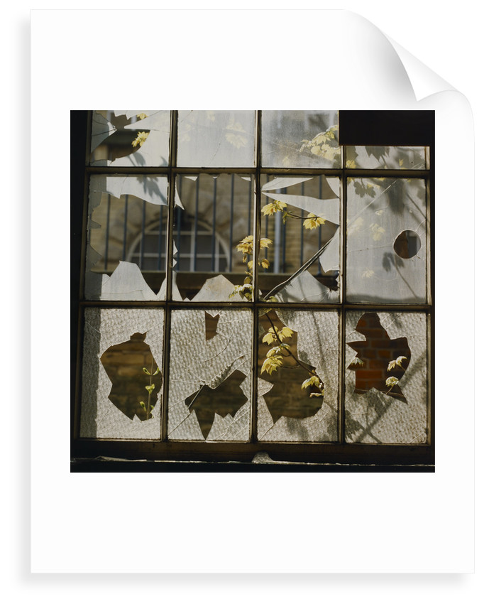
In Broken Window, Godwin has used a depth of field that allows the window and the plants just outside it to be seen clearly but also the bricks in the wall visible through the bottom half of the window to also be seen clearly. The size of the bricks seen implies that there is a reasonable distance between the wall and the window.
At first glance the broken glass, in the bottom part of the window, looked like leaves stuck to the glass. Even after realising they were not the way that the plants visible through the window intersect with the broken sections the feeling that these are leaves remained and with it a sense that what we build now, continues to link to the natural world around us, as much as we do our best to try and make it so that this isn’t the case.
Exploring the image further other things start to leap out. The figure in a crinoline dress at the top left of the image. The angry, oriental face in the bottom left of the image, the leaves visible through the broken glass helping to give the appearance of eye, nose, and mouth. The bloated, Nefertiti-like face in the third pane from the left at the bottom. Again, the visible leaves giving the appearance of eye and a mouth.
Finally, there is the face at the bottom right of the image. A figure wearing a floppy top hat whose mouth is open showing sharp teeth.
What started out as an ordinary photograph of a broken window, has a much more sinister appearance the longer you study it.
Several items in the archive demonstrate the use of a shallow depth of field. For instance, her close up work such as untitled (https://prints.bl.uk/collections/fay-godwin-archive/products/untitled-c13528-64#)
Untitled is an interesting image because it appears to be a close up of some plants. The reason I think it is that is because of the green leaf on the left-hand side of the image. The veins are clearly visible and provide a sense of proportion for the image. However, Tian (2018) and the National Museum of Natural History (s.d), provide examples of leaves that are 45cm thick and 810 square centimetres in area, respectively. With the knowledge that plant leaves can be quite big, it is possible to see this image as not quite as close up and on a similar scale to Godwin’s landscapes. Without something to give an accurate idea of scale, perspective becomes subjective rather than objective. Although what the camera sees is recorded accurately, what the viewer eventually sees is partly down to what the photographer wants them to see.
Devastation (https://prints.bl.uk/collections/fay-godwin-archive/products/devastation-hill-c13526-80) is an excellent example of what can be achieved when you use a large depth of field.
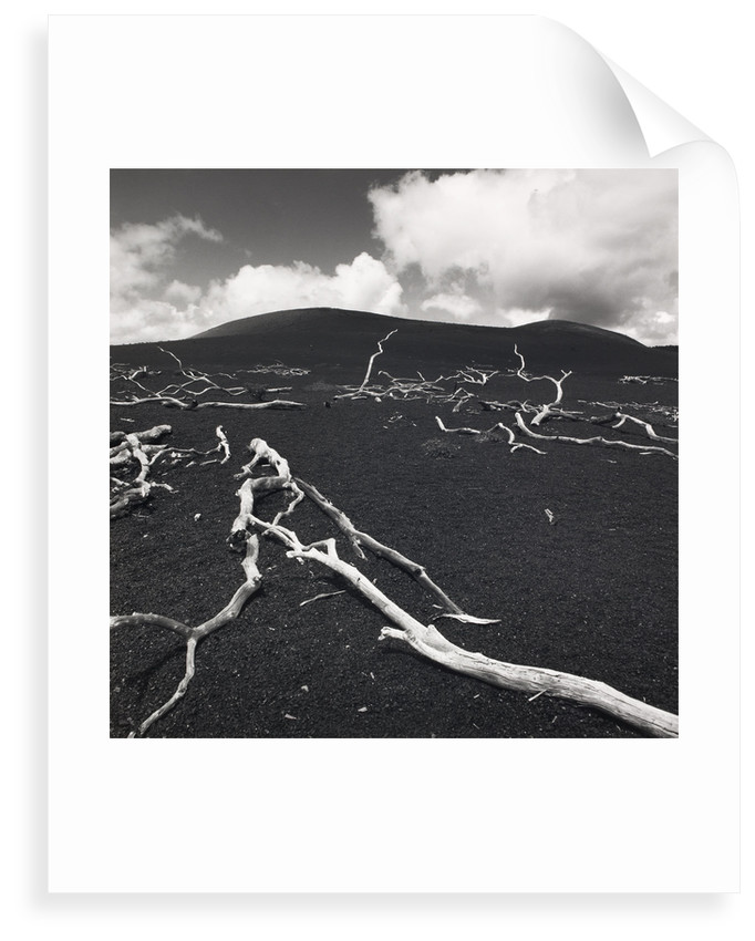
Devastation is a bleak image and Godwin’s use of a large depth of field adds to the bleakness. The sharpness and clarity of the bleached branches in the background adds to the sense that this is not a small area but a large one.
There is a sense with the branches in the background, from the way that they are pointing up to the sky, that they are pleading, that the ground and planet is calling out, for help.
The branches are the forefront of the image add a sense of desperation. They are reminiscent of images from places like Pompeii where the bodies of people caught in the eruption of Mount Vesuvius lie as they fell, fleeing from the death that was about to engulf them.
They are reminiscent of images of the skeletons of creatures that have died while trying to reach life giving safety.
A fitting image for a planet that, if the scientists are correct, is heading towards the point of collapse.
On a lighter note, this image just makes me see penguins. Lots of penguins. Grey, speckled penguins huddled together.
Gianluca Cosci
Panem Et Circenses, Cosci. G (2019) is at the other extreme to Fay Godwin’s landscapes. Gianluca Cosci as produced a series of images from a restricted viewpoint and where the depth of field is shallow, rendering the background and some of the foregrounds out of focus but still recognisable.
I like these images because they depict things that people do not normally see, certainly not from these perspectives.
Cosci says that his work has a political element to it and that he is interested in the restricted view of the marginalised, and that is a subject that I can relate to as someone who is part of, and has many friends and acquaintances with, the LGBT+ community. How we see things is not always the same way as others see them. For some people within this community, their view of life is from the bottom, looking up at everybody else. Cosci’s use of low angles and shallow depth of field gives a sense of what it feels like to not be seen, to be ignored.
Cosci’s use of things like benches and railings highlights that feeling of being ignored. We all see items like these every day but how many of us stop to look at them properly, how many of us even notice them in our rush to get where we are going. A lot of the time we only notice them when we need them for some reason, and that reflects the feeling that minorities have when attention is focused on us for a while in order that people can feel like they have done something to support us.
Several years ago, I was in London for a training course. I had travelled on the Underground to the nearest tube station to the venue and was walking along streets filled with commuters. As I walked, I noticed several people sleeping rough in doorways. As someone who was not used to seeing people sleeping rough this was a shock, but not as much of a shock as watching the people around me walk by these homeless people, without giving them a second glance. Almost as if their eyes had adjusted to a shallow depth of field so that they only saw what was of interest to them.
Mona Kuhn
Kuhn’s (2019) website displays 12 images from her Evidence series.
In ten of these twelve images people can be seen. In the others there is a noticeable absence of a person but there remains evidence of their existence which tells something about the person.
The image Closer has a voyeuristic edge to it, as a figure, that I assume is Kuhn, can be seen reflected in the window taking the photograph. The eyes of one of the figures looking directly at the photographer, and the partially turned head of the second figure, give the impression that something private has been interrupted.
Although all the figures in the images are naked, as far as can be told with regards to those images where the whole figure cannot be seen, Kuhn’s use of depth of field provides them with a level of privacy while also sharing intimate moments.
Kim Kirkpatrick
I found when searching for both the website that was linked to in the course notes and using online search mechanisms that finding out about Kim Kirkpatrick was difficult, especially when it came to examples of his work.
Guy Bourdin
Tate (s.d) and ICP Search Results (s.d) show quite different examples of Bourdin’s work. The Tate examples are in black and white, while the International Center of Photography examples are all colour and from a series called Sighs and Whispers. These latter have the feel of a magazine fashion shoot to them, in particular for a more high-end fashion magazine or label.
Each of the ICP images has an intensity to it, whether that is from the looks that the models appear to be giving the viewer, a sense that the figures are waiting for something to happen or, in the case of plate 9, the shadowy figure in the background who lurks like a Svengali figure who has the ladies in his control.
The Tate examples are from an earlier period in Bourdin’s career. Even so it is possible to see some of what would be used in his later fashion work. An image of bleached bones and carcasses on a floor looks menacing as does an image of a rusted door lock.
In other images figures look directly at the viewer or seem to be waiting for something. All techniques that can be seen in his fashion photography.
David Campany
‘I’m inclined to think that there is no such thing as a photojournalistic image, only a photojournalistic use of image.’
David Campany
The above quote is in response to a comment on an article that Campany (2013) wrote in May 2013.
The discussion was the result of an article that Campany had published that discussed the work of Eve Arnold and Don McCullin that had appeared in The Sunday Times magazine. In contrast with the McCullin piece, which used some of his images captured in Vietnam, the Arnold piece used images captured in North Carolina at a facility built to replicate a North Vietnamese village that could be used to train American troops before they embarked for a tour in Vietnam. McCullin’s piece showed how things were in country, while Arnold’s piece was a step removed from this and the dangers soldiers, journalists and photographers faced while in the war zone.
Whereas McCullin photographs were more immediate and could not be planned out easily. Arnold had the luxury of being able to take more time over her shots and to achieve results that could be influenced by other areas of photography, for instance fashion photography.
In response to the comment Campany argues that all images can be seen as forms of different genres of photography, for instance fashion, portrait, landscape, architectural etc. It is the use of the image to report on events that makes them photojournalistic.
With the use of mobile phones to capture images and video as events play out, by members of the public, who are by their very nature not journalists but either bystanders, or actual participants, in the events they are capturing, Campany’s point is a lot easier to understand. It is not the actual image but how it is used that defines how we see it.
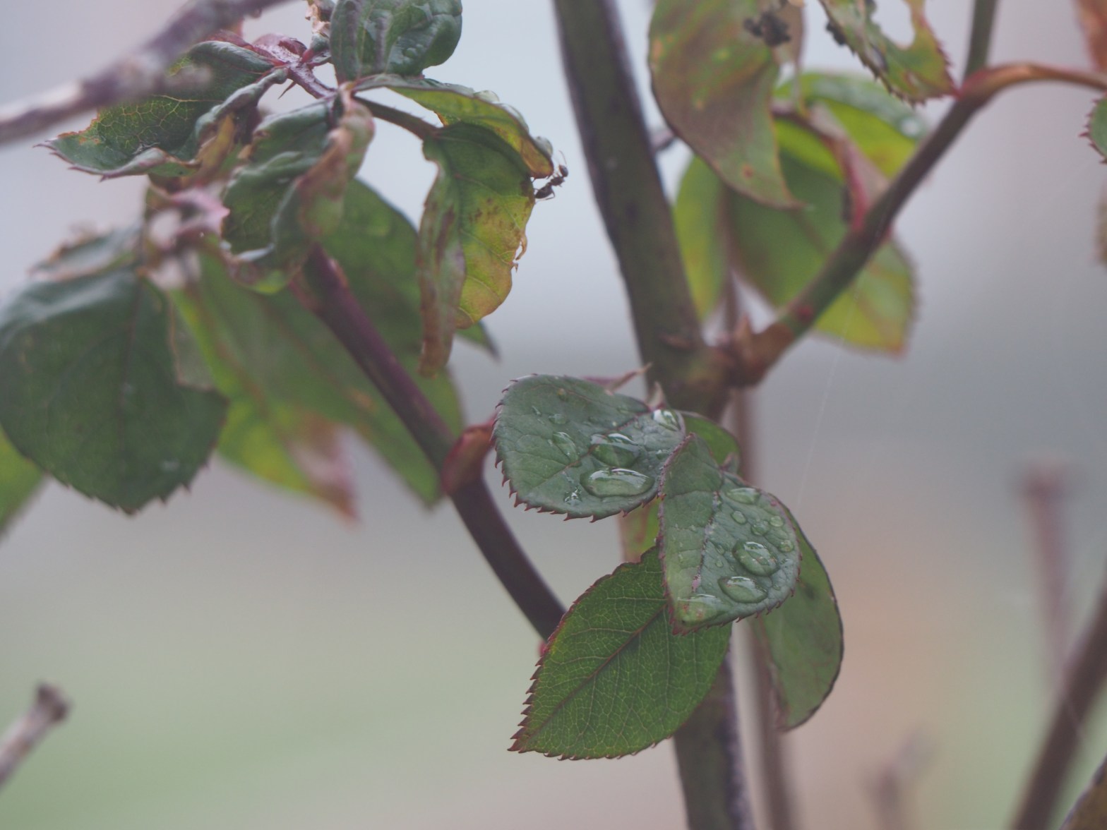
Personal Archive Photo

OLYMPUS E-M10 ISO-400 150mm f/7.1 1/20sec Taken 10th May 2016 06:11am
References
- British Library (2019) Fay Godwin Archive. At: https://prints.bl.uk/collections/fay-godwin-archive (Accessed 17/11/2019).
- Kuhn, M. (2019) Artworks | MONA KUHN. At: https://www.monakuhn.com/portfolio/works/ (Accessed 17/11/2019).
- Cosci, G. (2019) Panem Et Circenses. At: https://www.gianluca-cosci.com/panem-et-circenses (Accessed 17/11/2019).
- Quoteman (2019) photoquotations.com ⁄ wim wenders. At: http://www.photoquotations.com/a/723/Wim+Wenders (Accessed 17/11/2019).
- Tian, D. et al. (2018) ‘Diversity and conservation of Chinese wild begonias’ In: Plant Diversity 40 (3) pp.75–90. ISSN: 2468-2659 At: https://www.sciencedirect.com/science/article/pii/S2468265917300896 (Accessed 17/11/2019)
- National Museum of Natural History, Smithsonian (s.d.) Sagwan – Encyclopedia of Life. At: https://eol.org/pages/579742 (Accessed 17/11/2019).
- Campany, D. (2013) Backwards and Forwards – Still searching – Fotomuseum Winterthur. At: http://www.fotomuseum.ch/en/explore/still-searching/articles/26952_backwards_and_forwards (Accessed 31/12/2019).
- ICP Search Results – Guy Bourdin (s.d.) At: https://www.icp.org/search-results (Accessed 31/12/2019).
- Tate (s.d.) ‘Group of 27 photographs, gelatin silver prints on paper’, Guy Bourdin, 1950-7. At: https://www.tate.org.uk/art/artworks/bourdin-group-of-27-photographs-gelatin-silver-prints-on-paper-164175 (Accessed 31/12/2019).
