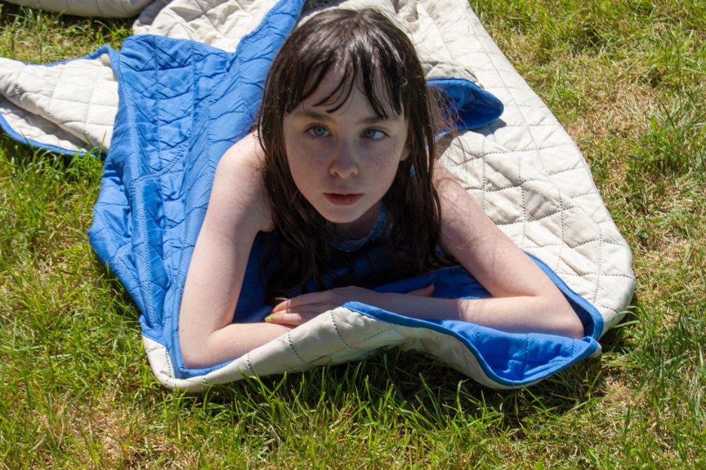
Capture ‘the beauty of artifical light’ in a short sequence of shots (‘beauty’ is of course a subjective term). The correct white balance setting will be important; this can get tricky – but interesting – if there are mixed light sources of different colour temperature in the same shot. You can shoot indoors or outside and the light can be ambient or handheld flash.
Add the sequence to your learning log. In your notes try to describe the difference in the quality of light from the daylight shots in Exercise 4.1
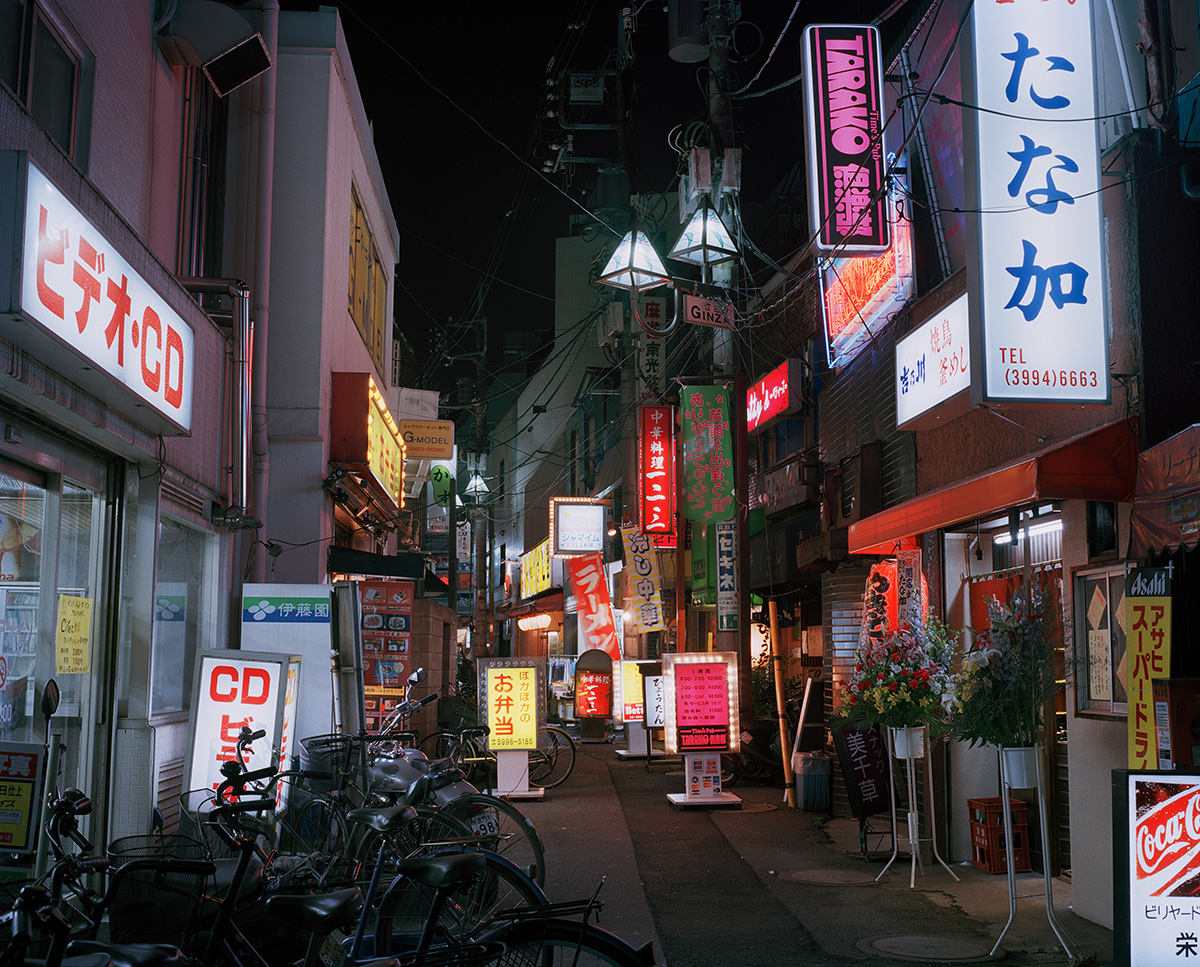
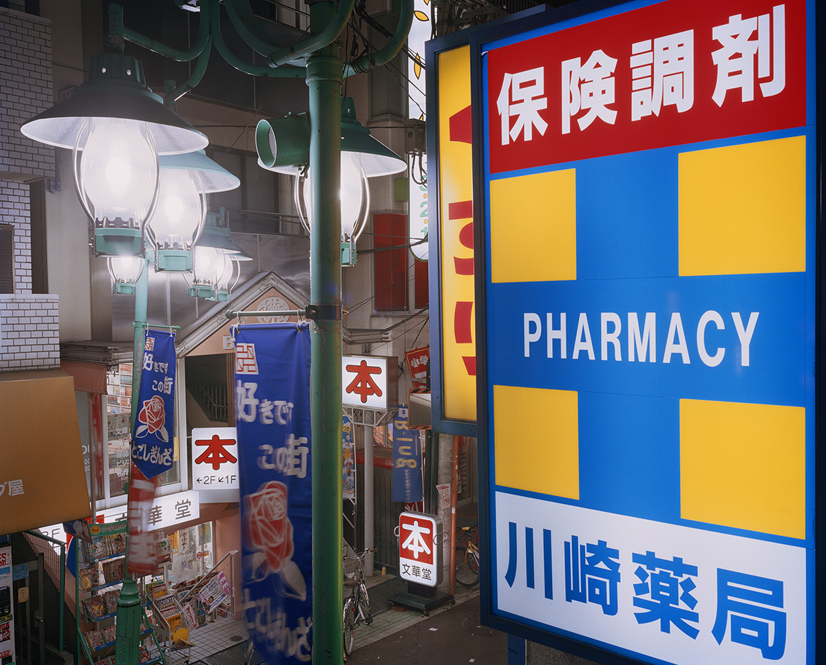
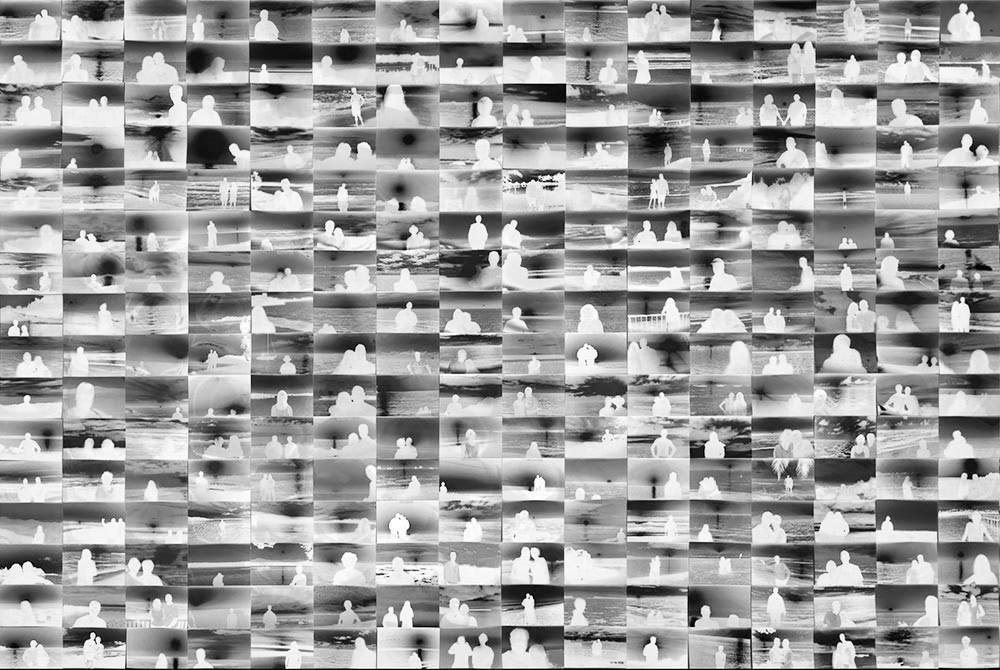
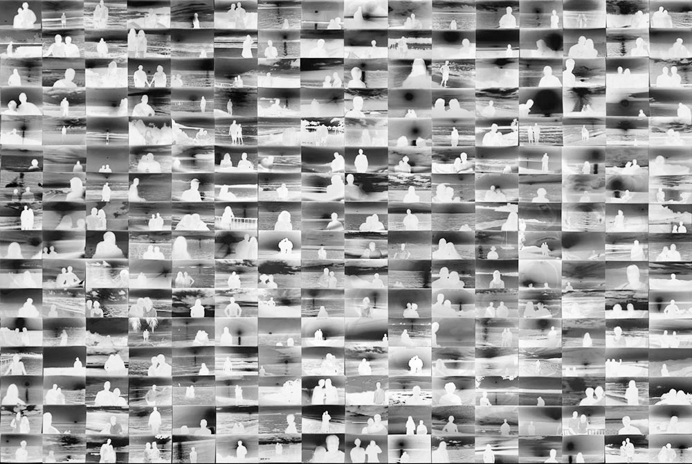
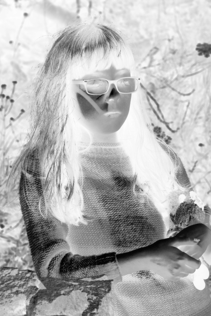
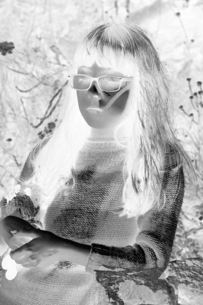
Brightly lit streets. Brightly lit street signs. Shops and businesses. No people!
Looking at the colours in this series there is colour everywhere. What’s missing in these very busy images is the people. The streets should be thronged with people, at the very least there should be one or two people but there aren’t any.
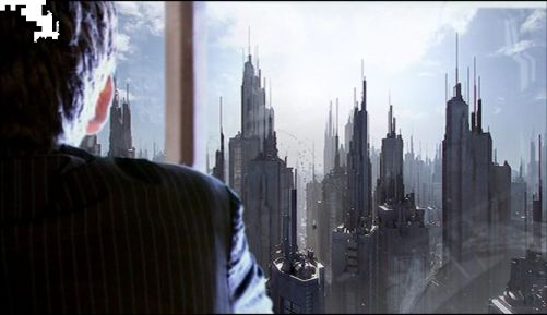
Reflecting on these images I was struck by how much they reminded me of a Doctor Who episode called Gridlock and it’s view of a future world populated by humanity. A world where until the Doctor arrives and figures out what it happening only has a few humans living above ground in a city made to house millions. Below ground, on the freeway, live the rest of the human population, survivors of a plague that shut sealed the exits to the outside.
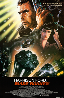
More importantly, the images are a reminder of the movie Bladerunner and the world inhabited by its people. With heavy Chinese and Japanese overtones, and constant bombardment from flying advertising screens, there is a similar feel to both the movie and Shintaro’s images.
Bladerunner, however, was released 15 years before Sato Shintaro, started his project. Is this a case of art influencing real life? I don’t think so, but a lot of science fiction portrays worlds have Chinese and Japanese influences. Joss Weedon’s Firefly is an example of this, where Mandarin Chinese is used whenever the characters wish to verbally express emotion, i.e. use profanity. Some of the phrases used have interesting, and sometimes funny, translations.
In the artist’s statement Shintaro states that if you take a bustling street and remove the people, the purpose of the lighting is lost and only the glow remains.
I don’t think that is quite true, it’s certainly an aim but there are still signs of people. Bicycles, stairways, other signs of people intrude. For instance at first viewing I found that in 01 Night Lights the stairway, just above the 2F 1F sign drew my attention. The more I look at this image, the more the background bleeds through and distracts from the glowing signs, even the Pharmacy one that take up the whole of the right side of the image.
Despite the brightness of the images, there is an apocalyptic feel to images. As if something caused all the people to abandon areas that they frequent, very suddenly, without the time to take their things with them, or to shut up shops and premises and switch off the lights. Not something that’s likely to happen in reality, if experience is anything to go by.
Rut Blees Luxenburg
Rut Lees Luxenburg is a German photographer born in 1967. Her photographs are mainly taken at night.
When I first saw her work I was immediately drawn to the colour of the images. The sodium glow gives everything a warm golden glow.
In Viewing the Open, I love the way that the pools of water are like portals to other worlds. Some dark and foreboding, like oily sludge, others bright and inviting, full of light. In the description for this image at Rut Blees Luxemburg born 1967 | Tate (s.d.), there is mention of the traffic cone on the embankment by one of the slopes. It is barely visible. What is more visible for me is the eye at the right hand side of the image. At least that is what the light reflecting in the pool of water there looks like.
What would have been ordinary during the day time, takes on a magical quality at night.
Rut Blees Luxenburg, Viewing the Open, Tate
The Libertine Sofa takes on a rich, golden quality when photographed at night. There is a certain decadence to it that would not have been out of place at the court of Louis XVI in the 18th century.
Rut Blees Luxenburg, The Libertine Sofa, Tate
In Tyson / Bombardier, the light makes the sign stand out, everything else fades into the background, a metaphor for what happens when high profile boxing matches, worth millions to the participants and promoters take place.
Rut Blees Luxenburg, Tyson / Bombardier, Tate
Ivan Radman
Petrichor – the smell of rain. The scent you get when rain falls on dry soil.
Looking at Ivan Radman’s images it is obvious that his inspiration came from Rut Blees Luxenburg.
For me, as I look at them, petrichor comes to mind, as well as the smell of rain.
Brassai
Unconsciously I did something like Toulouse-Lautrec or Degas or perhaps Van Gogh. It was not voluntarily but because we have a culture in painting. It would not happen to a young American perhaps, who had never seen paintings and who did something with his or her sight absolutely fresh.
Tony Ray-Jones Interviews Brassai” Pt. I (1970)
The above quote from Brassai’s interview with Tony Ray-Jones leapt out at me. It was so full of unconscious bias. Europe has a rich history of art and painting. Just because the USA is a relatively new country compared to Europe, Asia and other countries, it doesn’t mean that it doesn’t have it’s own art culture nor that American’s won’t have seen paintings and been influenced by them. Especially in a world where travel to other countries was possible. Why shouldn’t a young American photographer be influenced by paintings?
If education and intelligence are important as Brassai states, then what we learn and understand is influenced by the sources that we use to gain the information that underpins our education. We are all the culmination of our experiences and the things that we are exposed to.
Claire Daley
What I like about Claire’s images is that it has shades of Sato Shintaro’s work as well as Rut Blees Luxenburg’s. The brightly lit objects stand out from the surroundings. No sign of people to distract from the objects.
It’s more than that though. I love the way that she has managed to get objects to line up within each photograph in order that they lead the eye through the image. I particulary like image 4 where the upright on the telephone kiosk leads the eye to a lampost and then onwards to the lights in the alleyway opposite and deeper into the a scene.
Exercise
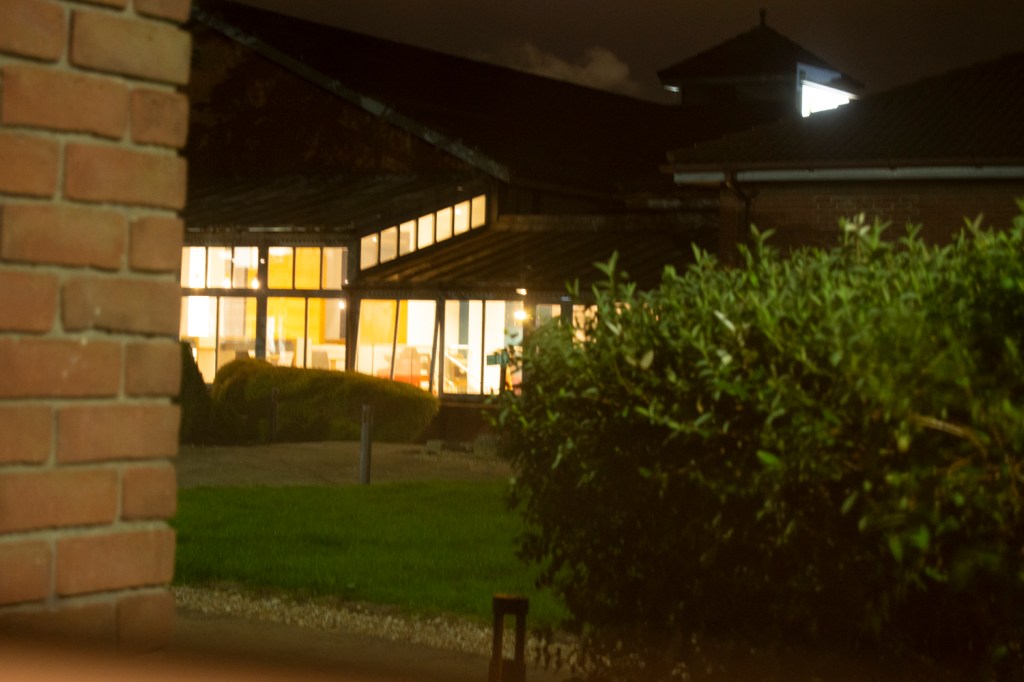
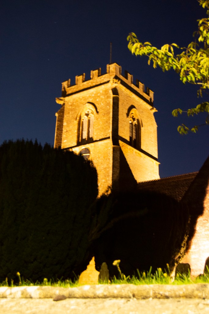
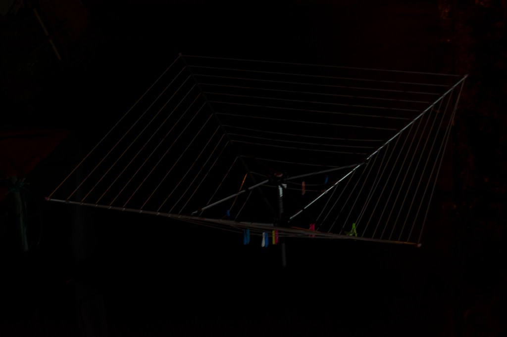
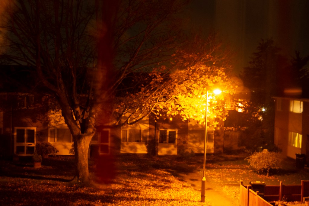
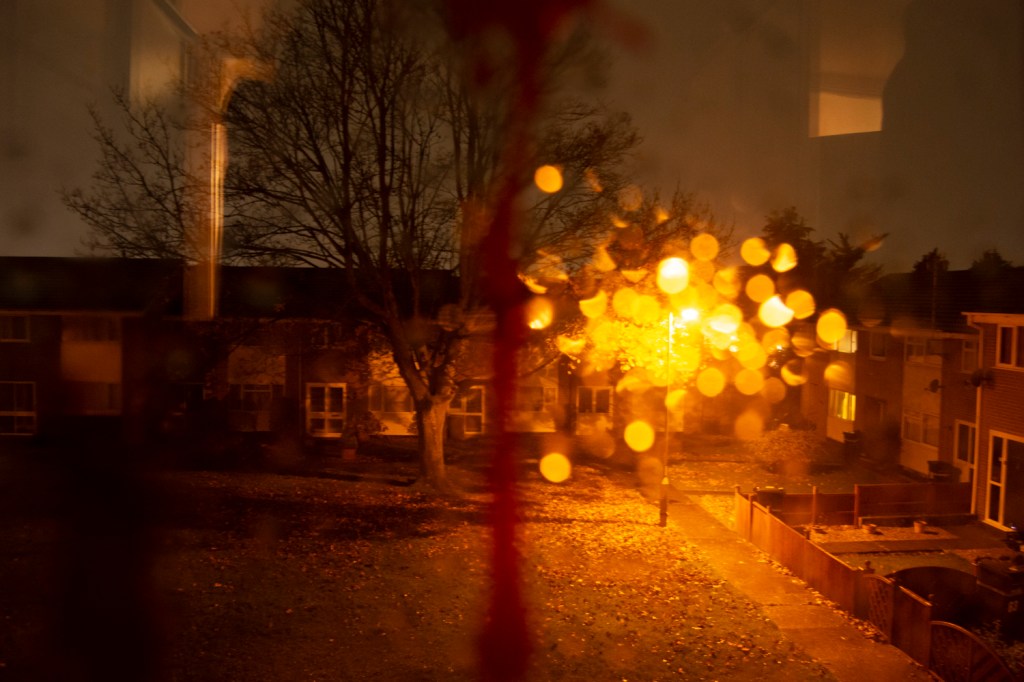
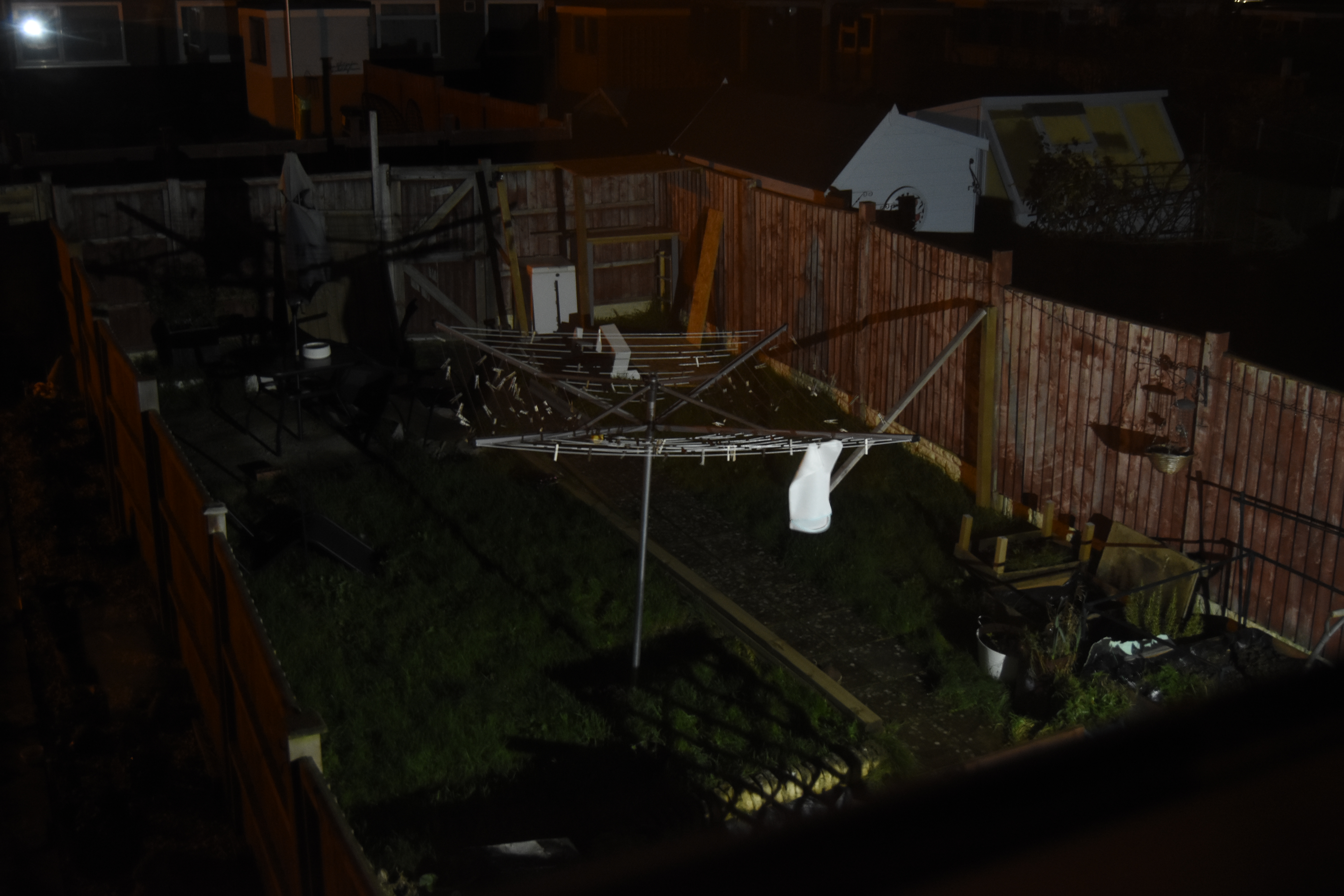
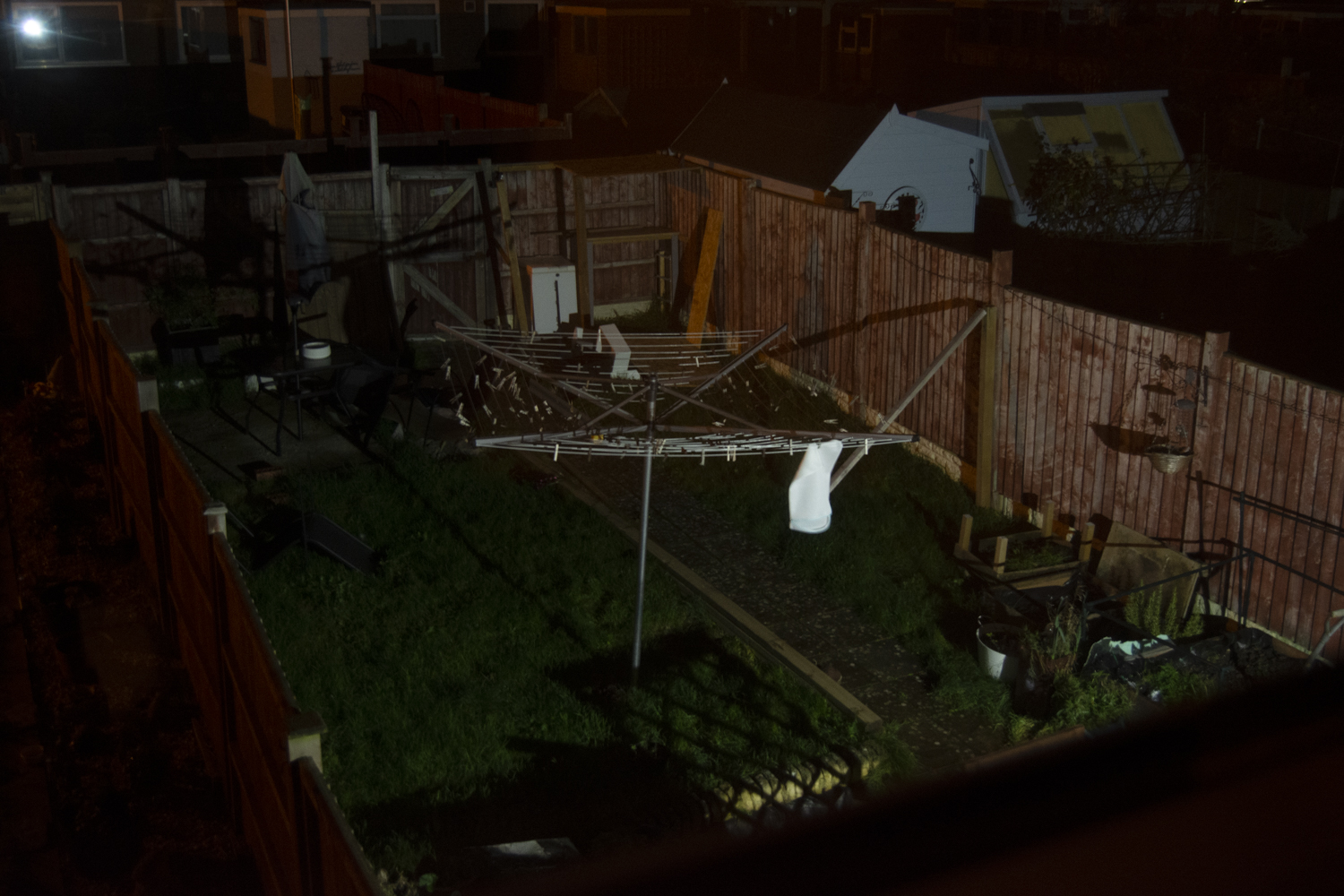
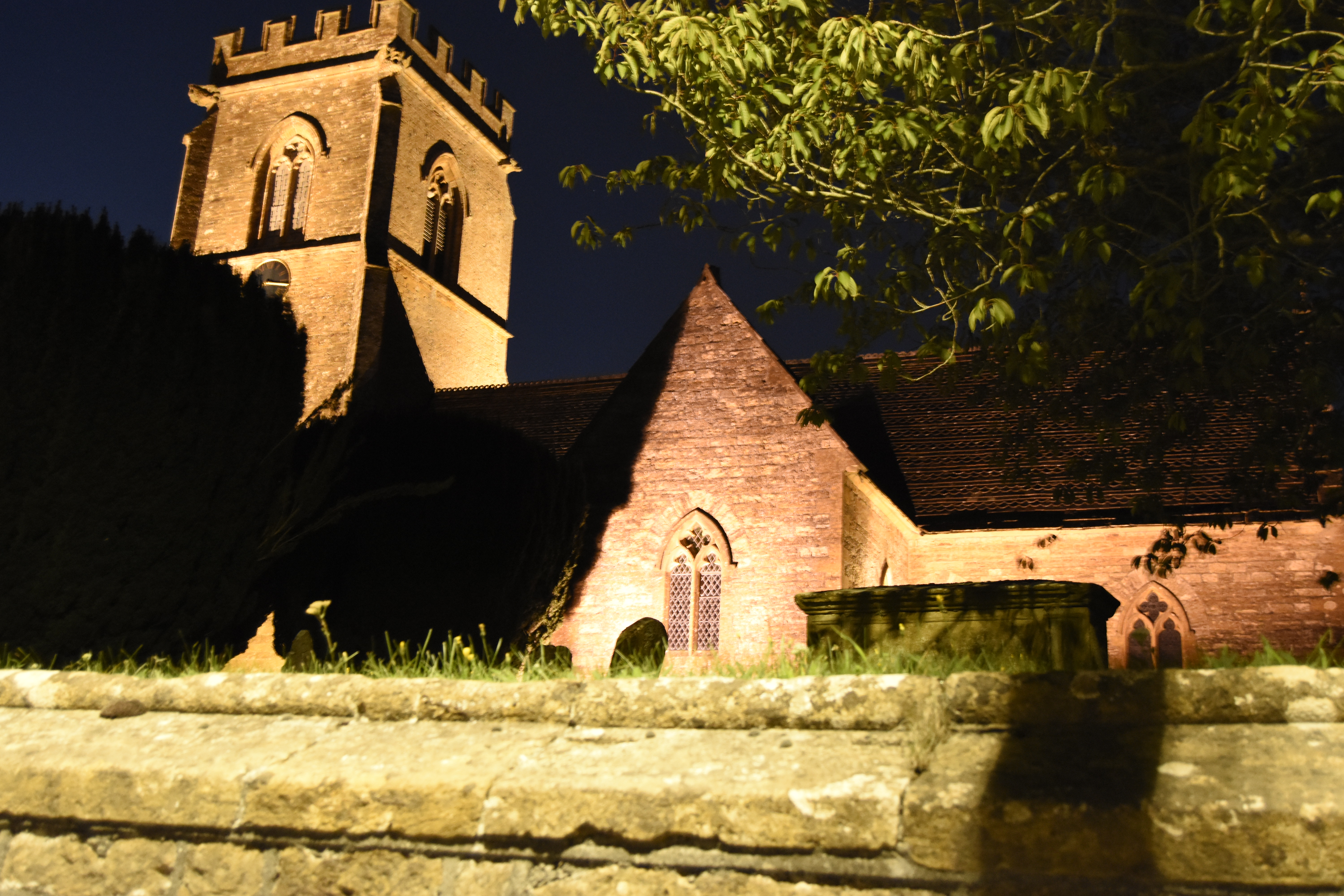
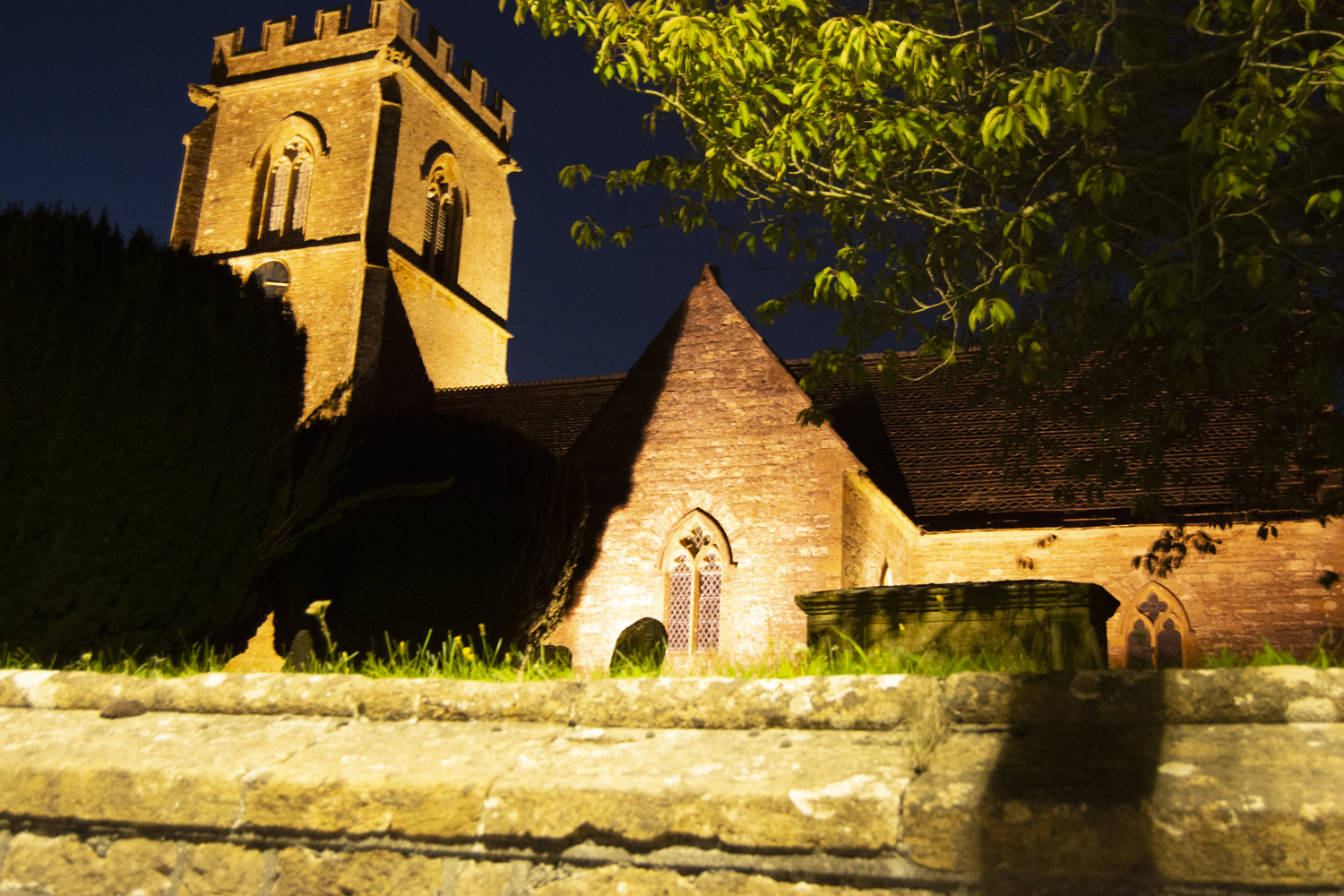
Artificial Light
The images above were taken over a period of time and at different locations. The top left image was taken from a hotel room in Portsmouth, looking across to the restuarant. The bright lights illuminating the courtyard.
The top middle image was taken one evening and is of a church close to where I live. The church is illuminated by street lights and some flood lights.
The top right image was taken looking out of the bedroom window overlooking my garden and is of a rotary clothes dryer. The light illuminating this comes from my neighbour’s security light.
The bottom two images were taken from a bedroom at the front of my house and are of the tree on the grass area in front of the houses, with the street light illuminating the scene. In the second image it has just started to rain and the water droplets on the window make it look like a swarm of fireflies surrounding the street light.
Early morning garden
My camera is set up to take images and store them as both JPEG and NEF format. When I downloaded the image above and the one below I noticed when I viewed them in Windows photos that the NEF files had more detail compared to the JPEGs produced by the camera. I know that the NEF format store a lot more detail than the JPEG format, which allows for the level of detail to be adjusted when processing in an application like Lightroom or Photoshop but having taken these images in low light conditions with artifical light the difference was visible for the first time.
In the image above the increased level of detail is particularly visible in the shadows in the top left corner of the photo.
In both cases, here, the image visible when the slider is to the far right is the JPEG, and when to the far left, the NEF, without any processing and exported from Lightroom as a JPEG.
Revisit one of the exercises on daylight, artificial light from Part 4 (Ex 4.1, Ex 4.2 or Ex 4.3) and develop it into a formal assignment submission. The submission requirement for this assignment is a set of between six and ten high quality photographic prints.
There are many ways to edit and the most valuable one is probably to show your work to friendss, family and your OCA peers for feedback – you are guaranteed to find something new in your work. Another tip is to pin the work up on the wall and live with it for a few days. ‘A Quick Guide to Editing You Photo Series using stickies’ on the IPO (Invisbile Photographer Asia) website, but bear in mind that this is not a narrative assignment – you’re not required to produce a story.
Assessment of photography in any context is an assessment of images and accompanying words so please include a written analysis of your work outlining:
how you you have developed the assignment from the original exercise in Part 4
which practitioners you’ve looked at for inspiration and how their work has influenced you
your technical approach and any particular techniques you incorporated
the strengths and weakness of particular photographs and your project as a whole (self-assessment)
Conclude your notes with a personal reflection on how you’ve developed the exercise to meet the descriptors of the Creativity criteria. Write 500 – 1000 words.
Assessment
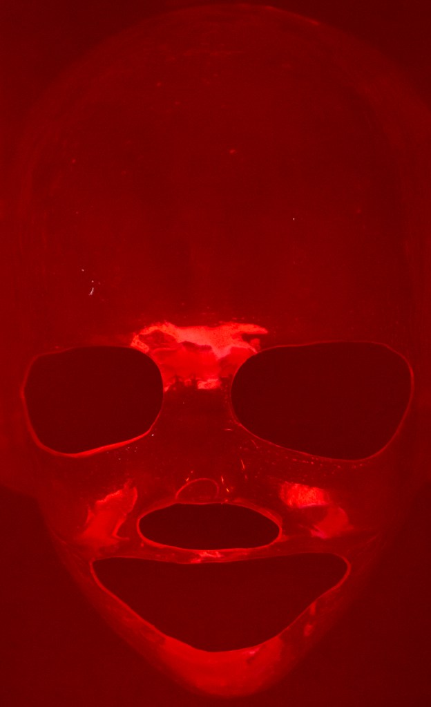
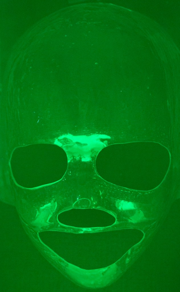
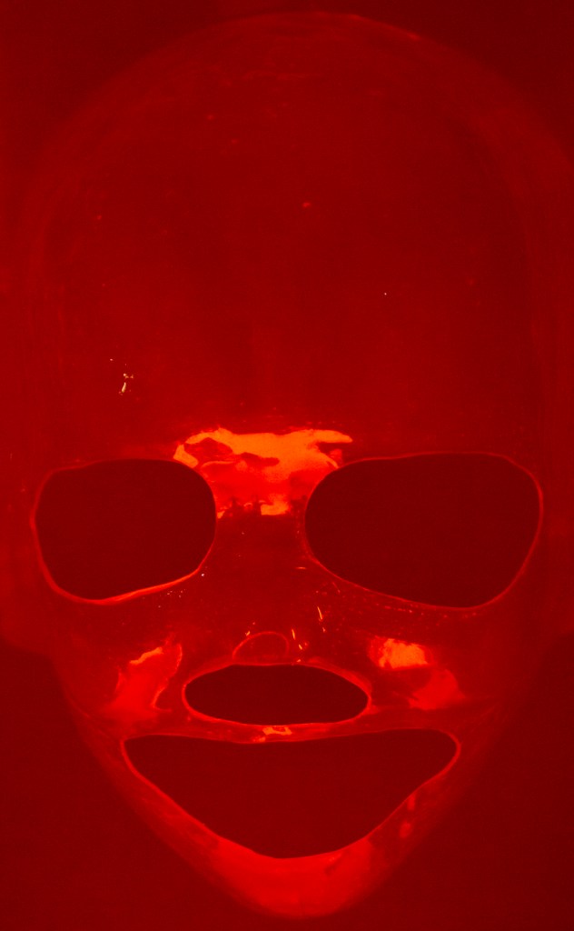
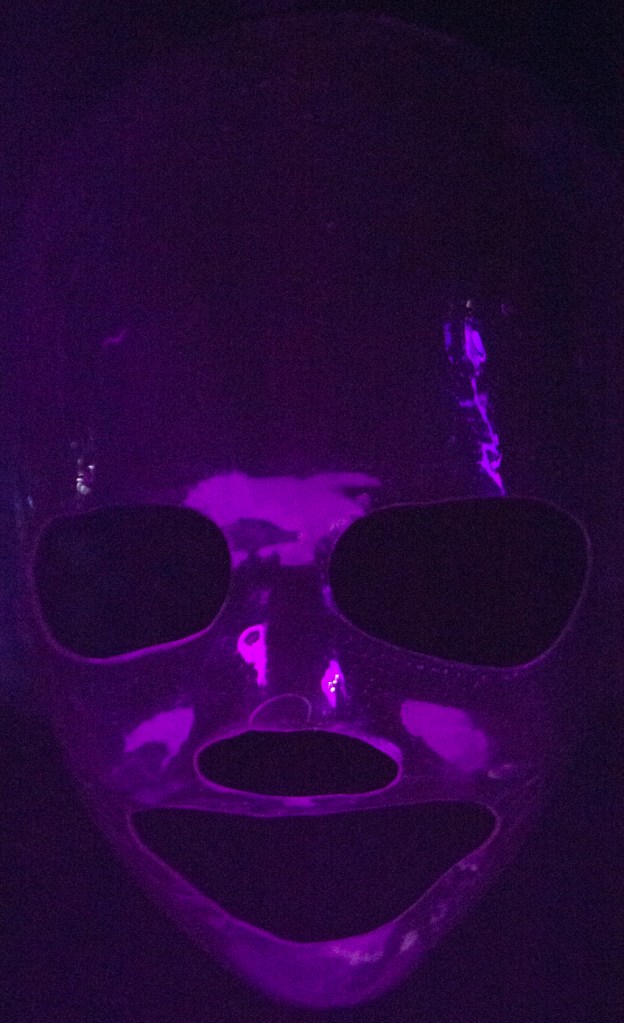
This assignment was based on the work done for Exercise 4.3 Egg or Stone. During the exercise I explored the use of light to reveal the form of an object, by using various aspects of light including quality, contrast, direction, and colour.
When shooting the images for that exercise I made use of natural light from a window to light a series of stones and changed the way the light hit them by moving the objects around so different facets of them caught the light.
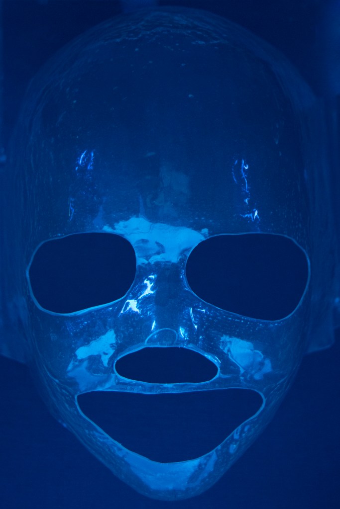
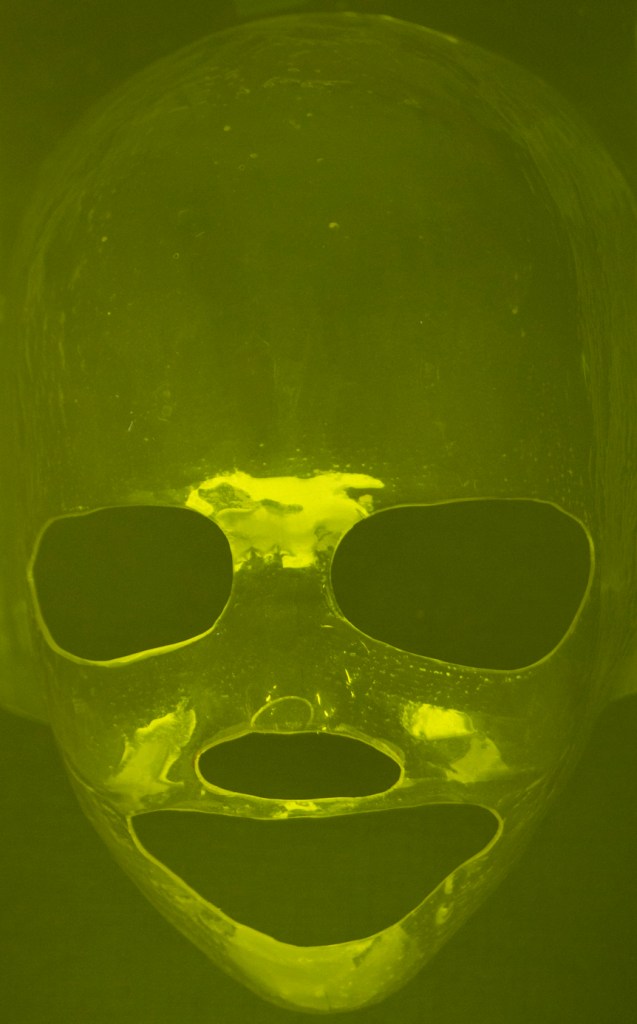
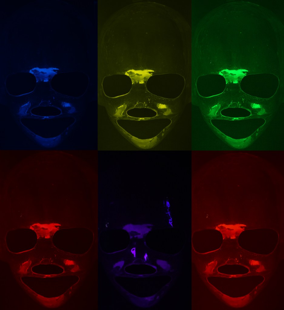
This assignment developed that work by introducing light sources in the form of two small LED lights which could be positioned to direct the light at an object. In addition to this, I added the use of colour by using coloured plastic film in front of the white lights. A range of colours including, yellow, green, blue, and red were used, with combinations of these allowing for other colours.
The main photographer who was my inspiration was Jean-Baptise Huynh, and particularly his image of a crystal skull.
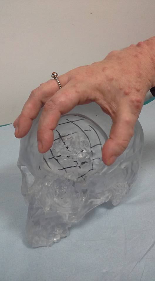
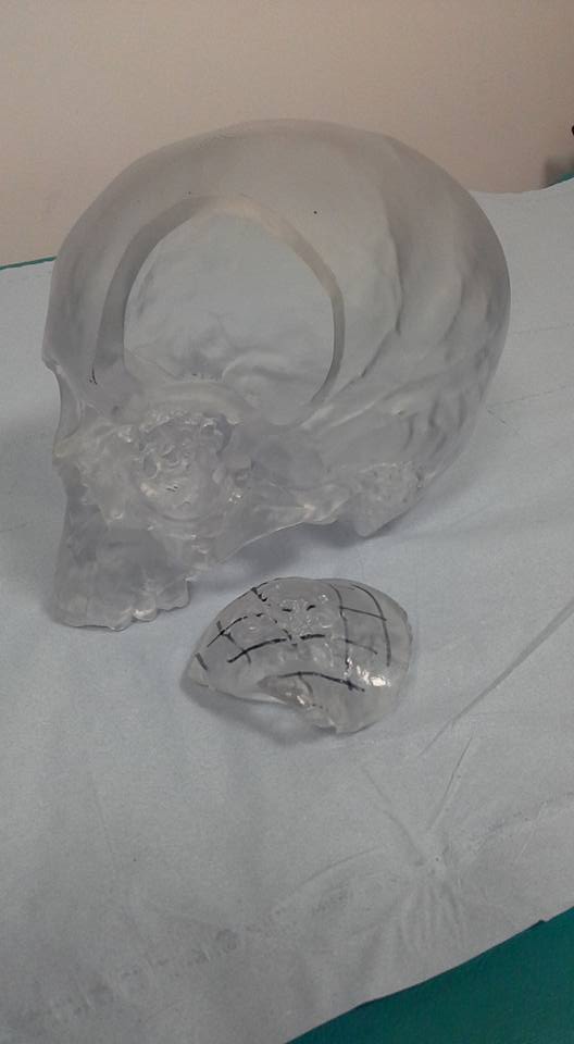
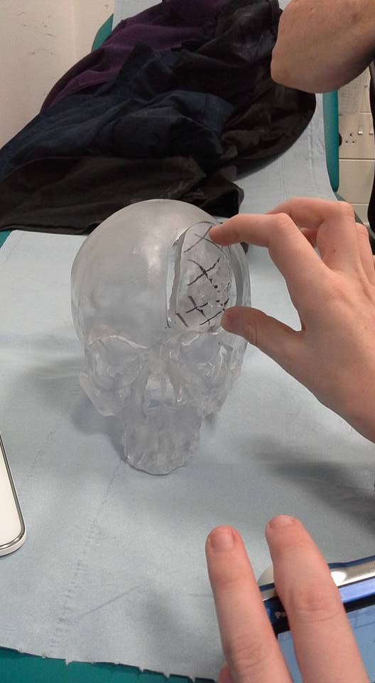
Although I didn’t have a crystal skull too hand, and couldn’t by the time of taking the photographs, get hold of an acrylic model of my son’s skull, I was able to make use of a plastic mould of his head that had been made when he was undergoing radiotherapy.
The other artist that influenced the final 6 image layout was Andy Warhol and his iconic artwork of Marilyn Monroe, and especially the multiple image layouts.
Huynh’s crystal skull image gave me the opportunity to read up on crystal skulls, and to find out a bit more about them. Although Huynh’s image is not illuminated by coloured lights the chance to replicate something similar was a challenge I wanted to undertake.
Warhol’s artwork was very much a last-minute influence as I thought about how best to display the complete set of images.
As stated above, my approach was to make use of small LED lights with coloured plastic filters. These were initially placed so that the light was directed at the skull, which had been attached to a black background. Photographs were taken from directly in front of the skull with the camera handheld. These initial images provided plenty of things to think about.
As a result of the initial experiments I decided that the camera needed to be placed on a tripod, to allow it to be focused on the skull without the camera changing focus during the act of taking the image. At the same time the camera was set so that the mirror was up, and triggering was performed using a remote.
The initial images taken showed that having the lights facing directly at the skull resulted in them being reflected in the clear plastic surface. To get around this the lights were moved so that the light pointed down at a white piece of paper which was used as a reflector. Tweaking the position of the lights removed these reflections.
Other reflections were not as easy to overcome but because of their position they have been left in the images, especially as they are in the same positions in all the photographs. Further experimentation will be needed to remove these for future photographs.
I think that the blue, green and yellow images are interesting, in that the light highlights areas of the skull. For instance, below the eye holes it is possible to see more clearly pin prick markings in the surface of the plastic. In the red and orange images these markings aren’t clear.
The weakest of the images is the purple one, where the top of the skull fades into the background too much.
I think however, when grouped with the other images there is a menacing look to this image, like the face is coming out of the background towards you or is withdrawing into the background.
To develop the work further I think I’d want to take a further set of images where the skull was lit with another dark colour so that there were three bright images and three darker ones. The layout of the images would then be adjusted so that the green image replaced the bottom left image and where it was originally positioned replaced with a third dark image.
Reflecting on this assignment against the Creativity criteria descriptors I believe that I have shown imagination because of the particular item I’ve chosen to photograph, and the way that I’ve attempted to do that using coloured light sources. I’ve experimented with different ways to achieve the end result, including printing the images out on digital transfer film so that they could be displayed in a way that allowed them to be illuminated from behind. I also feel that throughout Part 4 of the course I have been developing my personal voice, as can be seen in some of the material that I’ve been reading and this can be seen in the work produced for this assignment.
Images
Related Reading
The following learning log entries, articles and books influenced the development of the idea for this assigment.
For this assignment I decided to develop the work from Exercise 4.3 using inspiration gained from an image by Jean-Baptise Huynh called Crane en Cristal
Crystal skulls are made from clear or milky white quartz and are said to date back to the Aztec and Mayan civilisations. None, however, of those currently date back this far, and tests have found that all show signs of having been produced by relatively modern tools. As a result, they have been estimated to have been produced in the 19th and 20th centuries.
Crystal skulls hold a fascination for people because they suggest that our ancestors were capable of working materials in intricate ways. This fascination has led to Crystal skulls being featured in films and television programmes such as Indiana Jones and the Kingdom of the Crystal Skull and Stargate SG-1.
Crystal skulls are seen by some people to be linked to the paranormal and to be imbued with mystical powers.
It is not impossible that there exist crystal skulls that were created during the times of the Aztec and Mayan civilisations. Both were capable of building structures like Egyptian pyramids, and in the case of the Aztec are known to have performed human sacrifices. It is therefore possible that one day a crystal skull may turn up that can be dated back to these times.
Technology today allows us to create our own versions of crystal skulls. Using 3D printing techniques and highly detailed scans of the human head, we can produce not skulls made from quartz, but versions made of acrylic. These models allow surgeons to see what they are dealing before having to perform surgery on a person.
Although not as stunning as skulls made from crystal these are still as incredible because they are the skulls of an actual living, breathing human being. The images above are of the model made of my son’s skull when he was being prepared for surgery for a brain tumour.
Hospitals tend to hold on to items like this, although I have enquired as to whether his still exists and if it does could we have it. Until such time as I get confirmation either way, I have another avenue to progress the idea for this assignment.
Since we found out that my son had developed yet another tumour but this time it was terminal, I have been developing an interest in how people deal with death. The references below include several memoirs by people like Sally Mann and Nan Goldin, books that examine how we have handled death, particularly with regards to photography.
During his life Rhys had to undergo radiotherapy on several occasions. Some of these involved the head. As part of the preparation from radiotherapy a mould is made that is used to ensure that the body remains in the same position during each treatment session. We were lucky enough that Rhys kept the mould of his head from one of these batches of treatment. It is plastic and is what I intend to use as the subject for this assignment.
Pedro Meyer is a Mexican photographer. Although born in Spain, his family emigrated to Mexico in 1937. Initially a documentary photographer he is also known as the founder of ZoneZero, a photography webiste.
In 1991 he published the first ever CD-ROM containing sound and images.
I came across Meyer’s work, in the book Photograph and Death (Linkman A. (2011)) while researching how death has been handled in photography, a theme that I have been exploring in my work during the last few years.
The film I photograph to remember is a compilation of photographs the Meyer took during the events that culminated in his parent’s deaths, nine weeks apart.
My own parents died two years apart and in some ways parallels what happened to Meyer’s parents. Mum was diagnosed with breast cancer, had a mastectomy and started chemotherapy. The treatment left her feeling sick and so, with the agreement of the doctors, and the belief that there would be a very low chance of further cancer, stopped the chemo.
In the summer of 2014 she was diagnosed with cancer a second time, but this time it was terminal. Mum, who had taken care of everything, including watching over my father who had been forgetting things and having conversations out loud with out realising it, eventually died in the November.
Dad was left to fend for himself on a day-to-day basis, something that worried us, but in the end he did marvelolously well.
Two years and 7 days after Mum died, Dad died suddenly. My sister and I had jokingly said that we’d be surprised if he was still with us two years after Mum had passed away, but he proved us wrong.
In Meyer’s case, his Mum suffered a brain haemorrhage. In my Dad’s case, after a series of falls over a number of months, he died of a fractured spine and a peritoneal bleed.
Watching I photograph to remember I’m reminded that a lot of the photographs I have taken over the years have been a way to record people and events in ways that allow them to remain long after the point where the people in the photos are no longer alive. Just Like Pedro Meyer, I too, photograph to remember.
References
Linkman, A. (2011) Photography and Death. London: Reaction Books Ltd. At: www.reactionbooks.co.uk
Make a Google Images search for ‘landscape’, ‘portrait’, or any ordinary subject such as ‘apple’ or ‘sunset’. Add a screengrab of a representative page to your learning log and note down the similarities you find between the images.
Now take a number of your own photographs of the same subject, paying special attention to the ‘Creativity’ criteria at the end of Part One. You might like to make the subject appear as ‘incidental’, for instance by using focus or framing. Or you might begin with the observation of Ernst Haas, or the ‘camera vision’ of Bill Brandt. Or if your feeling bold you might forget your camera completely and think about the tricky question of originality in a different way – http://penelopeumbrico.net/index.php/project/suns/
Add a final image to your learning log, together with a series of preparatory shots. In your notes describe how your photograph or representation differs from your Google Images source images of the same subject.
Research
Chris Steele Perkins
Chris Steele Perkins is a British photographer born on the 28th July of 1947, the same day as my sister but 22 years before her. He is a member of Magnum Photos.
His series of images based around Mount Fuji, which although including it, manage to relegate it to the background of the image. This large, volcanic mountain that towers over the land around in dwindles into the background as the day to day lives of the people who live in its shadow come to prominence.
Unlike most images of Mount Fuji which will have it as their central focus, Perkin’s images show that it is just another part of the landscape. A popular and imposing part but none the less, just another feature of the world that surrounds the people that live near it.
Although Mount Fuji is a well-known and will draw tourists and photographers from around the world, one question that comes to mind is, how many of the people that live near it take photographs of it? Is it something that is taken for granted, do they find themselves thinking, well it is there, and I will get around to visiting it or photographing it at some point?
In my life I have lived in various places. Wales, Portsmouth, Dorset, and Somerset. When I lived in Sherborne in Dorset our home was about a mile from Sherborne Castle and a bit less to the Cathedral. During the years we lived there I always meant to visit both and because they were on the doorstep kept putting it off. To this day I have never set foot in either.
Similarly, when I lived in Portsmouth there were lots of places that I kept meeting to visit. The D Day Museum, Historic Dockyard. It is only in the last 10 years that Ih ave been to the Historic Dockyard, despite having lived in Portsmouth for 5 years and spent a lot of time there as a result of visiting family and for work prior to that.
So many of us take what is around us for granted and it is only when we find ourselves away from it, kick ourselves for missed opportunities.
Ernst Haas
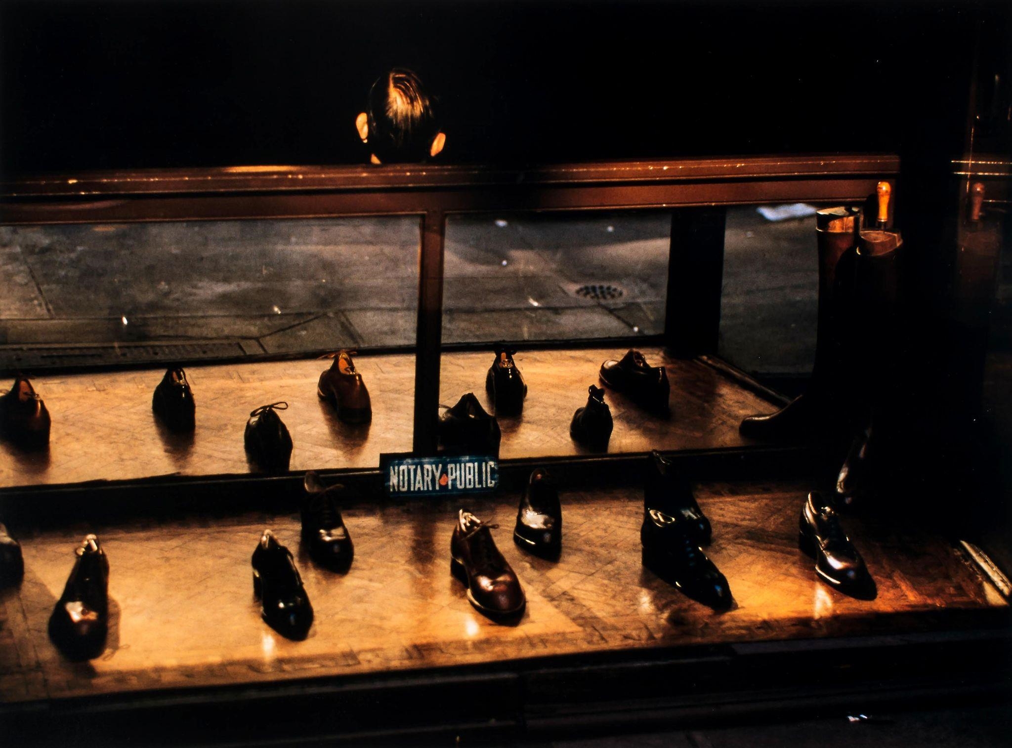
Looking through the Haas’ images at Visura I tried to see them with fresh eyes, I tried to see them like they were the first apple I had ever seen. Of the series of images shown two jumped out at me and wanted me to look for deeply at them. The first was the image of a swimmer, the second of shoes in a shop window.
There is nothing overly special about the shoes in the window and so what makes this different to other images of shoe shop windows. For me what makes this different is the sign in the middle of the image. “Notary Public”. Over the summer we needed to find a Notary Public.
A notary public (or notary or public notary) of the common law is a public officer constituted by law to serve the public in non-contentious matters usually concerned with estates, deeds, powers-of-attorney, and foreign and international business. A notary’s main functions are to administer oaths and affirmations, take affidavits and statutory declarations, witness and authenticate the execution of certain classes of documents, take acknowledgments of deeds and other conveyances, protest notes and bills of exchange, provide notice of foreign drafts, prepare marine or ship’s protests in cases of damage, provide exemplifications and notarial copies, and perform certain other official acts depending on the jurisdiction.[
The shoes appear to be very formal. Are these shoes aimed at solicitors and other professionals? Or are they aimed at the gentleman who wants a pair of shoes that make a particular statement about them.
The other thing that that stands out in this image and provides a juxtaposition to the shoes is the head of the man sitting facing away from the window. Shoes go with feet. Shoes are as far from head as you can get in a human.
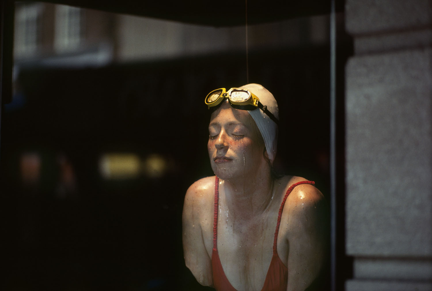
Ernst Haas – Swimmer
The image of the swimmer above has no context, leaving its interpretation open to the viewer. Ernst Haas has taken someone involved in an activity and captured them in a way that is not how we normally would see them.
Are we looking at a person who is preparing to take part in a swim race and so are mentally preparing for what is ahead? Is this someone who has just finished a race and is showing the emotion that has resulted from a win or a loss. The trail of liquid down her cheek could be water dripping down or it could be tears of sadness of joy. The background does not appear to fit with a normal swimming pool. Is she swimming at home, or has she just come outside a swim venue? In the same way that Haas found himself experiencing what it felt like to see an apple as if for the first time, the more I look at this image, the more I find myself wondering about the person it has captured.
Ernst Haas
And finally, Haas has captured a scene that a lot of visitors and tourists will have taken of city skyscrapers and done something unique and creative by including these binoculars in the shot but in such a way that they look like faces, each having the feel of a different personality.
Bill Brandt
Instead of photographing what I saw, I photographed what the camera was seeing. I interfered very little, and the lens produced anatomical images and shapes which my eyes had never observed.
Bill Brandt
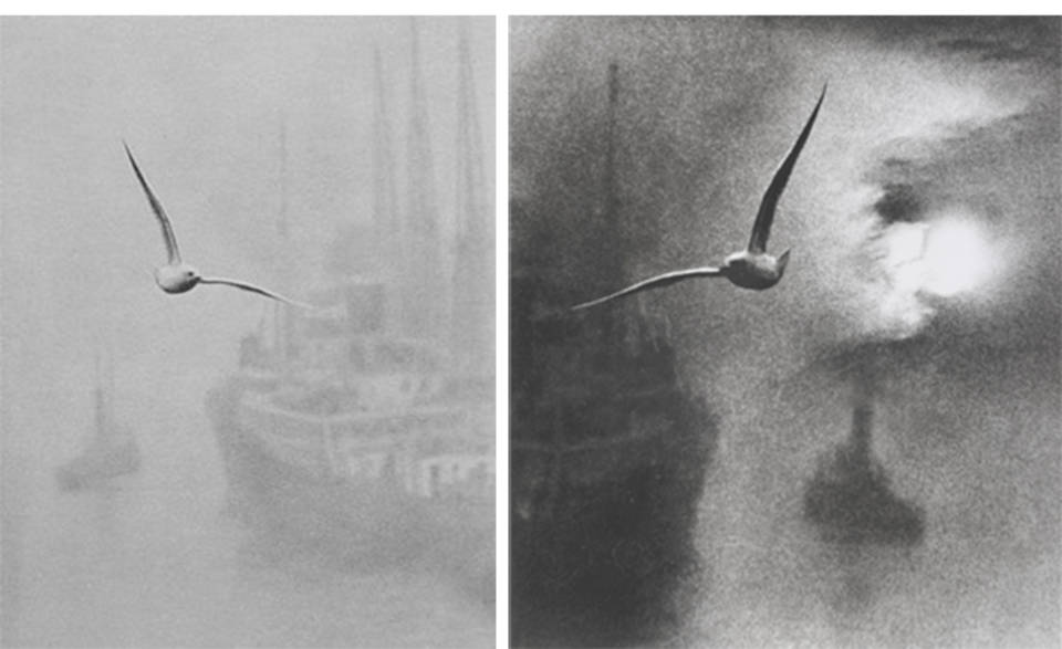
This quote is an interesting one when you put it into the context of some of Brandt’s work where he made use of family and friends to act out roles in his images, or heavily cropped and even added elements to images that were missing from the original.
For instance, in the images below the seagull has been added, and in the photograph on the right the sun has also been added. Not exactly what the camera was seeing.
Morning on the River, London Bridge – Bill Brandt
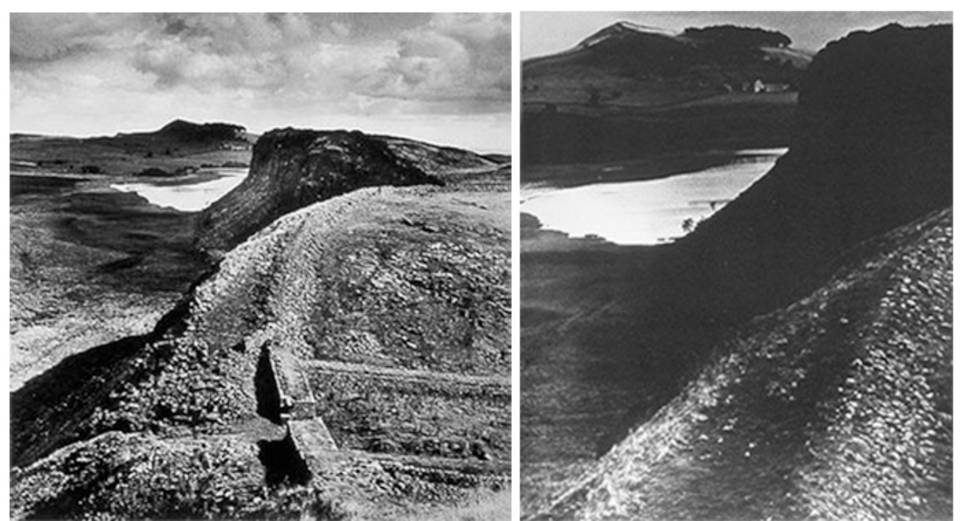
In the images below, the right-hand photograph is a cropped view of the top left section of the one on the left. This time it might have been what the camera was seeing but Brandt has focussed on just a part of what was seen.
Hadrian’s Wall – Bill Brandt
Brandt may have been photographing what the camera saw but he interpreted what was seen, either beforehand by placing people into scenes or during the editing process afterwards.
Maybe by cropping images he was highlighting parts of what the camera had seen, bring out details that might not have been seen clearly by the eye.
Exercise
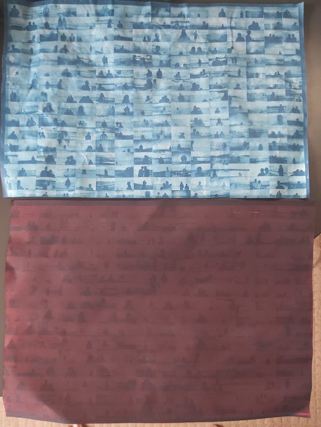
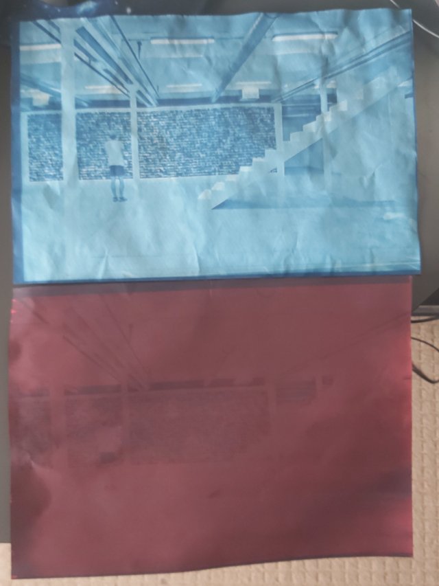
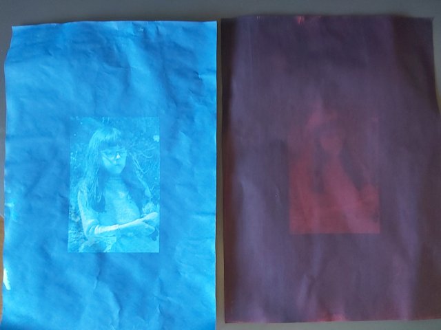
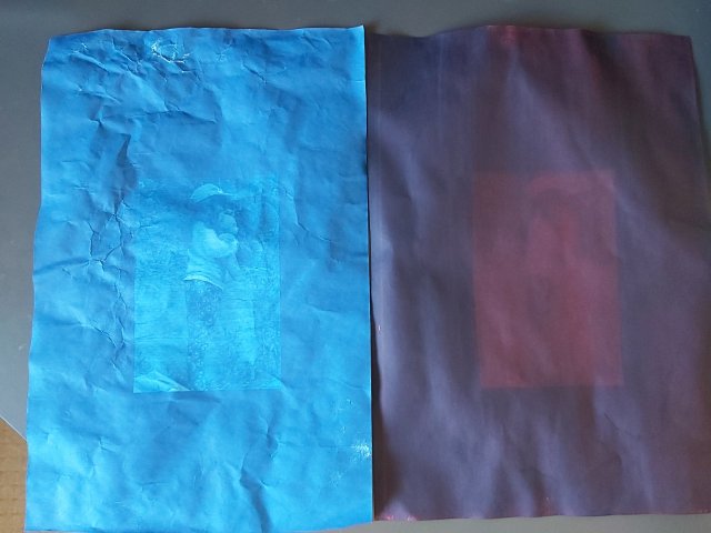
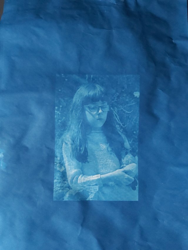
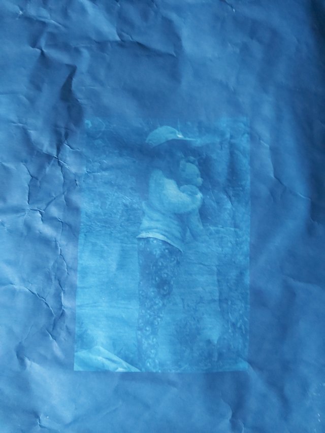
For this exercise I wanted to try something different, something that meant I did not have to use my camera. Photograms, Rayograms, Cyanotypes. Different names for a technique that requires an image of an object to be formed directly onto paper by placing the object on the paper and then exposing it to light.
A Google image search for cyanotypes resulted in the above results.
When you look at the individual images in the screengrabs above, there are lots of cyanotypes that include flowers and leaves. Those that do not feature these common themes therefore stand out. The image of the foxes, people, faces and landscapes. Far less prevalent and so more unusual.
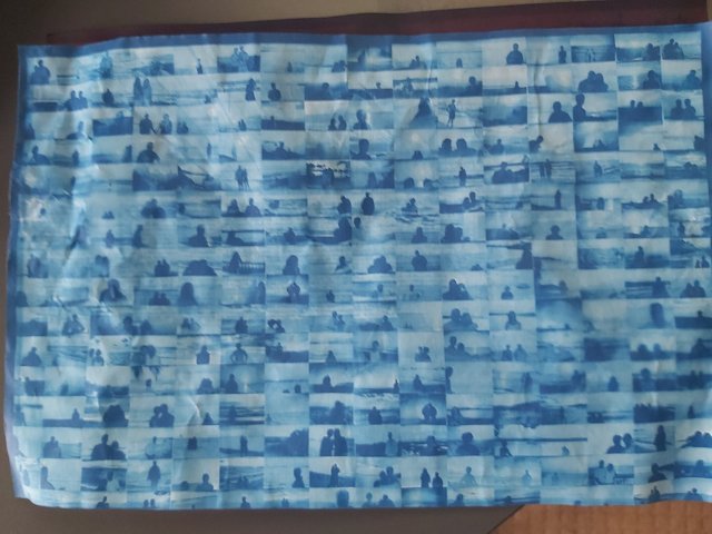
Before I even started to look at the work of Perkins, Haas and Brandt, I looked at Penelope Umbrico at the link provided in the exercise brief. Looking at her other work I found examples where she had made use of other people’s images to form her own artworks. This provided me with the inspiration for this exercise and I decided that I wanted to take some of the images of her work, turn them into digital negatives using Photoshop and then transfer them to cyanotype.
Inverted
Inverted and Flipped
Inverted
Inverted and Flipped
I also decided that I wanted to produce some cyanotypes based on photographs of my nieces that I had taken while working on this part of the course.
Inverted
Inverted and Flipped
Inverted
Inverted and Flipped
When I set out to produce the cyanotypes, I decided that I would use a simple method and purchased some paper that just required sunlight in order to cause the image to develop. Two types of paper were used for this exercise. The first, blue, paper required a short time in sunlight; between 1 and 5 minutes. The second, brown, paper required a longer time of between 5 to 15 minutes.
As can be seen in the images below the blue paper produced better results.
Achieving these cyanotypes was the result of a lot of experimentation with exposure times as well as placing the negatives on the paper the correct way as this is a form of contact printing. Additionally, prior to making the exposures below a step wedge was made using each of the papers to determine the required exposure time.
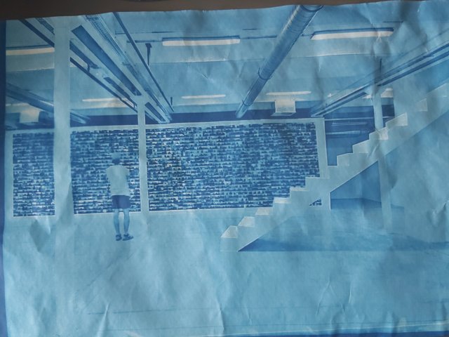
Reflecting on my work, the ways that it is different to the results of the Google Search are that it uses images taken using a camera and a digital negative. Although in the search results there can be seen several images that are similar in using this method, they are in the minority.
The second way that they differ is in the use of the brown paper. When you look at the search results you are looking at primarily blue cyanotypes, and so to be creative and stand out from the crowd you need to do something different like producing different coloured cyanotypes.
The key thing that I learned from producing these cyanotypes is that you need to have a high-quality negative. The cyanotypes produced from Penelope Umbrico’s work were from negatives of 300dpi when printed, those of my nieces were approximate 72dpi when printed at A4 and so to achieve a reasonable dpi, the image had to be smaller.
While producing these I made use of the book Cyanotype – The Blueprint in Contemporary Practice by Christina Anderson, Anderson, C (2019), which provides a guide to the history of the process, suggestions for suitable papers to use, different cyanotype formulas and a guide to artists using this technique in their work.
References
Anderson, C. (2019) Cyanotype: The Blueprint in Contemporary Practice. London; New York: Routledge.
Use a combination of quality, contrast, direction and colour to light an object in order to reveal its form. For this exercise, we recommend that you choose a natural or organic object such as an egg or stone rather than a man-made object. Man-made or cultural artefacts can be fascinating to light but they’re already authored to some degree, which requires interpretation by the photographer; this exercise is just about controlling the light to reveal form.
You don’t need a studio light for this exercise; a desk lamp or even window light will be fine, although camera flash that you can use remotely is a useful tool. The only proviso is that you can control the way the light falls on the subject.
Take some time to set up the shot. If your shooting an egg, you should think about emptying it first so that it will stand up. This is really a topic for advanced student at Level 3 but you might get some help from Google. The background for your subject is crucial. For a smallish object, you can tape a large sheet of paper or card to the wall as an ‘infinity curve’ which you can mask off from the main light source by pieces of card. You don’t need to use a curve if you can manage the ‘horizon line’ effectively – the line where the surface mets the background. Taking a high viewpoint will make the surface the background, in which case the surface you choose will be important to the shot.
Exposure times will be much longer than you’re used to (unless you’re using flash) and metering and focusing will be challenging. The key to success is to keep it simple. The important thing is to aim for four or five unique shots – either change the viewpoint, the subject or the lighting for each shot.
Add the sequence to your learning log. Draw a simple lighting diagram for each of your shots showing the position of the camera, the subject and the direction of key light and fill. Don’t labour the diagrams; quick sketches with notes will be just as useful as perfect graphics.
In the image above, the focus of is on the hand. The light is used to draw attention away from the body behind it and your attention is directed to the fingers and the lines on the palm of the hand. The intimate body area behind the hand fades into the background.
One image of Huynh’s is the inspiration for what I am planning on developing for my assignment.
Exercise
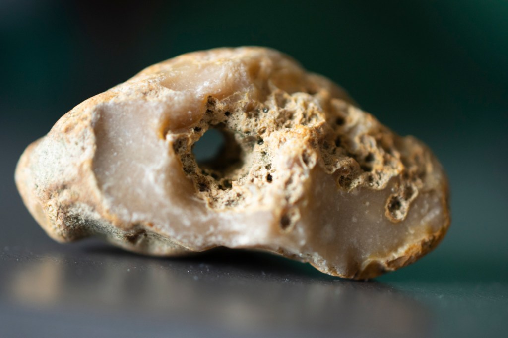
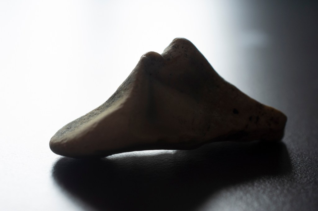
For this exercise I decided to photograph some stones that I had lying around at home. I used natural light from a window, my Nikon camera with a 40mm macro lens. All images were captured with the stone placed on a desk with a slightly reflective surface.
Nikon D-7200, ISO-800, f/3.5, 1/25 sec, 40mm
For the image above, as with all the images here the light was from the left. The camera and orientation of the stone were manipulated to achieve results.
In the above case the camera was positioned in front of the stone. This allowed shadows to be visible inside the hole through the stone and some of the pitting. The left hand of the stone appears brighter, and the colour a lot more muted, than the right-hand side where the colour of the stone is much stronger.
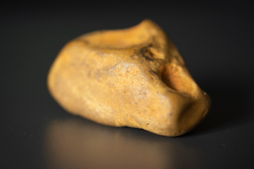
Nikon D-7200, ISO-800, f/3.3, 1/25 sec, 40mm
In the above image the object was rotated so that it was at more of an angle in relation to the camera. The large area of the stone is reflecting a larger portion of light and it is very clear where shadows are forming on the surface of the stone because its shape is blocking light from reaching those areas. Rotating the stone to smaller or larger degrees would have affected how much shadow would have been visible.
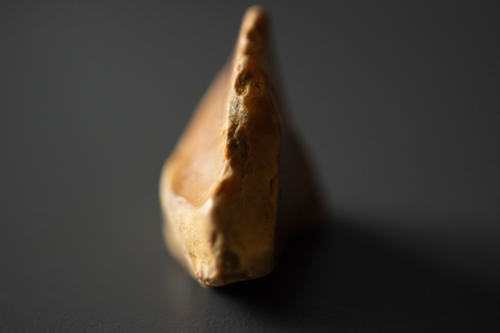
Nikon D-7200, ISO-800, f/13, 1/10 sec, 40mm
In the image above the camera was positioned so that it was almost directly behind the stone in relation to the light source. This resulted in a large portion of it being in shadow. The parts of the stone that are in shadow, but which are more easily visible have a strong contrast to the areas around them. For instance, the faint black line seen just to the left of the middle of the stone is, very dark compared to the pale stone around it.
Where the stone is more accessible to the light the surface can be seen in a lot more detail as the light picks out the dark points in that area.
Nikon D-7200, ISO-800, f/4.5, 1/40 sec, 40mm
In the above image I put the camera so that it was in its original position in front of the stone. I then rotated the stone so that the edge was 90 degrees to the light source. This allowed the nicks in the edge to be made out but also resulted in a more marked line between light and shadow.
Nikon D-7200, ISO-800, f/4.5, 1/15 sec, 40mm
For the final image above, I decided that I wanted to see if I could disguise the object by positioning it in such a way that the light might blur what it was. At the same time, I decided to compose the photo so that only part was visible.
After processing the image, I shared it with friends on Facebook and asked them what they thought it was. The responses ranged from a stone to a piece of bread, to a snake. The latter being what I was aiming to portray in the image.
This is described as “A Memoir with Photographs” and describes Mann’s life, while exploring the lives of her forebears through photographs, information passed down verbally and in writing, and research.
It is also a story of life and death.
Sally Mann talks about the death of family members, including her father, but that is not all.
She talks about the death of a beloved dog and what happened to it afterwards.
Mann shares the story of the time a wanted man, an armed wanted man, made their way onto the family property while she was home alone.
Fortunately, the police arrived before the fugitive could make his way to the house. This ensured her safety but led to the man losing his life.
Looking at the place he died afterwards, her view of it was forever changed.
Mann talks in detail about her time spent at the Body Farm, photographing the corpses of deceased people, left outside on the ground so that the decomposition of their bodies could be studied and measured for science and to expand our knowledge of what happens to the lump of flesh that we inhabit after out lifeforce no longer animates it.
Death fascinates Mann, whether it is historical as depicted by her exploration of the South and the Civil War history and locations, or whether it is more recent.
Mann’s photographs are like Nan Goldin’s. A way to fix memories in place so that they can’t be changed as individuals, or entire nations, move onwards trying to alter perceptions of the past so that it is more favourable towards them and the people that built the foundations of the societies we live within.
References
Mann, S. (2016) Hold Still – A Memoir with Photographs. (5th ed.) New York: Hachette Book Group.
“The Ballad of Sexual Dependency” “is the diary I let people read.” It is a visual diary of the family and friends that make up Goldin’s tribe.
Originally a slide show with a musical soundtrack, it was eventually made into a book.
In the forward to the book Nan Golding talks about why this visual diary exists.
“Preserving the sense of people’s lives, to endow them with strength and beauty I see in them.”
Nan Goldin – The Ballad of Sexual Dependency, p6
Golding states that we all tell stories and that stories can be rewritten but memories cannot. I agree with the first part but not then second.
Memory can be rewritten, especially the further in time you get from the events that shaped that memory. Even more so if there aren’t people around who were witness to the event to correct it, or even worse if they have different views of events that shape your memory of them, changing what you remember as you filter it through other people’s perceptions.
When we lose someone our memories of them can become faulty. We can attribute things to them, that without any way to contradict them, become ingrained in our memories.
Goldin’s photographs of people and events in her life is a way to lock those memories in place for ever. Snapshots of time will be there forever more, no matter how faulty the memory might become.
Many of the people in her photos have died. Through violence, through drugs, through AIDS, and through suicide.
“In the process of leaving my family, in recreating myself, I lost the real memory of my sister. I remember my version of her, of the things she said, of the things she meant to me. But I don’t remember the tangible sense of who she was, her presence, what her eyes looked like, what her voice sounded like. I don’t want to be susceptible to anyone else’s version of my history. I don’t ever want to lose real memory of anyone again.”
Nan Goldin – The Ballad of Sexual Dependency, p9
The photos in the book are intimate portraits of her friends and family. Nudity is not shied away from, but still done in a way that keeps some things private.
The image I feel are more intimate are ones where there is a sense of vulnerability, where a side of the people is revealed that would not normally be.
In “Suzanne in The Parents’ Bed” the dark shadows around the eyes give an impression of something who is not well.
Suzanne in The Parents’ Bed – Nan Goldin
Goldin’s subjects are reminiscent of Diane Arbus’ subjects. People who are on the fringes of society.
There is an honesty about Nan Goldin’s pictures and a sense of the time they were captured.
“The Other Side” is where Goldin pays homage to those friends of hers, her tribe, who blurred and even stepped over the line that marks the crossing point between male and female.
This book and its images are a snapshot of the drag scene from the 1970s and 80s and the people that inhabited that world.
When I first looked through the images in the book, I found myself pausing at the images of Greer. Her images are those of a confident, young woman, but some are tinged with sadness and a look of introspection.
Greer’s life 1958 – 96
The picture “Greer’s life 1958 – 96” reveals someone who understood themselves from an early age, the transformation from young boy to young woman is there to see. They show someone who was not ashamed of themselves and their past.
That may seem like a lot to read from an image, but it is there to see.
Eleven photos of Greer as a child and young person, take up a fraction of the top left of the image. The friends of someone who rejected that part of their life would not have included those photos. It would have been painful for the deceased if they had known they were being used, but also would have been saying “we deny your identity.” The only way that images like those could have been used would have been if Greer, herself, was happy with that part of her life, or at least happy enough not to deny its existence.
There is a beauty, a strength in these images. There is also a sense that this is not all a world of glamour but hard work and boredom. A world of contrast that Goldin’s images reveal.
This book is a homage to people from a community that spans the world but is also a tribute to those who are no longer with us, through drugs, through AIDS and through violence. A violence that continues today.
A violence that can be seen in countries where such things should not be possible. Countries that have known oppression and how its feels to be oppressed. Except that now the oppressed are the oppressors.
References
Goldin, N. (2012) The Ballad of Sexual Dependency. (9th ed.) Italy: Aperture Foundation.
Goldin, N. (2019) The Other Side. (1st ed.) Germany: Steidl.
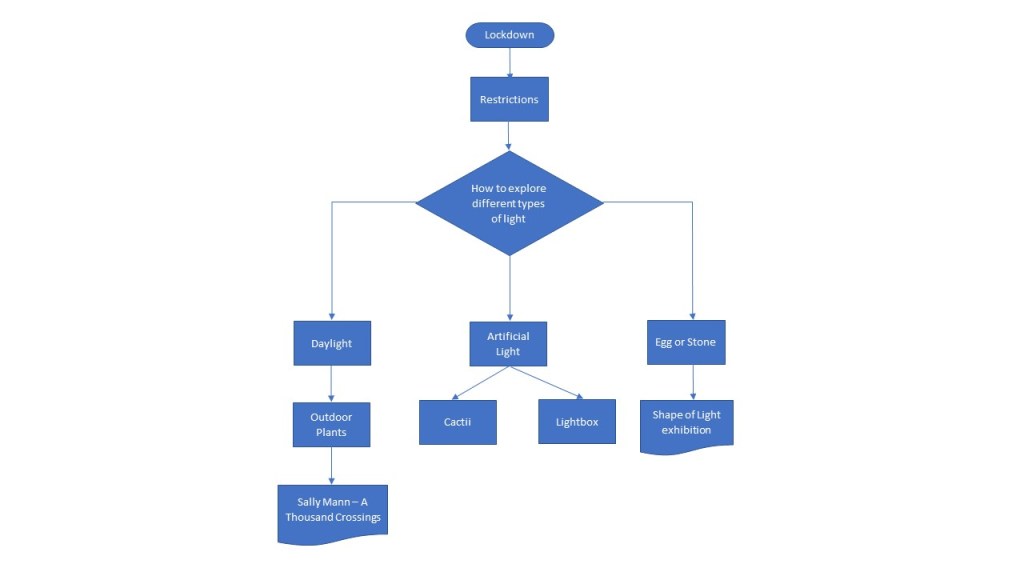
Before starting part 4 of Express Your Vision I thought I’d give some thought to how I might approach the coursework, especially because we are still under lockdown because of COVID-19.
With that in mind I drew up an initial flowchart to give me some idea of the direction I planned to take.
Different Types of Light
Google “different types of light for photography” and you get a variety of different answers. Some discuss light at different times of day, others talk about the source of the light; natural or artificial. Yet others, describe the patterns that light can make and how to achieve those.
The Oxford English Dictionary defines light for our purposes as
noun 1 the natural form of energy that makes things visible; elecrtomagnetic radiation from about 390 to 740 nm in wavelength. 2 a source of illumination such as a lamp.
Compact Oxford English Dictionary, Edition 3, 2005
In the article What are the Different Types of Light in Photography, Hashem, A. (2017), Amin Hashem describes the different types and the characteristics associated with it, such as intensity, colour, quality and direction. Each of these affects how an object will appear when photographed.
For part 4 of the course both natural and artificial light are being used for different exercises and my plan is to try and explore as many different ways of lighting a subject as possible.
Light at Different Types of Day
At different times of the day, natural light has different qualities. ▷ Understanding Golden Hour, Blue Hour and Twilights (2016) provides a table of when these occur based on the sun’s elevation.
Nighttime (below -18°)
Morning twilights (from -18° to 0°)
Astronomical Twilight (from -18° to -12°)
Nautical Twilight (from -12° to -6°)
Civil twilight (from -6° to 0°)
Morning magic hours
Blue hour (from -6° to -4°)
Golden hour (from -4° to 6°)
Daytime (above 6°)
Evening magic hours
Golden hour (from 6° to -4°)
Blue hour (from -4° to -6°)
Evening twilights (from 0° to -18°)
Civil twilight (from 0° to -6°)
Nautical Twilight (from -6° to -12°)
Astronomical Twilight (from -12° to -18°)
Nighttime (below -18°)
Golden Hour
The Golden Hour is the period of time just after sunrise or just before sunset, where the light from the sun changes from a red/orange to yellow (hence the term golden) tone. The light is diffused because of the sun’s low position in the sky.
Images taken during the Golden Hour will have a warm tone and few, if any shadows, because of the sun’s low position.
Blue Hour
The Blue Hour is that period of time when the sun is below the horizon and as a result indirect sunlight takes on a blue shade.
Lighting Patterns
Lighting patterns are the way that light and shadow play across an object. In her article 6 Portrait Lighting Patterns Every Photographer Should Know (s.d.), Darlene Hildebrandt discusses four of these.
Split lighting
Loop lighting
Rembrandt lighting
Butterfly lighting
Split lighting is where an object is divided into equal halves of light and shadow. To achieve split lighting the light source is positioned so that it is at 90 degrees to the subject. Although Hildebrandt is discussing portrait photography, split lighting can be used with other forms of photography, like landscape.
Loop lighting involves positioning a light source at just above eye level and at 30 to 45 degrees from the camera. This results in a small shadow of a person’s nose appearing on their cheek. Unlike with Rembrandt lighting, loop lighting does not connect with the shadow on the cheek.
Again this type of lighting could be used with other forms of photography where the shadow of some feature could be generated on the surface of an object.
Rembrandt lighting is a form of loop lighting but where the shadow of the nose connects with the shadow on the cheek.
Butterfly lighting is achieved by positioning the light source behind the camera and just above the subjects eye or head level. This results in a butterfly shape below the nose.
Walter Nurnberg
Nurnberg was an industrial photographer in post-war Britain. Born in Berlin, he moved to England in 1933, and although designated an enemy alien at the outbreak of World War II eventually served in the British Army until 1944.
Walter Nurnberg Pictures and Photos – Getty Images (s.d.) contains a range of his industrial photographs. The black and white images, with dramatic lighting, something that Nurnberg pioneered evoke a bygone era of British industry and manufacturing. Reminiscent of black and white movies, which is unsurprising, as Nurnberg pioneered movie style lighting for photography, the images could almost be stills from wartime propaganda movies intended to keep up the morale of the British people. It is the way that objects and people have been lit that gives them this feel.
Paging through the images it is the occasional colour image that leaps out at you.
And then you come across an image like this.
Men fit casings to a line of Hoovermatic washing machines, 1961
Clicking on the image resulted in the image being displayed in a separate window with the title “A (sic) the Hoover plant of Merthyr Tydfil”
For most people an image like this would just be another industrial photograph but for me it has a more personal connection. I was born and raised in Merthyr Tydfil until I left home in my early 20s. My father did a number of jobs throughout his lifetime. He was the fireman on a steam train, worked as a labourer on a building site, but for most of his life he worked at Hoovers at their factory in Merthyr. He worked on the production line building washing machines.
Although we went to the factory site for things like Christmas parties and Lord’s Taveners cricket matches, we never got to see where he actually worked so this image adds to his life story and my understanding of a part of his life that I never got to know as well as I could have.
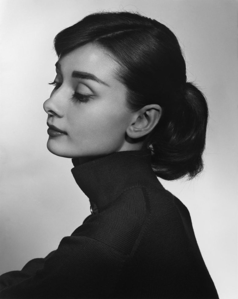
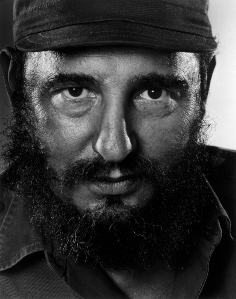
Yousuf Karsh
Karsh was an American-Canadian photographer known for his portraits of famous people.
His use of lighting shows how to produce flattering images of your subject.
Audrey Hepburn
In this image of Audrey Hepburn, Karsh has managed to light her face up so that there is minimal shadow, while still managing to highlight parts of her face. The flawless skin, the lashes (including individual ones), the detail is incredible. There is a gentleness to this image, and an almost dreamlike look to Hepburn.
Fidel Castro
This image of Castro, is compeltely different. Every crease, every line on his face can be seen. The catchpoints in his eyes draw your gaze to them. The image has a very intense feel to it.
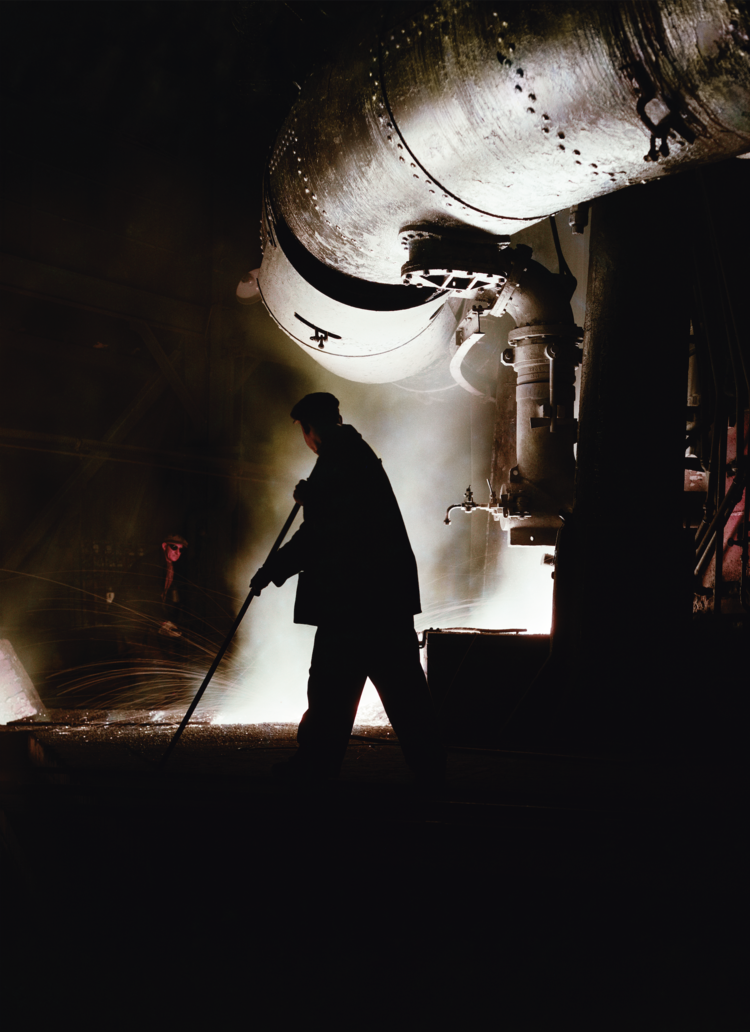
Maurice Broomfield
Born in Derbyshire, Broomfield was a British photographer who, like Nurnberg, worked in the area of industrial photography in the post-war years.
Looking at the images at Buy prints — Maurice Broomfield (s.d.), there are a lot more which are in colour. This suggests to me that Broomfield understood when colour would add to the iamges he was producing in ways that black and white would not.
Furnace crop
For instance this image would have worked in black and white but the use of colour makes the face of the man in the background stand out more.
It also makes a grinning, devilish, face at the mid right hand of the picture seem to be peering out of the image, adding a menancing feel to a photograph of what is a very dangerous job. Almost as if something was about to go horribly wrong.
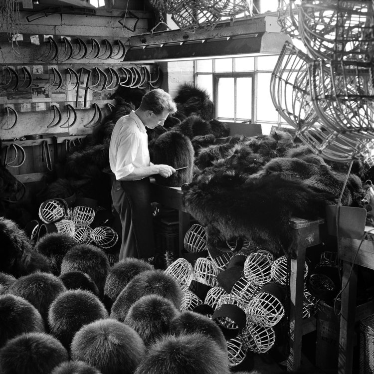
Combing a Guard’s Bearskin. The workshop of J Compton, Sons and Webb, London, 1957
Broomfield’s choice of perspective also adds a challenging element to his work for his viewers.
Without knowing what the subject matter of the image was, at first glance I thought that I was looking at a group of children watching someone working with fur pelts. It was only on closer examination, and with the confirmation of the caption that I wasn’t looking at group of people but at headwear. Not only does light affect how we see an image but so does where we are asked to look at it from.
Taking the photography of Mann, Atget or Schmidt or a photographer of your own choosing as your starting point, shoot a number of photographs exploring the quality of natural light. The exercise should be done in manual mode and the important thing is to observe the light, not just photograph it. In your learning log, and using the descriptions above as your starting point, try to describe the qulaity of the light in your photographs in your own words.
Research
Sally Mann
Mann’s work is a masterclass in how to use natural light for outdoor photography. The exhibition catalog Sally Mann: A Thousand Crossing (2018) contains over one hundred images taken in and around Mann’s home in Virginia, USA.
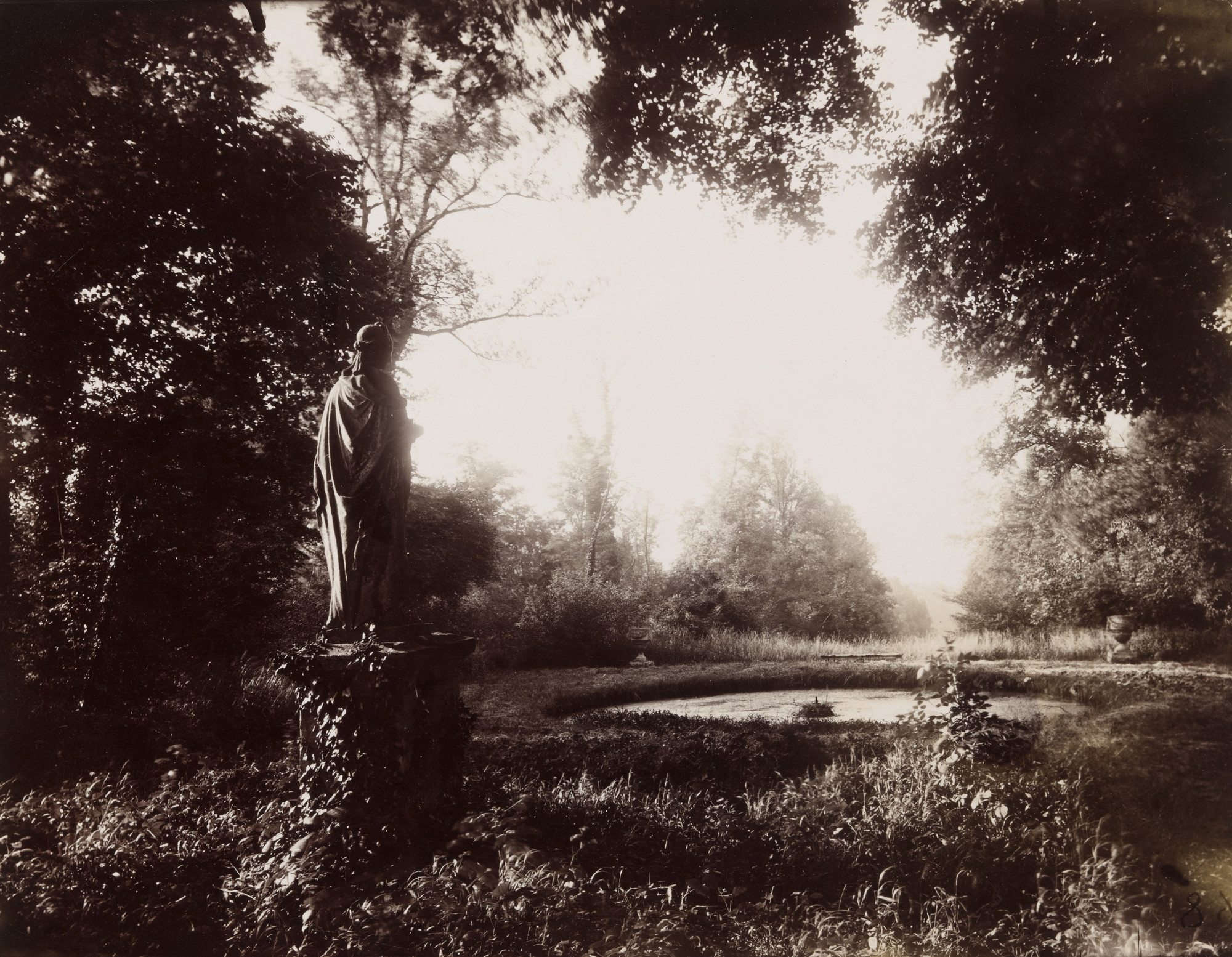
In the image ‘Sensible Hole’ we see a water-side scene. The foreground of the image is the surface of the water with a few trees, pale and ghostly, reflected in its surface.
The background is the trees, their leave and branches lit by the light, but not reflected in the surface of the water. It’s like you are looking at the living world and the underworld, the realm of Hades, home of the dead.
In the middle of the image an area of ground stands out from everything else, bare of vegetation, this lit area draws the attention.
Sally Mann, Untiltled, Lewis Law, Slideshare.net
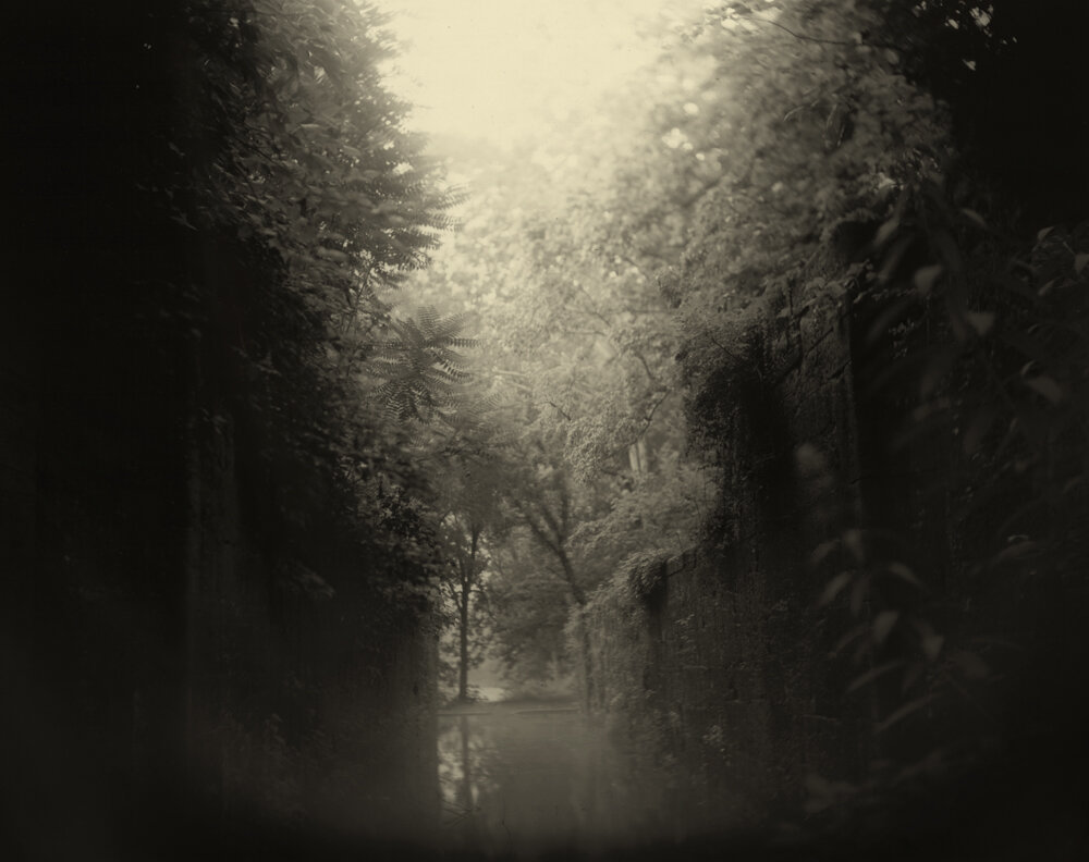
In ‘Untiltled, Lewis Law’ Mann made use of a long exposure time at night, combined with modifications to her camera lens using a toilet roll to block the light. This resulted in an image, where what should have been a dark wall, seems lit up from within.
Mann’s use of light in her photographs allows her to focus the viewers attention. In the image ‘The Ditch’, the majority of the image is dark, however, a single bright area brings the viewers attention to the young boy lying in the ditch, dug out of the riverbank.
In ‘Jessie at Six’ the reverse is true. The majority of the image is bright. Details in the background are out of focus or completely obliterated by the light. This leaves the darker, more defined figure of Jessie and the tree she leans against as the focus of the image.
In Southern Landscape (s.d.) we see a series of landscape images from Virginia, Georgia and other parts of the American Deep South. Each of the images has a dreamlike quality to it because of the way that the landscape is lit. The way that parts of the images are in focus while other parts are just out of focus adds to this dreamlike impression. It’s like when you wake up from a dream and during those first few moments try to cling to it but all you get are fleeting images that stand out clearly as the rest of the dream fades away. It’s not always the obvious that is in focus, in the image of a canal below, the fern in the middle left of the image stands out more than closer items, drawing attention to it.
The vinagretting effect in a number of the images can also bee seen in this image, and because of the composition of the image there is the faint continuation of this effect in the centre of the image where the eye and the brain want to add a circular effect using the canal walls and the vegetation. Almost like your are being drawn in to the image the more you look at it.
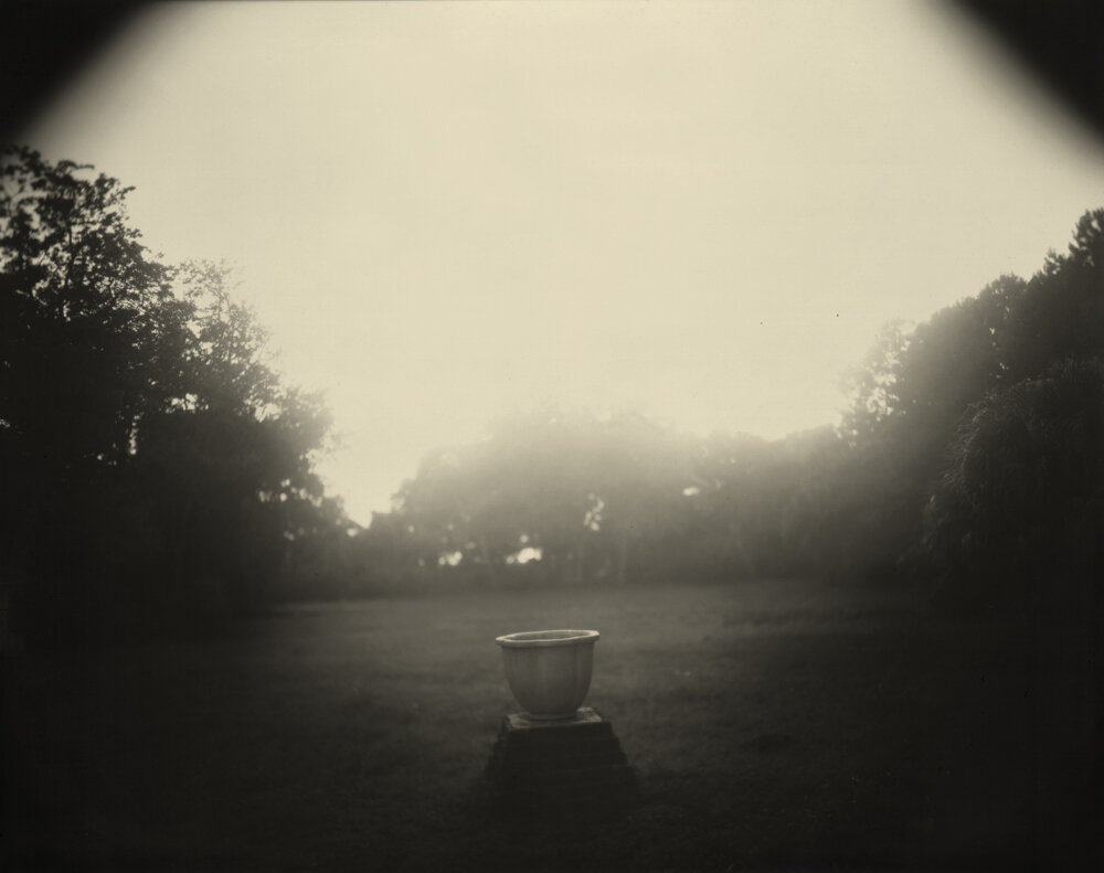
There is also something heavenly about several of the images. The way that the light seems to pour down from above onto objects, for instance, the photograph with the large urn in the Virginia series. There is an almost religious quality to the image that is reminiscent of religious painting where a light shines down from above lighting up Jesus, a saint or some other religious figure.
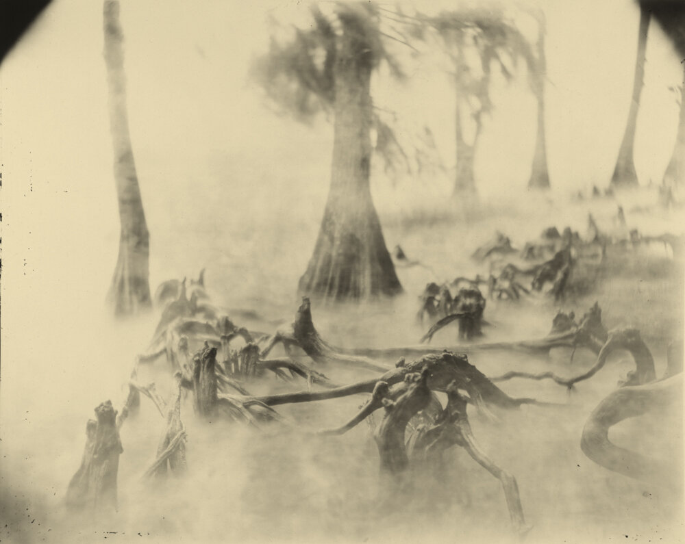
The Deep South image ‘Swamp Bones’ as a much scarier feel to it. The tree limbs looking like some alien creatures emerging through the mist.
As a child of the 70s and 80s and a science fiction fan the more I look at the image I find myself linking it to the Doctor Who episode The Ark in Space and the Wirrn.
In an interview with Jiang Rong for American Suburb X Mann talks about light in the following way:
Why do you think that is? I guess it’s because of the temperature. Also, the light in the South is so different from the North, where you have this crisp and clear light. There is no mystery in that light. Everything is revealed in the Northern light. You have to live in the South to understand the difference. In summer, the quality of the air and light are so layered, complex, and mysterious, especially in the late afternoon. I was able to catch the quality of that light in a lot of the photos.
An Exclusive Interview with Sally Mann – ‘The Touch of an Angel’ (2010) – ASX, E. @ (2013)
Light is light. How can the light in one part of the world be different to the light in another part of the world. Of course there are different types of light. The light from a cloudless, blue sky is different at noon, compared to what it would be a few hours either side of noon. The light at dusk and dawn are different because the sun is lower in the sky. Light on an overcast day is a defused by the clouds and so not as bright and sharp.
To understand what Mann means we need to look at this from three viewpoints.
Mann is talking about a location that is closer to the equator that Northern parts of the USA. Weather conditions are therefore going to be a lot warmer for most of the year and so there would be a sense that the light is somehow warmer as a result.
Secondly, there is the emotional attachment that Mann has to the area. In the quote below, Mann states that she can get information across by appealing to viewer’s emotions. To do this though you have to understand the emotions that you are trying to bring out, and the only way to do that is to understand them yourself. Mann’s fondness for the area she has spent her career photographing, will have coloured her perceptions to some degree, which I believe will affect how she sees the quality of light.
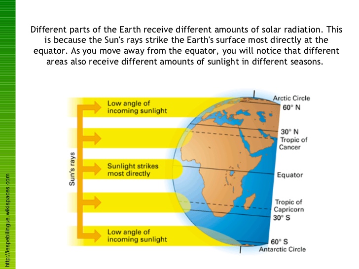
Finally, there is the fact that we live on a globe that is orbiting our Sun. Our world is tilted at an angle and so different parts of it receive different amounts of the sun’s rays, and because of the way that sunlight hits the Earth, at the equator the Sun’s rays are more concentrated than they are at other parts of the globe where they are spread out over a larger area. From the physical viewpoint, the light in the Southern USA is actually warmer than that further north.
And you referred to it as the “translucence and fragility of light”. Yes, and also the refulgence or the reflection when light and water interact. There is no coating on the lens of my old camera, which permits a much softer and more luminous light. I am less interested in the facts of a picture than in the feelings. The facts don’t have to be absolutely sharp. I can get information across by appealing to viewer’s emotions.
An Exclusive Interview with Sally Mann – ‘The Touch of an Angel’ (2010) – ASX, E. @ (2013)
Eugene Atget
Eugene Atget, Environs, Amiens, circa 1898, National Gallery of Art
Eugene Atget, Parc de Sceaux, 1925, MoMA
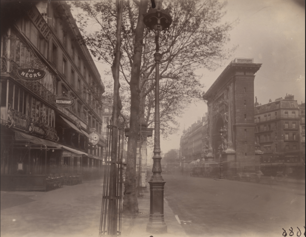
Eugene Atget spent his career photographing Paris, not just any part of the city but those that would eventually disappear. His photographs document a Paris that no longer exists, or which has changed since the turn of the 20th century.
Atget’s early photographs use light in ways that obliterate shadows, revealing as much detail as possible. Over the course of his career his photographic style and his use of light change. The above images, taken almost three decades apart, show this change. However, Atget’s use of light and shadow can be seen in images taken throughout his career.
In his book, Gautrand (2016) gathers together over 500 photographs of Paris taken by Eugene Atget. These document a Paris that, for the most part, no longer exists. All of the images are black and white and so the need to balance light and shadow to allow details to stand out is important.
The technology available to Atget allowed for photographs to be taken with shutter speeds that allowed for movement to be observed, unlike in the period before where people and animals moving would not register, only people who were stationary.
Eugene Atget, Old House, 77 Rue du Temple, 1901
Eugene Atget, Passage de Choiseul, 1907
Eugene Atget, Boulevard Saint-Denis, 1926
The photo of Old House, Passage de Choiseul and Boulevard Saint-Denis, above, all show the ghostly effects that resulted from improvements in camera technology by the early 20th century. People and vehicles that were in motion could be faintly caught when taking an image.
In Passage de Choiseul, Atget has made use of the glass roof, which allows enough light into the area that he is photographing. The way that the light is striking the buildings on the right of the image has turned them into impromptu reflectors, allowing the building and figures that would otherwise have been in shadow to be seen. This is another example of Atget’s use of light to ensure that the maximum amount of detail is avaialble to the viewer.
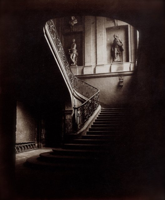
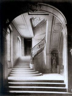
Eugene Atget, Staircase of the Hotel de Tallard, 1901
In Staircase of the Hotel de Tallard, Atget has shown how areas that are lit can be used to draw the eye to parts of a photograph. In this photograph the splendour of the staircase can be contrasted with the ladder lying, propped against the wall, beneath the staircase. The way that the dark parts of the image, follow the sweep of the staircase, also serves to draw the eye away from the statues in their alcoves on the wall and down towards the area under the stairs.
It would have been easy enough for Atget to mask this part of the image but he hasn’t. It is as if he is drawing aside a curtain and helping us to see what goes on behind it.
Atget’s use of light and dark in the image allows us to see the ordinary that goes with the magnificence. Taken in 1901, this photograph, and those of the Hotel du marquis de Legrange and rue Sainte-Croix-de-la-Bretonnerie below, show the direction that his work would eventually take.
Eugene Atget, Hotel du marquis de Legrange, 1901
In the Hotel du marquis de Legrange, above, we see the interplay of light and shadow. In the same way that there are individual steps leading upwards there are also groups of steps that are linked by whether there is a window or wall alongside them. Where there is a wall the steps have areas of shadow, where they are alongside a window, those same areas of shadow are obliterated by the light shining through the window.
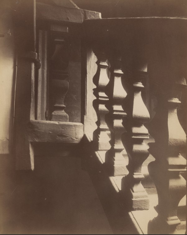
Eugene Atget, 13 rue Sainte-Croix-de-la-Bretonnerie, 1901-1902
Atget’s use of light and shadow in 13 rue Sainte-Croix-de-la-Bretonnerie, above, makes the uprights on the bannister of this look like the Moai from Easter Island. Just by working with the light you have and how it strikes an object allows you to take the ordinary, although these are anything but ordinary in themselves, and turn them into something extraordinary.
Ian Sewell – IanAndWendy.com Photo gallery from Easter Island
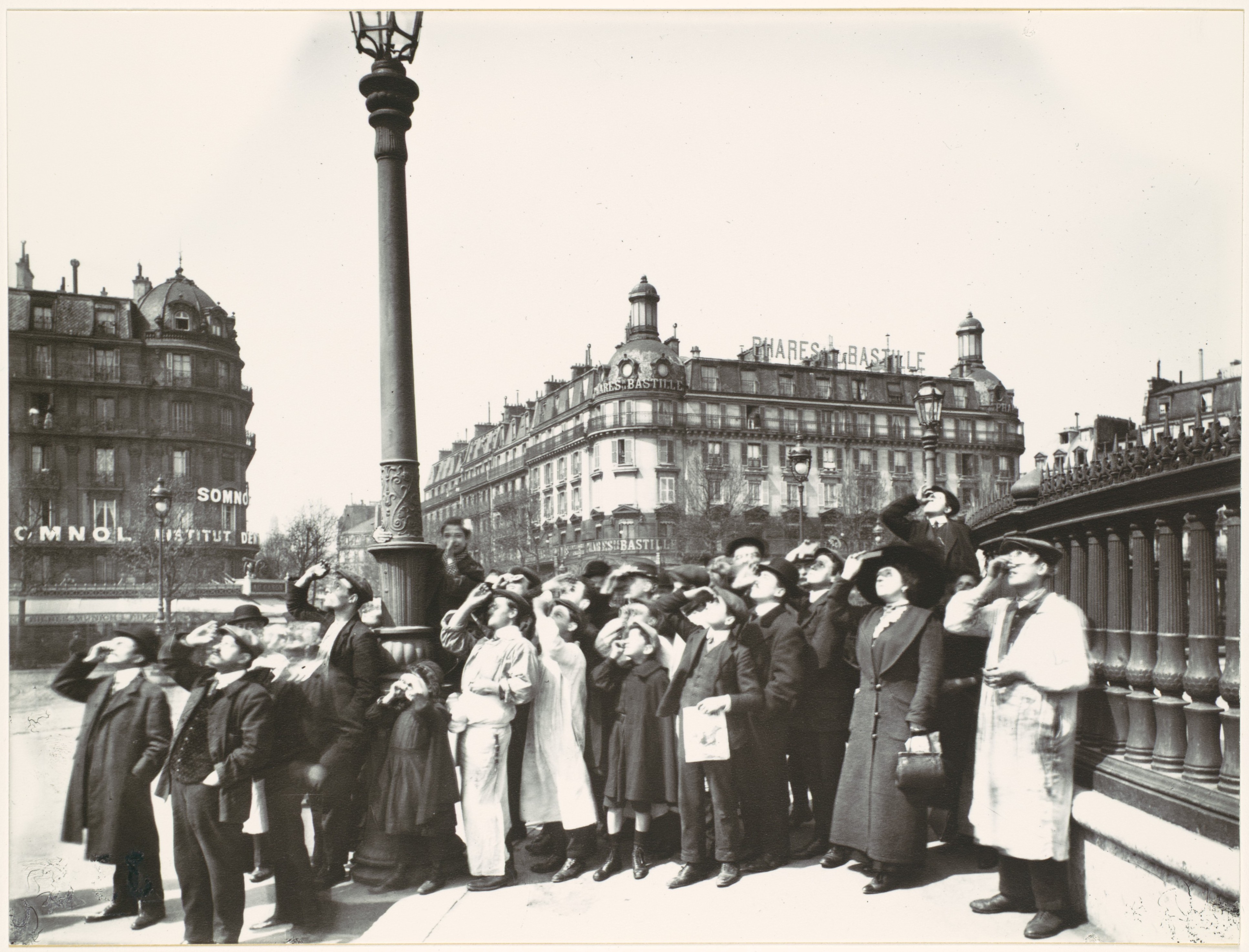
Eugene Atget, During the eclipse, April 17, 1912, Place de la Bastille
How do you get a large group of people to stand still long enough for you to photograph them? Do it when they are distracted.
Where the majority of people would have been fascinated by the eclipse taking place, Atget has turned his camera away from such as momentous event and pointed it at the onlookers. Most photographers would find themselves when faced with an event such as an eclipse, pointing their camera towards the sun in order to record the event. By positioning his camera not to record what was happening in the sky but what was happening on the ground, Atget has stayed true to his vision of recording a Paris that would disappear, by recording it’s citizens doing something that may never have been recorded again.
Atget’s image shows us that no matter who we are, or what part of society we may be seen to be part of, there will always be some spectacle that will transcend societies bounds and bring us together.
Eugene Atget’s work demonstrates how, even when we set limits on ourselves, it is possible to capture images that will be viewed for decades to come. We just need to be aware of our surroundings and their importance to future generations. Additionally, his photographs show how our relationship with light can evolve over the years as we take photographs.
Michael Schmidt
Schmidt’s approach to as described in ASX, E. @ (2010) is very similar to Atget’s early images. Both photographers document the things they see and both use light in ways that minimise or eradicate shadows. Presenting the viewer with an image containing as much information as possible.
Where Eugene Atget was documenting a Paris that people knew, there would always be an emotional response for some people who would recognise the areas and people that he was capturing, especially where the area had been demolished, or the person was no longer around.
Michael Schmidt, however, aims to remove emotional distraction from his images, allowing the viewer to formulate a more objective, rather than subjective, view of what they are seeing.
In his review of Waffenruhe, Badger, G. (1987) reflects on the way that straight photography was out of favour because of people’s desire for more artistic photographs. In the thirty years since then straight photography has seen a resurrgence with the prevalence of mobile phones, and particularly those that have built-in cameras. People are able to document everything, photographically, with ease. The use of photos and videos recorded using phones is something that we see regularly on news programmes.
Michael Schmidt, Waffenruhe
The swastika, Schmidt reminds us in one grim image, merely lies dormant, retaining remnants of potency despite surface decay. Nazism flourishes under different guises.
Gerry Badger >> Another Brick in the Wall – Michael Schmidt’s Waffenruhe
These lines from Badger’s article strike me as being very telling. Written in 1987, they are as relevant now, as they were thirty years ago. Switch on the television, access social media via your computer or smartphone, and it is possible to see examples of where beliefs in racial purity still exist, where treating people who are different, can be seen by the removal of the protections granted to those who society deem to be acceptable.
Somewhere out there are erstwhile Michael Schmidt’s documenting events and making their own versions of Waffenruhe. One day we may be looking at those as a reminder of how things were at the start of the third decade of the 21st century.
Tacita Dean
Unlike the golden hour, the blue hour, civil twilight, nautical twilight, astronomical twilight or any of the other periods that produce different types of light for photographers, the green ray is a moment of time where a “rare green flash” can be seen as the sun sinks below the horizon, The Green Ray (2020).
Watching Tacita Dean’s video, green ray by tacita dean (s.d.), I was not sure what I was looking for. On the first viewing I thought there was green tinge to parts of the sky as the sun was setting. On the second viewing I was not as sure. I definitely didn’t see a green flash. As Dean says in the voiceover for the video, observing the green ray is not an easy thing to do and requires patience.
Unlike other types of light, the green ray is not something that you could easily use, in fact it would be more the subject of any photographs that you were to take.
Exercise
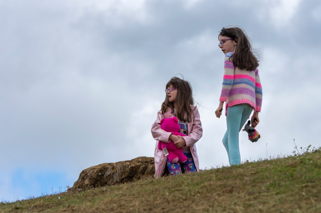
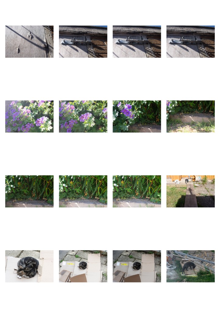
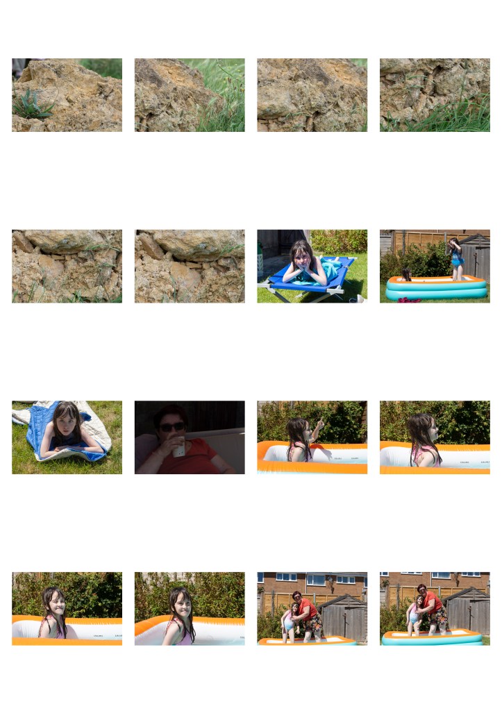
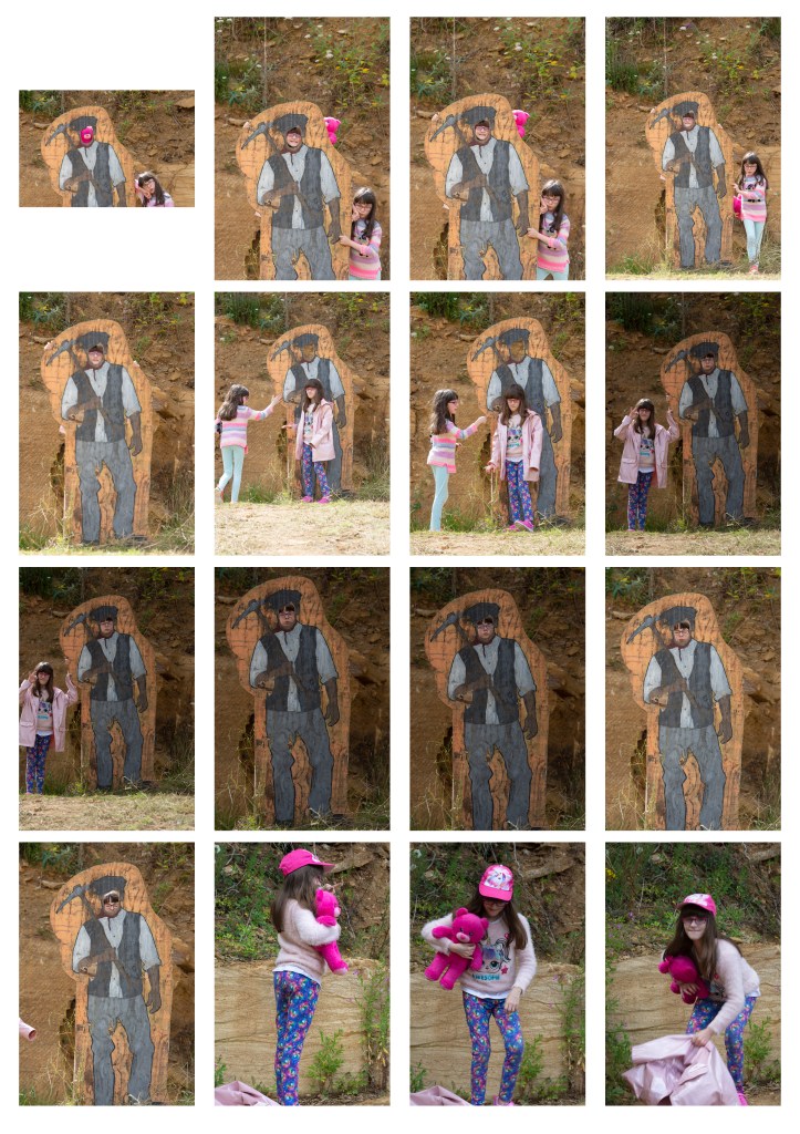
I used Sally Mann as my inspiration, particularly her use of her family as the subject for her photographs. The two sets of images below were taken a couple of days apart.
The first set up photos were taken mid-afternoon. The sky was patchy cloud and so the light was changing from diffuse because clouds were blocking the sun, to full sunlight.
Jess, Ham Hill, 2020, f/5, 1/640sec. ISO-200, Nikon D7200 92mm
The light in the image about is soft, diffused through the passing clouds. The lack of bright light gives it a darker appearance. It also means that it was easier to capture my niece as the sun was not in her eyes. At the point I took the photograph the sun would have been behind her but wasn’t been reflected by the phone screen into her eyes, which might have made her squint.
Jess & Charlotte, Ham Hill, 2020, f/5, 1/1250sec. ISO-200, Nikon D7200 150mm
In the image above the clouds act as a background as well as diffusing the light. The clouds as a background also avoids what would have been a very harsh blue background. The result is that the girls stand out.
The photograph was taken from a low level using a 200mm lens and has been cropped from the original.
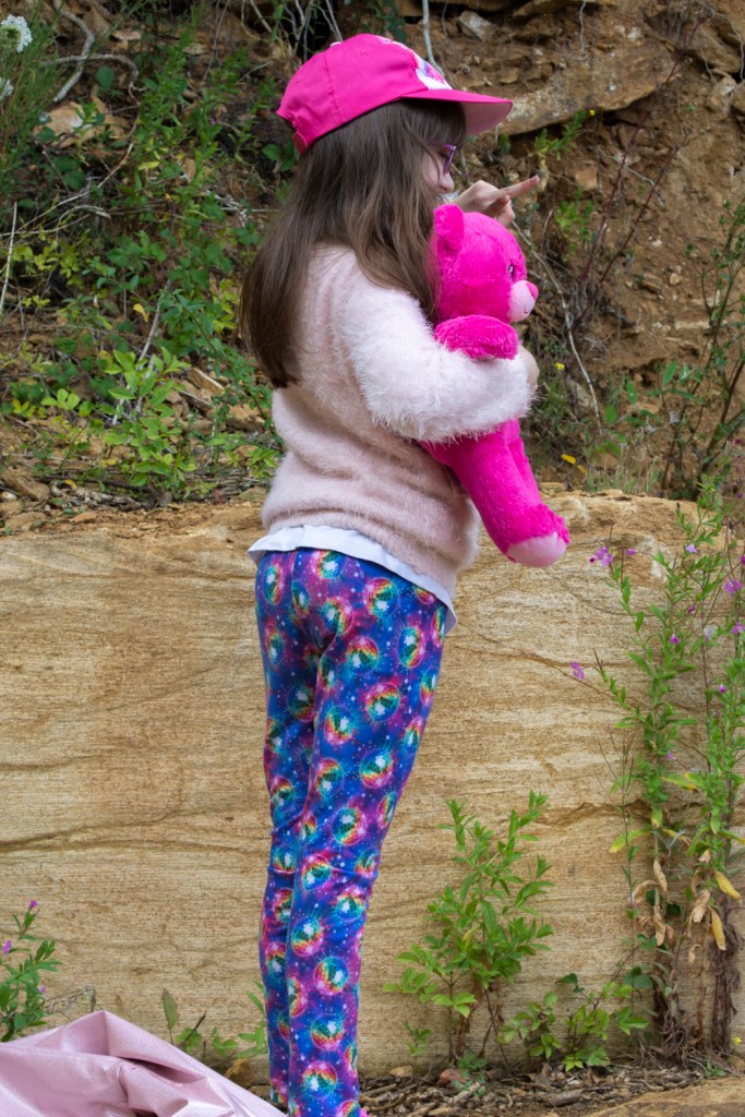
Jess not happy, Ham Hill, 2020, f/5, 1/500sec. ISO-200, Nikon D7200 120mm
Jess & Pinky, Ham Hill, f/10, 1/100sec. ISO-200, Nikon D7200 78mm
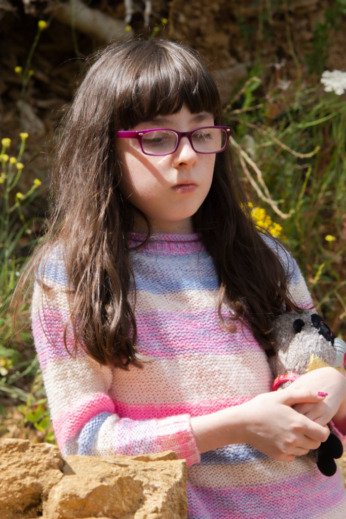
Charlotte lost in thought, Ham Hill, f/10, 1/200sec. ISO-200, Nikon D7200 145mm
In the above photograph of Charlotte I believe I’ve managed to achieve an example of broad lighting.
The set of images below were taken mid afternoon on a sunny, hot day. There were no clouds in the sky and so the only shade was what was provided by the garage wall that runs along the garden and the house itself.
The light was quite harsh because there were no clouds to diffuse the light and it was high in the sky.
The shadows produced by the girls body positions helps to counteract the light hitting them.
Charlotte, drying off, Home f/10, 1/250sec. ISO-200, Nikon D7200 55mm
In the above photograph of Charlotte I believe I’ve managed to achieve an example of short lighting.
Charlotte, Lying on grass, Home f/10, 1/320sec. ISO-200, Nikon D7200 55mm
Jess, LoL, Home f/10, 1/500sec. ISO-200, Nikon D7200 55mm
Using Sally Mann as my inspiration I think the subject matter is about the only thing that comes close to the work that she produced. I’ve used my nieces as the subject matter and have photographed them either at home or very close to home. Mann’s images are black and white mine are colour. The most important difference though is to do with the quality of the light. Mann talks about how the light where she lives is warmer than the light further north. In the UK we are further north and as a result, the light is colder. In addition to that I think that it can be more intense and because of where we live, changeable and so challenging to work with. More so even that where the weather, and therefore the light, can be more consistent.
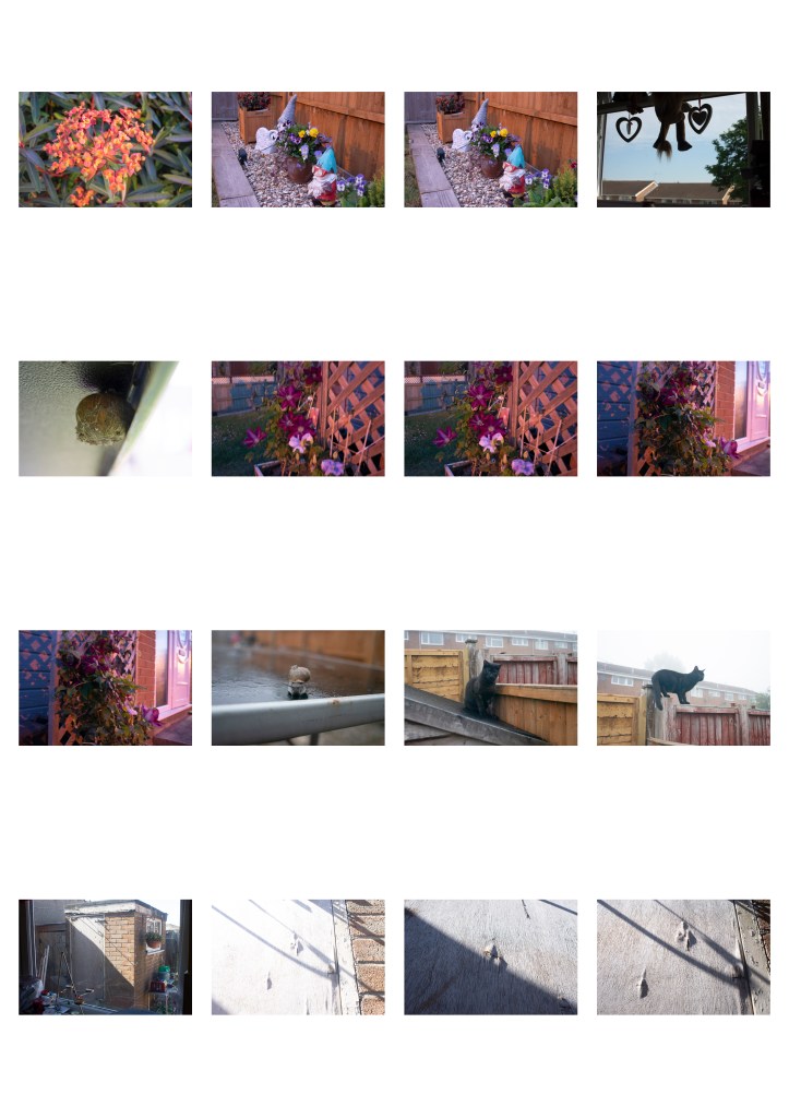
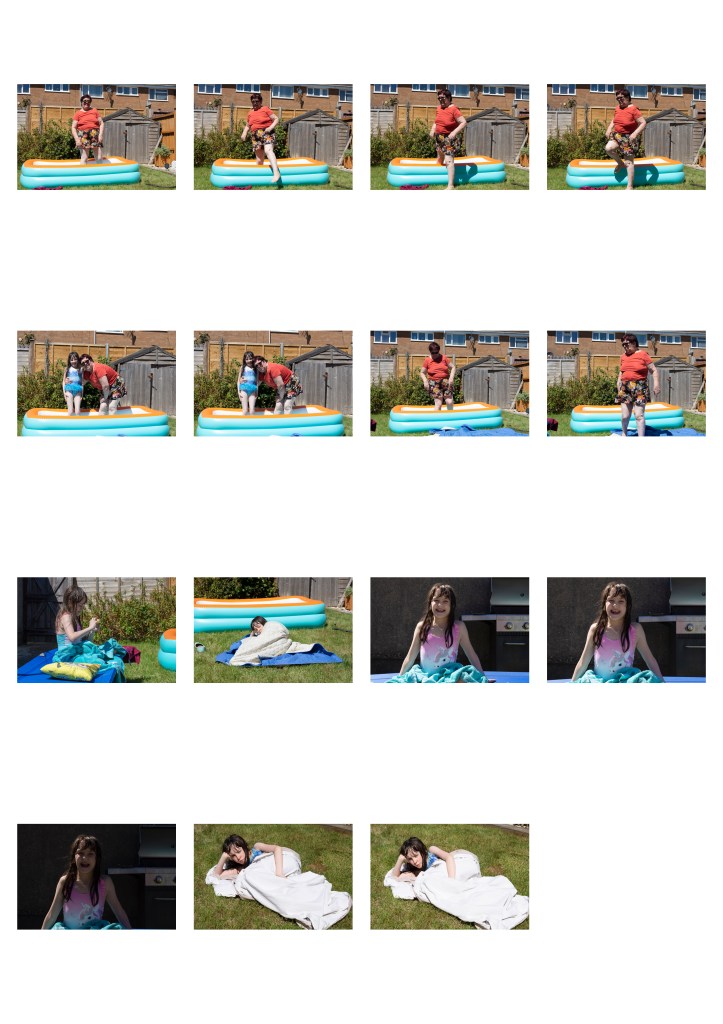
The images below were captured over a period of weeks and at different times of the day. They show the differences between light at different times of the day.
The above was taken just after sunrise during the Golden Hour.
Another image captured during the Golden Hour. The red tinge to the light that occurs during the Golden Hour can be clearly seen on the door, brickwork and where it passes through the trellis.
Another image captured around dawn. However, this time the light is completely different. This image was taken four days and half an hour later that the previous image and shows how even such a small time frame can see the sun rise early enough that the Golden Hour can be missed and the quality of the light changes completely.
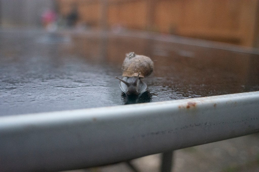
This chap paid regular visits to our garden table early in the morning over a few days. They’d made their home underneath the table as I discovered when looking under there one day. I like the reflection in the table surface and the glint of light reflecting off the water coating its surface.
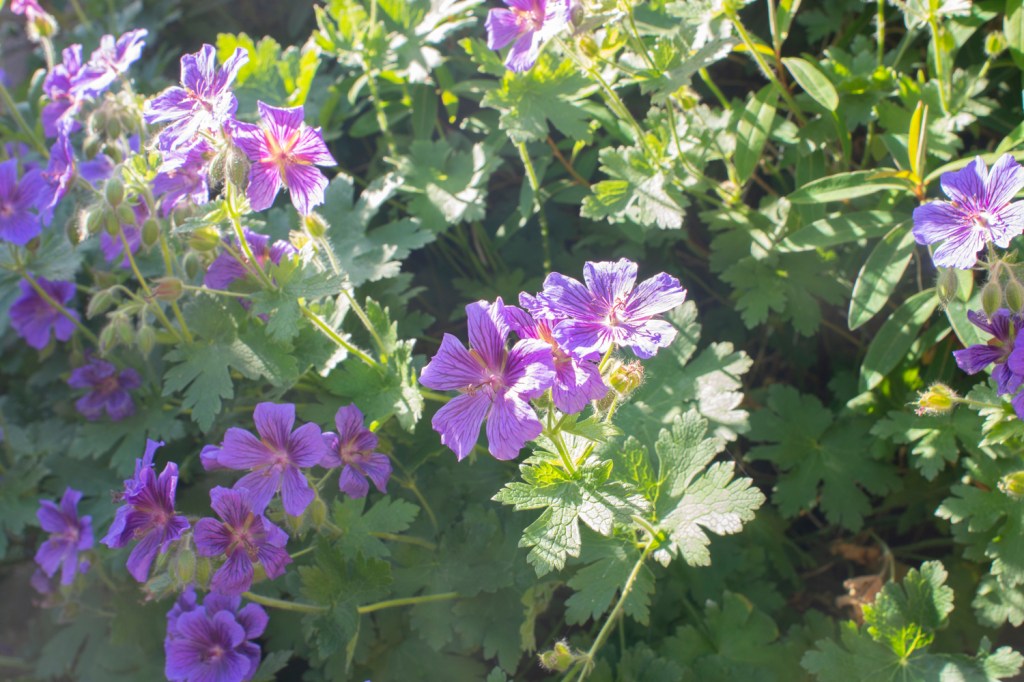
The last set of images above were taken early evening with the sun behind and to one side of me. The first image is in full sunlight and so a lot of the colour in the floors has been bleached out by the light. In the second image I shifted position so that the flowers were shaded which allowed some of the colour to return because the light wasn’t as intense.
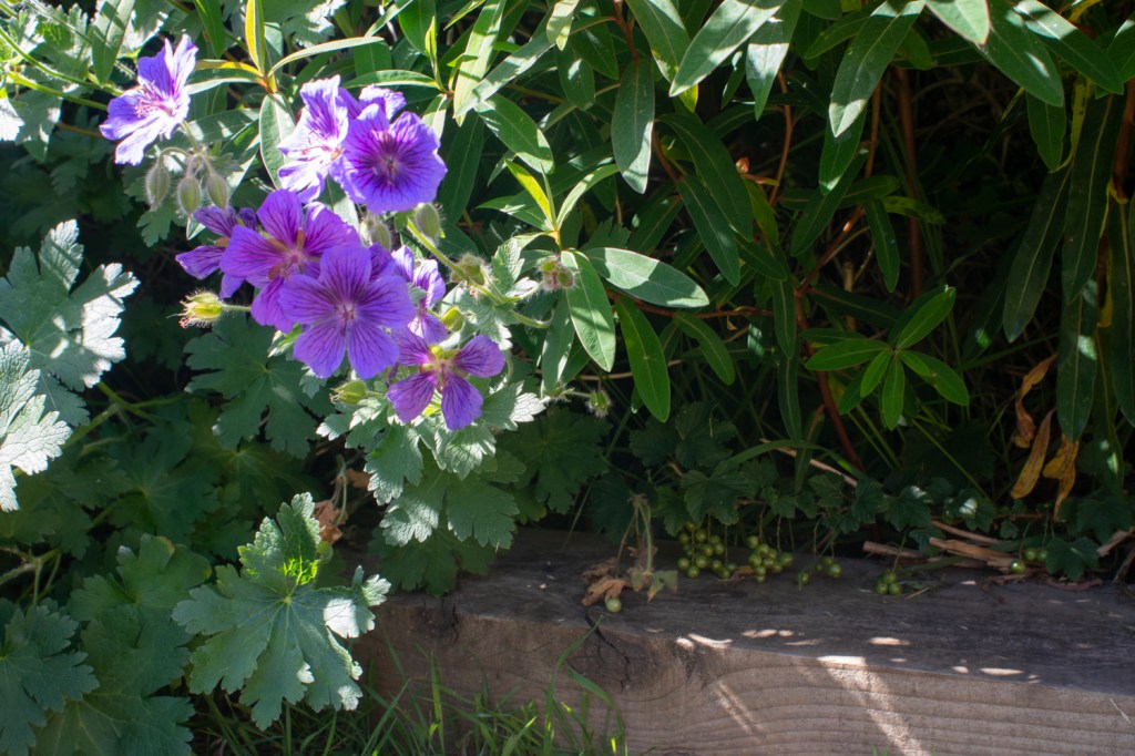
In the final image I decided to try and use as much of the shade from the foliage as possible. The glints of light on the grapes is reminiscent of the catch points that can occur when light is reflected in a person’s eyes and draws attention to them amongst the rest of the foliage.
Contact Sheets
For this exercise I took over 160 photographs, experimenting with different objects and trying to capture images in different light conditions.
In the images of the shed door I wanted to capture the way that when light hit raised sections on the surface of the door it would result in shadows. The brighter the light, the less of the texture of the door’s surface was visible. Less is more in this case.
I moved away from this idea as the exercise and my research took shape as I didn’t see that it would be a sufficiently strong enough set of images in itself. Maybe if I took the photographs at different times of the day and under different conditions it might produce something stronger.