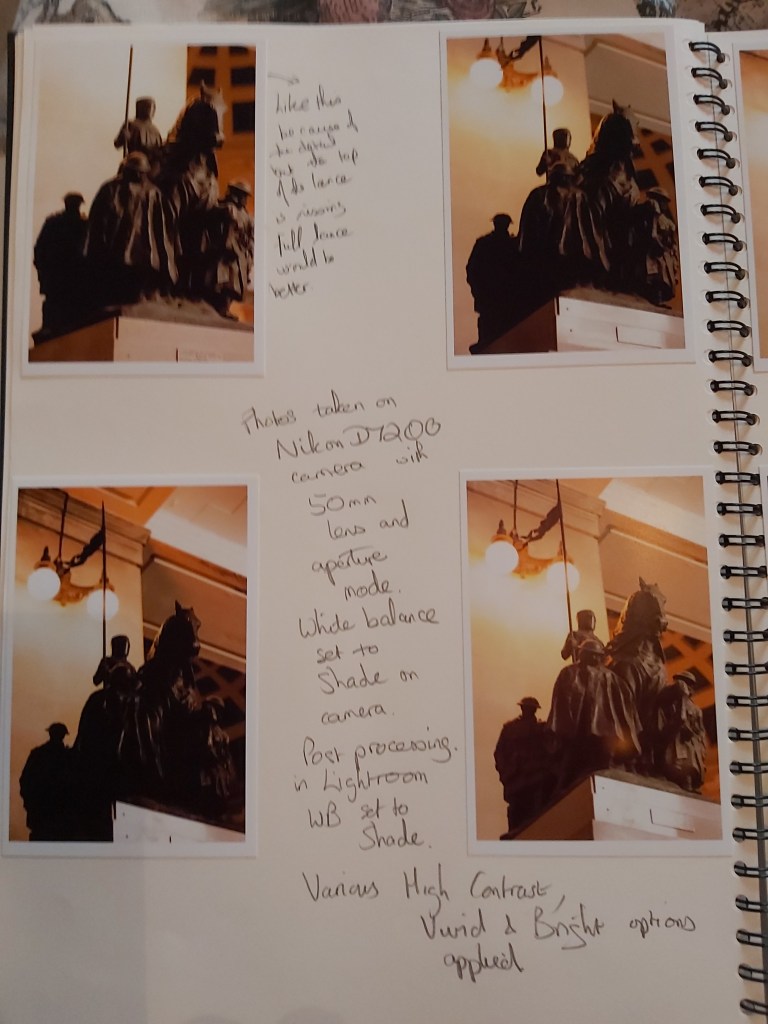
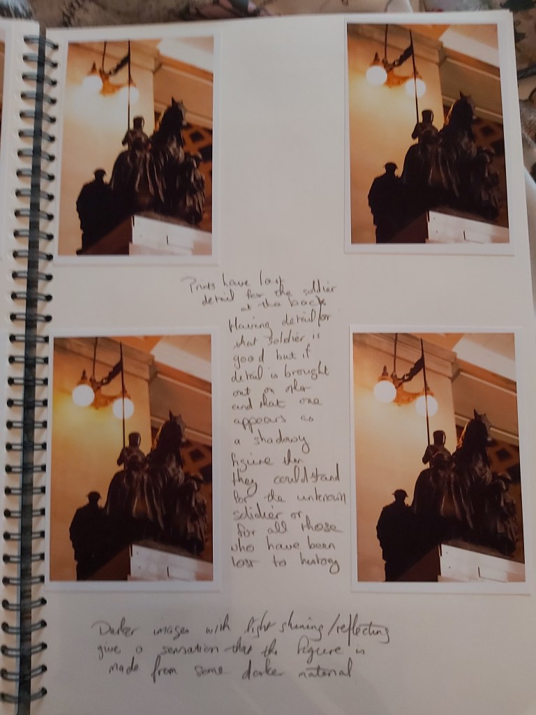
The brief for this exercise is, using slow shutter speeds, multiple exposures or another technique inspired by the research done for A Durational Space, to try and record the trace of movement within the frame.
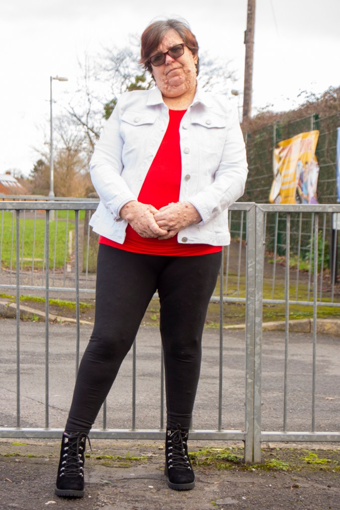
For this exercise I used the camera on my phone and an application called Slit Scan Camera developed by Jan Rychtář.
The shooting process for all of the images below was to select how wide the slit was in pixels, the application allows slits from 1 to 10 pixels in width. The application does not allow you to zoom in on a subject, so you must move to get your subject as you want it.
If you are holding the camera in your hand then, unless you have a very steady hand the resultant image will pick up any movement of your hands, especially when using smaller slit widths. Using a stand or tripod to rest the camera on would give a steadier image.
The above is my wife turning in place while the camera was capturing her image using a slit width of approximately 2 pixels.
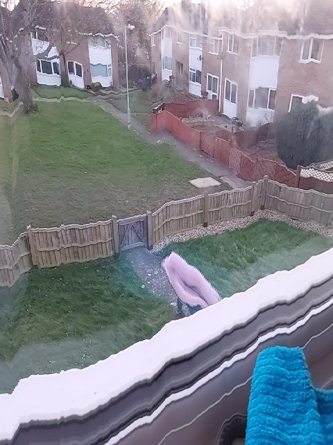
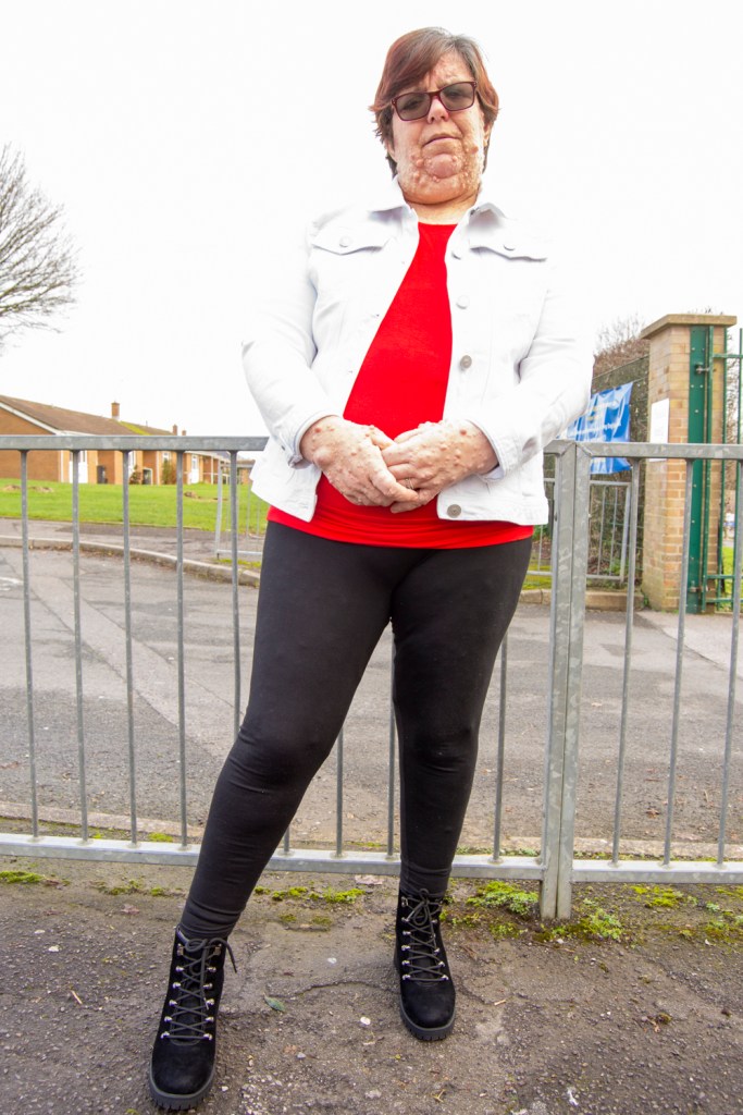
The above was taken from an upstairs window as my wife was coming home from work. I particularly like the misty look to the top and sides of the image.
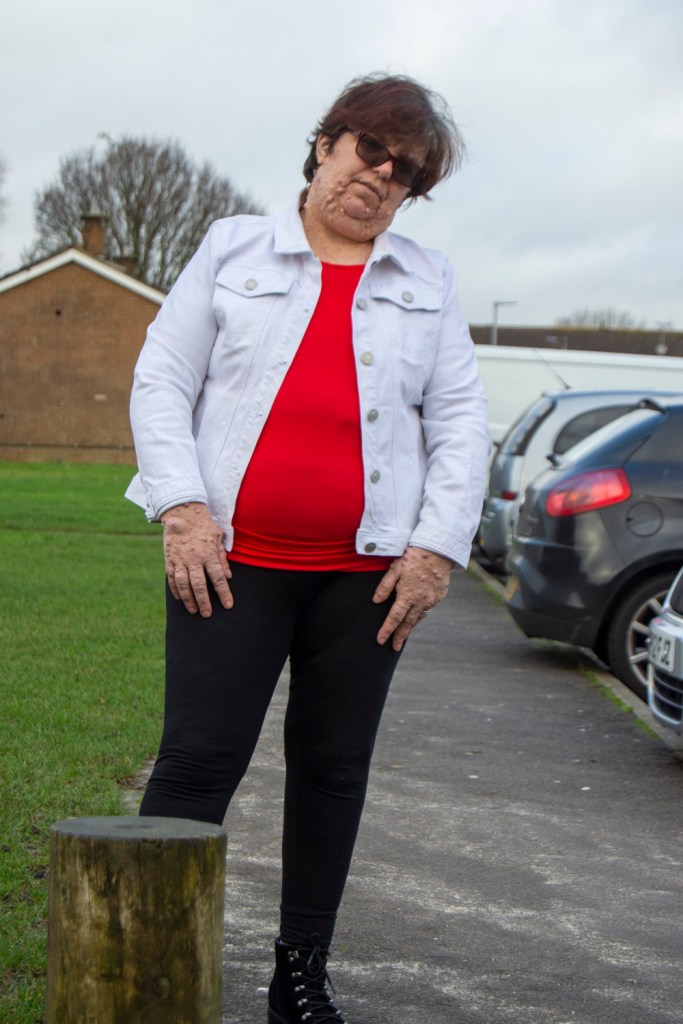
The image above was taken while walking from my car to the house one evening. I decided to see what would happen if, rather than standing still, you captured something while walking forward. I feel that there is something haunting about the image, almost like you have captured an apparition.
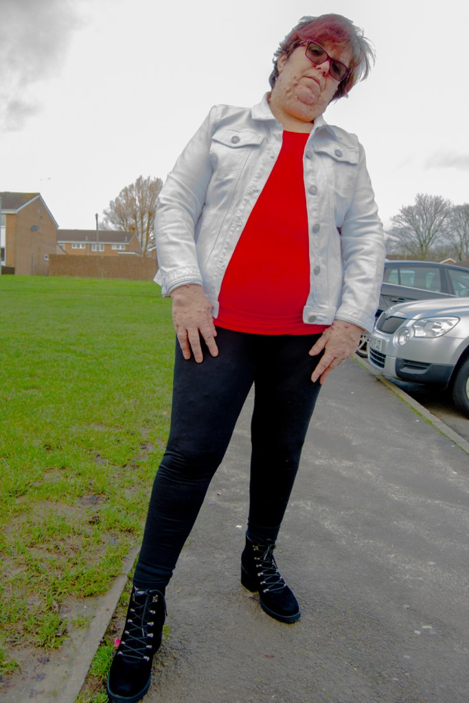
Another image captured while walking forwards, this time approaching my house. The jagged orange object reminds me of a carved Halloween pumpkin.
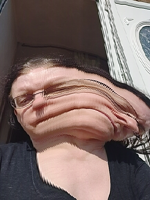
The images above were taken to see what effects could be achieved simply by moving the head from side to side. Very much a different type of selfie.
Finally, I wanted to try and replicate and image I tried some time ago where the subject was looking in two different directions. I achieved the above by starting the Slit Scan application capturing the image and at the point it was halfway through the image capture, turned my head 180 degrees.
Recording movement in an image is challenging but there are many ways to do it. Focussing on a moving object and panning with it as it moves before triggering the shutter, slowing shutter speeds, all of these have their own uses depending on the result that the photographer is aiming to achieve. However, some methods are more appropriate than others.
Blurring movement completely might be useful in some situations but in others, for instance motor sports would not be appropriate, however, panning would be if you wanted to have the vehicle in focus. Using a slower shutter speed would be appropriate if you wanted to show the background clearly but have the vehicle a blur of motion through the image. As with any image, it is what you are aiming to achieve that influences how you capture it.
Using fast shutter speeds, try to isolate a frozen moment of time in a moving subject. Depending on the available light you may have to select a high ISO to avoid visible blur in the photograph. Add a selection of shots, together with the relevant shooting data and a description of process (how you captured the images).
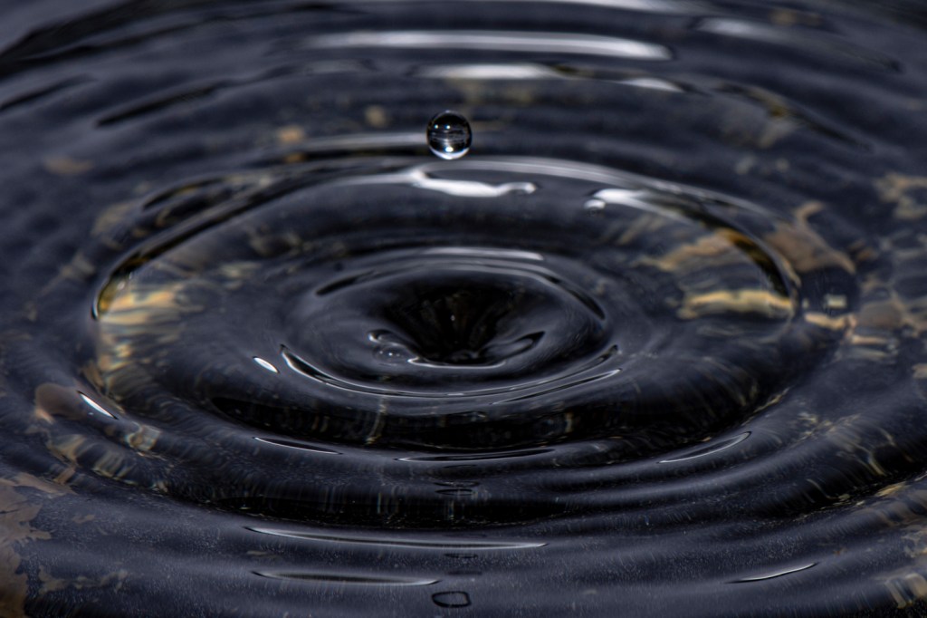
Water
This was my first attempt at capturing droplets hitting water.
Milk
For my second attempt, I used milk rather than water.
The setup was like my first experiments. A rectangular, plastic container to hold the liquid I would be releasing droplets into, in this case milk. A turkey baster attached to the body of an enlarger which would release the droplets. The camera was set up on a tripod directly in front of the container with a flash attached via a remote trigger. A second flash was placed almost 90 degrees to the left of this with the flash aimed so that it would bounce off a piece of white card placed directly in front of the camera but behind the container.
An 85mm lens was attached to the camera and manually focussed on the area where them drops would land. Shutter speed was set to 1/250 second.
The camera was set to burst mode so that several shots would be captured each time the camera was manually triggered. As it would not be possible to guarantee the result triggering the camera manually with for a single shot, multiple shots seemed the best way to capture something.
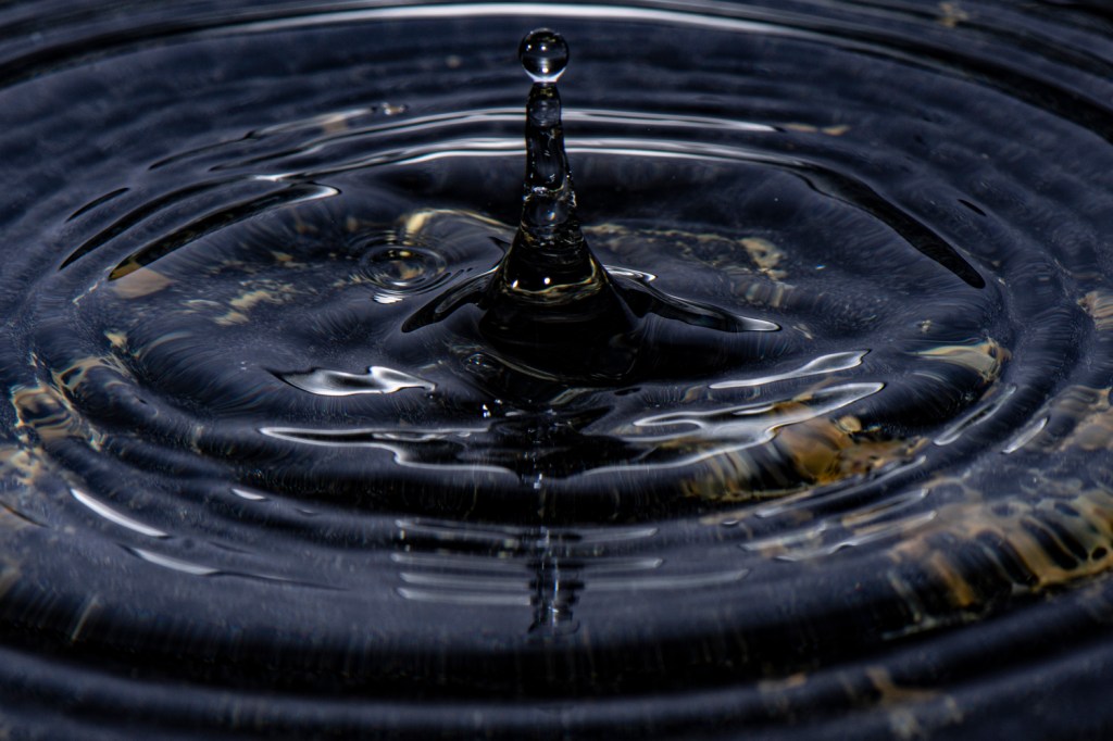
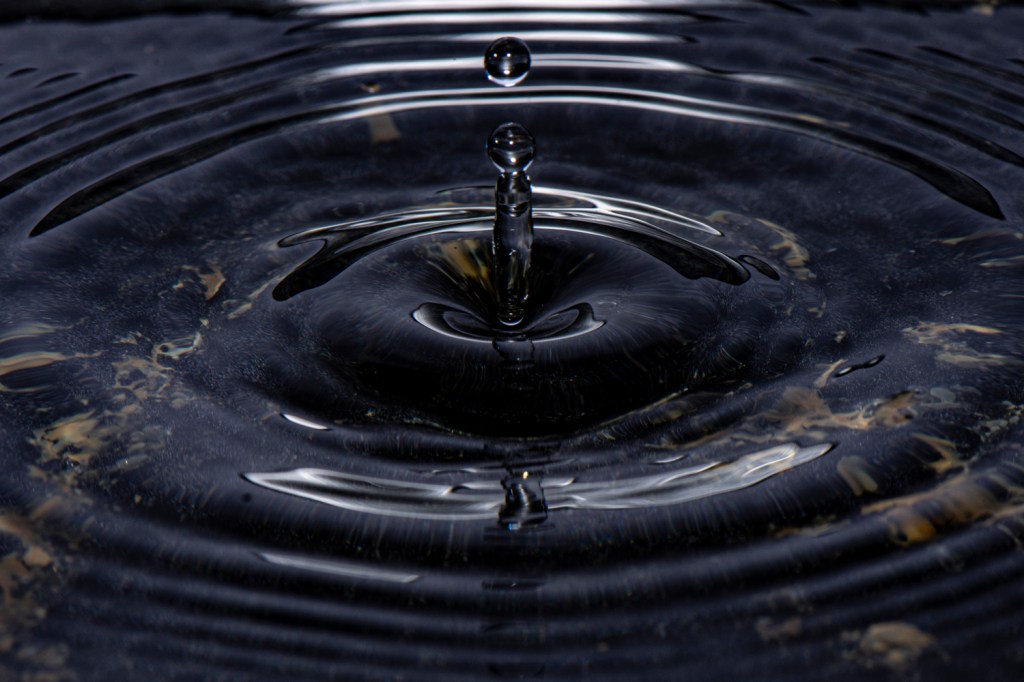
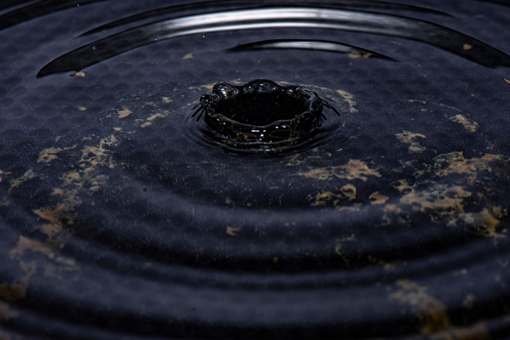
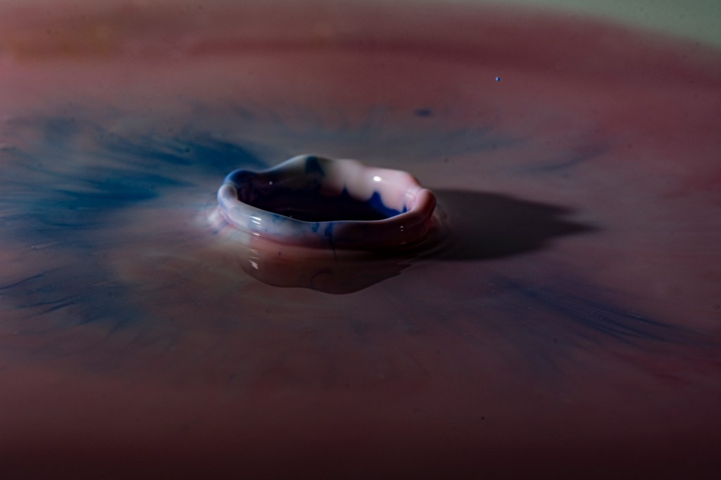
The first few images were checking out the setup using water while releasing droplets of milk from a turkey baster. Of these very few of the images were noteworthy. The exception being the ones below where I captured the crater formed when the droplet hit the water, and a crown was beginning to form.
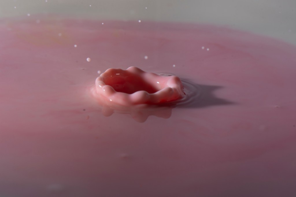
With everything set up the container was emptied and refilled with full fat milk. Focussing was then rechecked, and milk used to recheck positioning of the drops.
Reviewing the images captured at this point, there were no interesting ones, with the majority showing the after effect of the drop with just ripples and the liquid setting back.
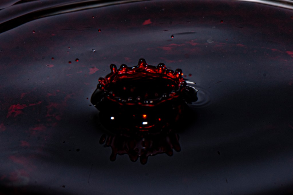
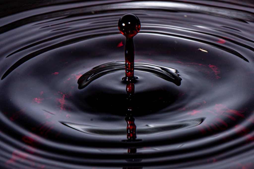
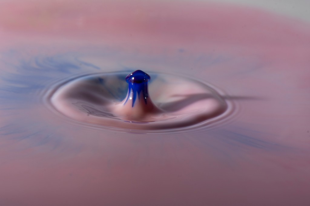
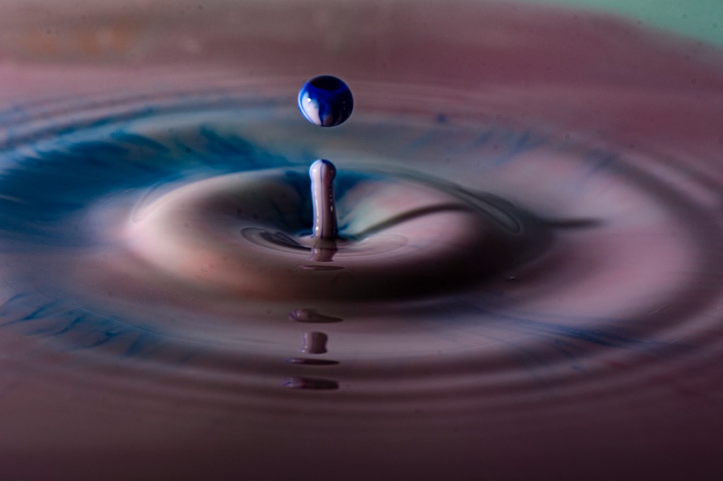
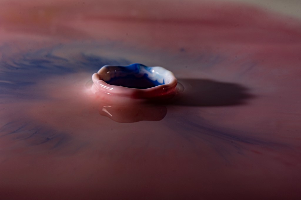
Changing from milk to drops of food colouring produced much better results. Of the 80 photos that made it through weeding out images that were not in focus or did not show any, or very little result of the droplet, the following were the most interesting.
The food colouring was changing from red, to yellow, to blue, throughout the activity.
Images have been adjusted in Lightroom to increase the Dehaze, Clarity and Texture options.
Reflection
This exercise highlighted just how lucky we must be sometimes to capture an image. Some of the greatest images captured were because the photographer was in the right place, at the right time, and in some cases were so experienced and aware of what would make a great image that they stopped there and then to take the photo.
The exercise also highlighted how; some images can be controversial because they appear too good to be true.
For instance, Robert Capa’s image of a Loyalist Soldier in the Spanish Civil War was originally taken for what it was, an example of a photograph being taken at the perfect moment.
Loyalist Militiaman at the Moment of Death, Robert Capa
Since 1975, however, there has been discussions about its authenticity. Capa said that the photo was taken at the Battle of Cerro Muriano, but subsequent research has suggested that the photograph was taken 30 miles away at Espejo, far from the battlefront. Part of the doubt about the photograph’s authenticity is due to the restrictions on photographers’ movements. Unlike subsequent wars journalists and photographers were limited in their access to active frontlines.
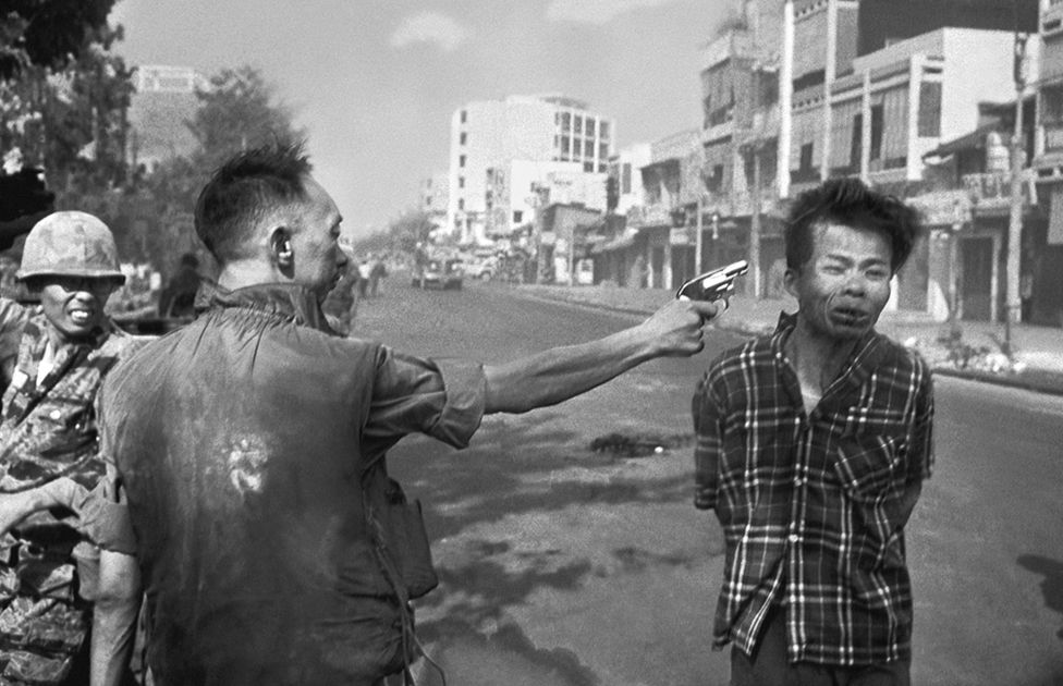
During the Vietnam War, photographer Eddie Adams, was able to capture the exact moment when Viet Cong prisoner Nguyễn Văn Lém was executed by General Nguyen Ngoc Loan.
The image was to affect both Adams and the General. An article on the BBC News website describes what happened in the years afterwards.
Nguyen Ngoc Loan left South Vietnam at the end of the war and moved to the United States of America. Settling there he opened a restaurant but after his past was discovered he was forced into retirement because of the impact on his business.
In 1998, Loan died of cancer, following which Eddie Adams wrote:
“Two people died in that photograph. The general killed the Viet Cong; I killed the general with my camera.”
Eadweard Muybridge (born Edward James Muggeridge) was a 19th century English American photographer who was a pioneer in the study of motion using photography.
Although originally a landscape and architectural photographer, he is remembered for his study of horses trotting and galloping, the result of being hired by Leland Stanford, a former Californian governor to prove whether all four of a horse’s hooves were off the ground at the same time while trotting.
Later in his career Muybridge would study motion in other animals and humans.
His initial work was performed using a series of cameras, lined up which were triggered initially by a thread that the horse broke as it moved along in front of the cameras, and later by a clockwork mechanism.
Muybridge’s life was not free from controversary.
When a book was written analysing the result of the experiments with horse motion by a friend of Stanford’s, Muybridge was not credited and as a result funding by the Royal Society of Arts was withdrawn and a paper he had written rejected with the accusation of plagiarism.
In 1872, Eadweard Muybridge confronted and shot a man who he believed to have fathered his wife’s 7-month-old son. Muybridge was eventually acquitted on the grounds of justifiable homicide.
Like Edgerton’s work (see below), Muybridge’s work was technically advanced. Banks of cameras needed to be triggered at the exact right moment in order to capture an animal’s motion. Photography was demonstrating that it was very good for capturing those moments which the eye was not good enough or quick enough to capture.
Images like these must have been useful to those arguing that photography was not art but just a way to record events more quickly and accurately than had been available up to that time.
In order to achieve everything that he did in his lifetime, Muybridge had to improve the chemicals that allowed developed film, improve shutter speeds and find ways to capture multiple images of a subject as it moved.
Like Edgerton after him, see below, Muybridge helped to advance the technology and techniques that allowed photographers to freeze or slow time enough that we can capture those things that are to swift to see.
AM Worthington
Arthur Mason Worthington was a physicist who taught at Clifton College in Bristol and the Royal Naval Engineering College in Devonport.
His work on fluid dynamics and, particularly, the study of splashes was instrumental in the development of high-speed photography.
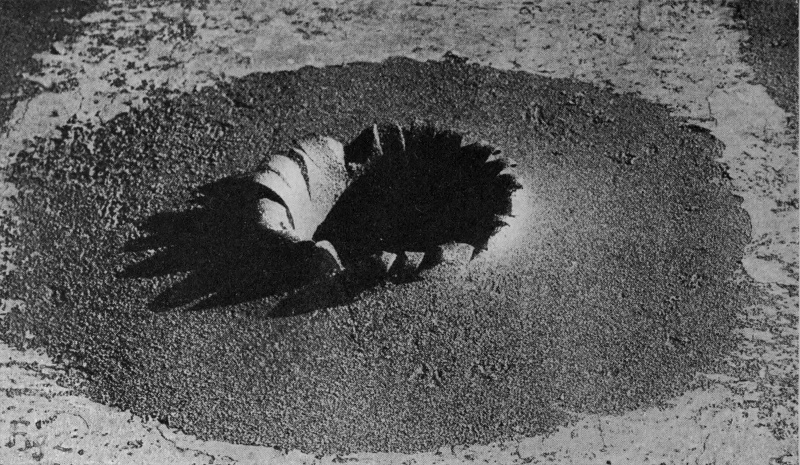
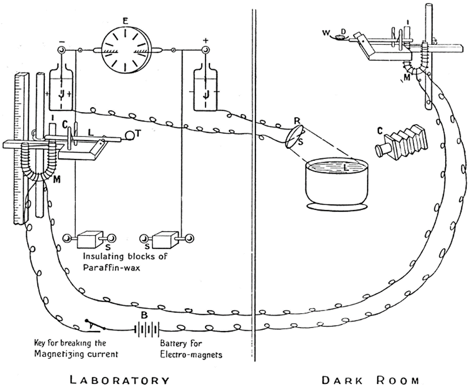
In A Study of Splashes (1908) Worthington details the results of studying items falling into liquids and the splash that resulted. The book contains several series of images captured using a complex setup, including a means of generating a spark to illuminate the splash.
At the start of the book there are two images of “permanent” splashes which are the result of a projectile piercing armour-plate.
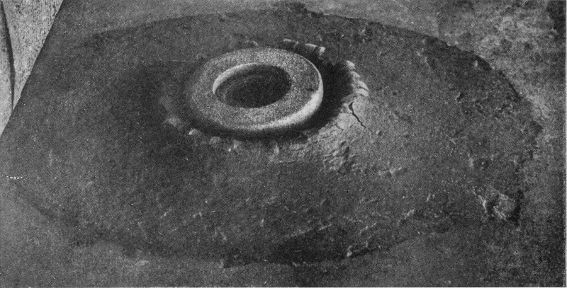
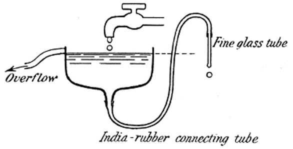
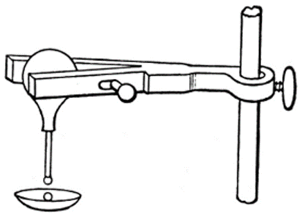
The process of capturing the splashes started with producing a drop of liquid that was to be release from height into the liquid from which the splash would result. The diagrams below show two of the mechanisms that were used to ensure a suitable droplet was produced.
The set up is quite complex and requires careful calibration, especially of the height of the “timing sphere”, a metal sphere which, when dropped will allow a spark to jump between the two magnesium terminals.
Key to diagram:
E is the electrical machine.
J are the Leyden jars whose inner coats are connected to the sparking knobs S.
L is the lever for releasing the timing sphere T.
C is the catapult.
I is the light strip of iron held down by the electro-magnet M.
D is the drop resting on the smoked watch-glass W.
M is the electro-magnet holding down the lever against the action of the catapult, by means of the thin strip of iron I.
C is the camera directed towards the liquid L into which the drop will fall.
S is the spark-gap between magnesium terminals connected to the outer coats of the Leyden jars.
R is the concave mirror.
The images that Worthington captured are remarkable considering when they were made and the technology that was available. Although today we would use similar set ups to release the droplets, triggering the camera and providing a flash to illuminate the splash is a lot simpler with the availability of remote flash triggers and battery powered flashes.
What for Worthington would have been a complex endeavour, and something that rightly deserved the publicity it received, including a Fellowship of the Royal Society, is something that any of us can replicate at home.
Harold Edgerton
Delving into the work of Harold Edgerton was fascinating because aspects of his life resonated with my own.
Edgerton was born on the 6th April 1903. I was born on the 6th April, but over 60 years later.
Edgerton was involved with the development of sonar. I spent 5 years of my career developing software for a sonar system.
Edgerton developed equipment that was used by Jacques Cousteau. I learned to scuba dive while studying at Polytechnic and grew up watching Cousteau’s exploits around the world on television.
Looking through the Edgerton Digital Collection (Harold ‘Doc’ Edgerton (s.d)) reveals a lot of information about Harold Edgerton. It also includes numerous examples of his attempts to freeze motion. The site contains many iconic images.
For some reason the sites owners decided to provide the facility for members of the public to add tags to the images. Some of these are insightful, while others are complete gibberish, or show the maturity of some of the people that have visited the site.
For instance, one of the tags that has been applied to the image of a soap bubble being penetrated by a bullet is “living planet”. This tag is very appropriate because the bubble is reminiscent of images captured from space of the Earth while it is shrouded by night. Lights from towns and cities pouring upwards into the sky. The bullet could be a spacecraft orbiting the planet.
Edgerton’s work developing the stroboscope and his photographs give us an insight into what happens in those fractions of a second that we can’t observe with the human eye. His work as an engineer and applying these techniques when looking at machines give us tools; we can use to study them in the present days. For instance, Edgerton’s work with rotating fan blades and the high-speed images he captured of air flow is something that modern vehicle designers use in wind tunnels to study the flow of air around objects.
Without the work of Edgerton, and people like him, some of the images we take for granted today would not be possible.
Edgerton’s work, also demonstrates that, the development of photography was a major step in the development of human society because of the ways it allows us to study and document the world around us, something that we wouldn’t be able to do if we had to rely on the human eye alone.
This image could symbolise the end of the world, with its inhabitants leaving just as the shockwave from a dying sun reaches the planet.
Although there is a scientific basis to Edgerton’s images, they still allow the human brain to manipulate what the eyes behold and interpret it in ways that are more creative and artistic.
Of all the images that are accessible through the Digital Collection, it is the “Milk Coronet” and similar that are the easiest to reproduce by a modern photographer, without the need for highly specialised equipment or permits for firearms.
DiCorcia’s Heads is Street Photography on steroids, or at least that is what it appears to be when you see the images.
Each of the images has the feel that it was taken at night because of the dark backgrounds. How could the subjects in these images not have noticed a flash going off?
In describing Heads #10. 2002, MOMA adds the fact that the images were taken in daylight to the description provided by the artist in the video, Philip-Lorca DiCorcia – Exposed at Tate Modern (s.d.) of how he captured the images.
Head #10, Philip-Lorca diCorcia
Over the years there has been debate about the rights and wrongs of photographing people without their knowledge or their permission.
Walker Evans used a camera hidden inside his coat in order to photograph members of the public using the New York Subway in the late 30s, early 40s. A risky endeavour when you aren’t able to get away from any situation that might arise because someone takes offence to you taking their photo.
Walker Evans, Subway Portraits
Taking photos on public property is not against the law in a lot of countries so DiCorcia’s capturing people’s images although not illegal does open question of whether it is morally right. In the video clip DiCorcia, himself, says that he wouldn’t appreciate someone taking his photograph without his permission but goes ahead and takes other people’s without theirs.
Gefter, Philip (2006) discusses the lawsuit against Philip-Lorca DiCorcia and the implications that a verdict in favour of the plaintiff would have had on both future and past Street Photography.
CCTV cameras, people taking photographs with cameras or on their phones as you happen to be walking by, car dashcams, bodycams, Google StreetView cars, even satellites; we live in a world where our images are captured daily without us knowing it. In few of these examples do we have any right to have our image removed or censored.
Common sense does need to come into any decision to photograph people without their knowledge, or even with their knowledge if they are likely to object violently. If you intend to publish photographs publicly then you need to think about who your subject is and the location where you are taking photographs.
Some people in society are more vulnerable than others, for instance children. It is entirely possible that a child in your image might be in danger from someone, an estranged family member for instance if it was possible to identify their location.
Someone going in or out of a LGBTQ+ venue may end up in difficulty if they are not out to family and friends but are then identified from an image.
Then there is the question of whether you would want someone to take your image or not. If you don’t want someone taking your photo without your knowledge, then you must think hard about why it is OK for you to take other people’s.
Taking photos of people when they aren’t aware of what you are doing, is something I like. I find that, particularly with people I know, it allows me to capture more of the essence of the person. These images can be very powerful, they can also leave the subject vulnerable. I have photos of friends which they don’t like but which I love because the person I know comes through, and not just what they want to show to the world. DiCorcia’s doesn’t have the same level of vulnerability in his images because of the lack of interaction between him and his subjects, but there is still a vulnerability in the images because his subjects weren’t aware their photo was being taken and so may have been letting their guard down in ways they didn’t realise.
Water Drop Photography
There are plenty of examples of water drop photography online. SplashArt have an introduction to their water drop equipment which shows some of the equipment that they supply for photographers who want to explore this area of photography.
The Comprehensive Water Drop Photography Guide – DIY Photography (s.d.) is a detailed guide to which I found very useful when looking at exercise 3.1. The guide covers all the areas you need to consider; equipment, lighting, liquids, colours, focussing and editing.
Copyright diyphotography.net
Final Thoughts
One of the things that the work of Muybridge, Worthington and Edgerton has highlighted for me is that photography has been, and always will be, influenced by the technology that we have available.
Without the ability to capture images quickly, we would not be able to freeze motion. The development of faster shutter speeds, better film development chemicals, flashes and lenses we would not have images such as the ones produced by this trio of photographers. Photography and technology will always go hand in hand as we continue to explore the world and universe around us, but no matter how advanced the technology gets, there will always be the need for human creativity as well as our curiosity as a species when it comes to the images that we capture and how we see them.
On a rainy day in November I went to the National Museum in Wales with my wife, sister and twin neices. The museum were exhibiting Dippy the Dinosaur as part of it’s nationwide tour. We had seen Dippy before in Dorchester but I knew that the twins would love to see it again. On top of that we had the rest of the museum to explore.
Personally I had an ulterior motive which was to see some of the photography exhibitions that were on at the time, in particular the Becher’s exhibition.
I’ve pulled out what, for me, were some of the key parts of the day.
Paintings
After we’d visited the ground floor of the museum and having a break for refreshments we started on the first floor. The museum is quite large and I would have needed a couple more hours to do it justice. However, we did manage to see quite a bit.
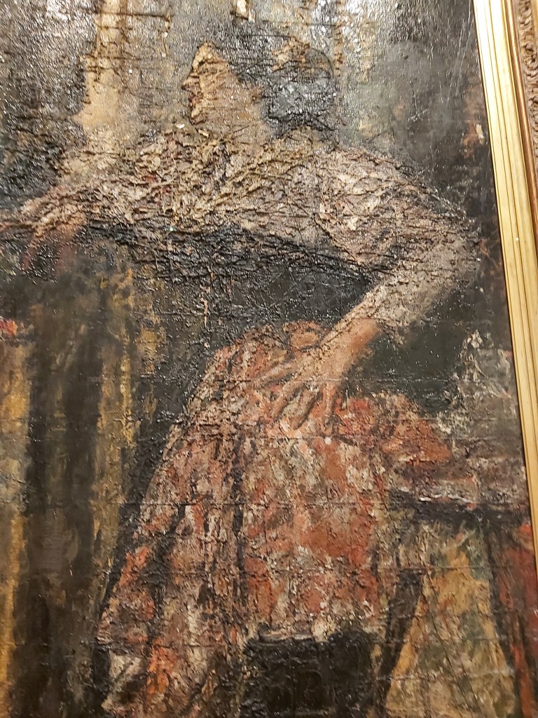
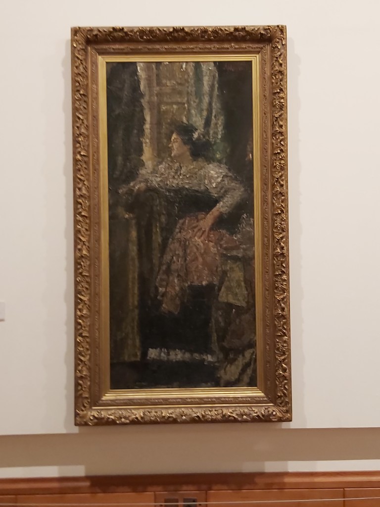
I found this an interesting painting. From a distance it is easy to make out what the subject matter is. However, as you move in closer to the painting it becomes much harder to make out details. Painfully so I found. This is definitely a painting that is intended to be seen from afar, maybe symbolising that girl is to be seen from a distance and not approached.
The other interesting feature of this painting that you can see clearly in the image above is the grid lines. Mancini’s technique was to use a grid when painting. This grid matched one that was placed in front of the person that was sitting for the painting. As a result the remains of the grid lines can be seen when you look closely at the painting.
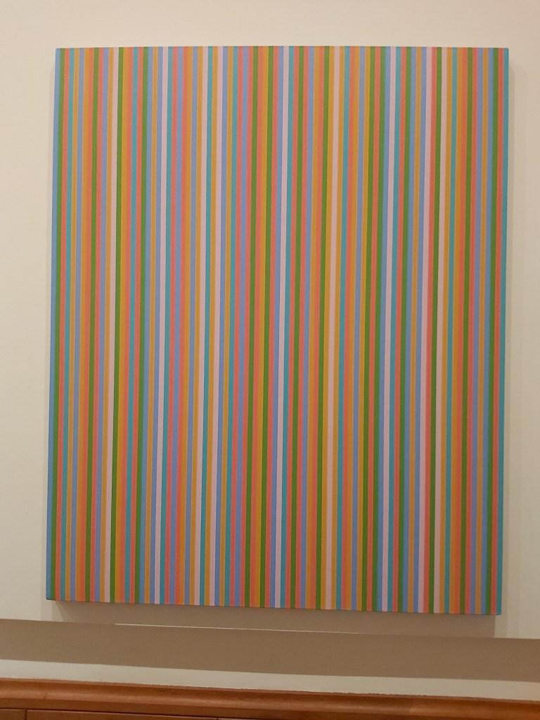
Kashan – Bridget Riley (1931-)
Kashan is an artwork that reminds me of the seeing eye pictures that were popular several years ago. If you looked at the picture in a certain way you saw an image form.
With Kashan I found that depending on where I stood in relation to the artwork, the lines had a rolling, moving effect. Something quite fascinating from something that is, effectively, a series of vertical lines.
Parr in Wales
Martin Parr’s exhibition entitled Parr in Wales brought back memories of childhood memories of holidays in Barry Island and Porthcawl. Hundreds of people sitting and lying on sandy beaches enjoying the summer son during the factory fortnight holidays.
The exhibition features a number of photographs that take Wales and it’s people and locations as it’s theme.
There is a book Martin Parr in Wales that ties in with the exhibition.
The exhibition contains a number of images, of which I just want to look at a couple.
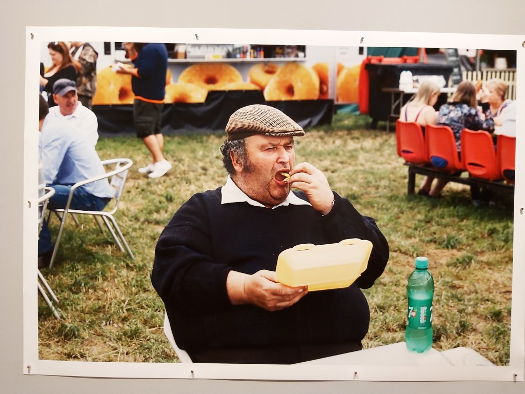
Pembrokeshire Show, 2016
My reason for highlighting this image is that it was one that you could not ignore. Positioned across the room from the entrance to the exhibition, this had to be the largest photograph on display in the whole space. It was also an image that kept bringing your attention back to it as you wandered through the exhibition space.
A second photograph that I wanted to look at briefly is of three miners showering after a shift in the Tower Colliery mine. The reason for chosing this image is that it is quite explicit with regards to it’s content. It is also quite an intimate image, showing a group of miners in what would normally be a private moment. There is no sense of embarassment from any of the participants with regards to being photographed. If anything they are ignoring the camer and photographer and getting on with a task that they likely do at the end of every shift.
Although I do find the direction of the gaze of the left most figure interesting, which I think adds a new dimension to my viewing of the image.
The main reason that I selected this image is, that with two 10 year old girls in tow, there was a “lets move on shall we” moment when we saw it for the first time. Something that didn’t quite happen as the twins were drawn back to it two or three times.
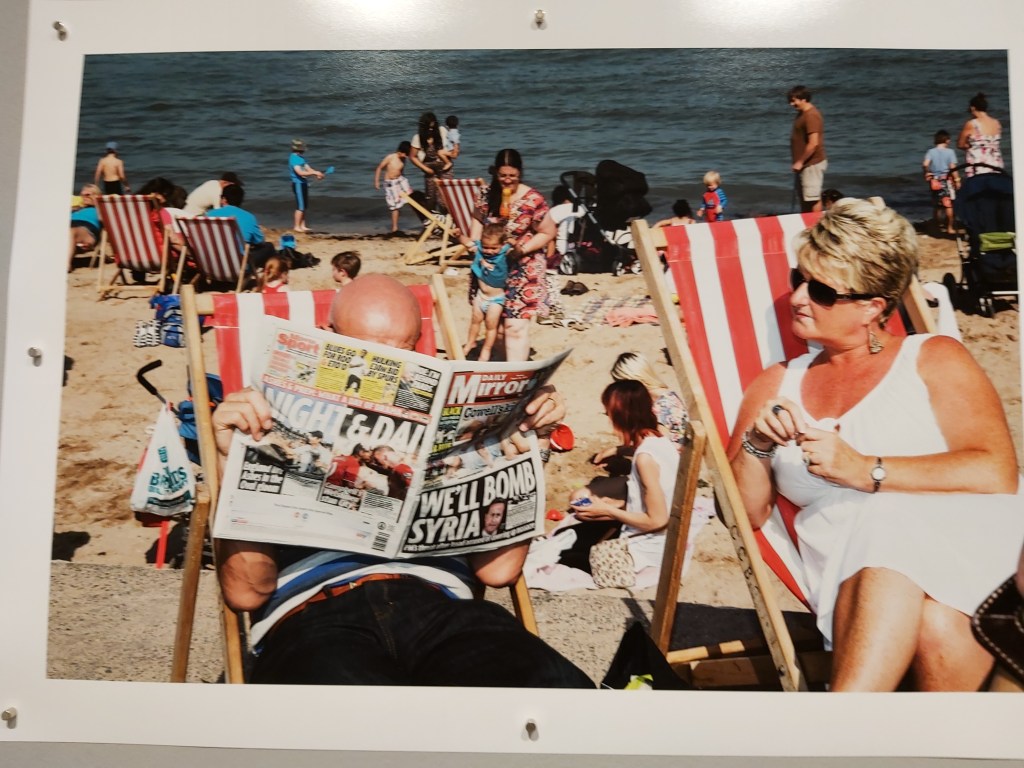
Bank Holiday Llandudno, 2013
The next image I want to look at is this one from 2013. The image is a reflection of what was happening in the world at the time. In the UK, people were enjoying their holidays, while thousands of miles away in the Middle East, a country was being bombed and people being killed. Six years on, as we face the possibility of a USA/Iran conflict, there is still conflict in Syria and ISIS is regrouping as an organisation.
An image from 2013, may be one that we see again in 2020 but most definitely in years to come if something is not done to end the conflicts in the Middle East.
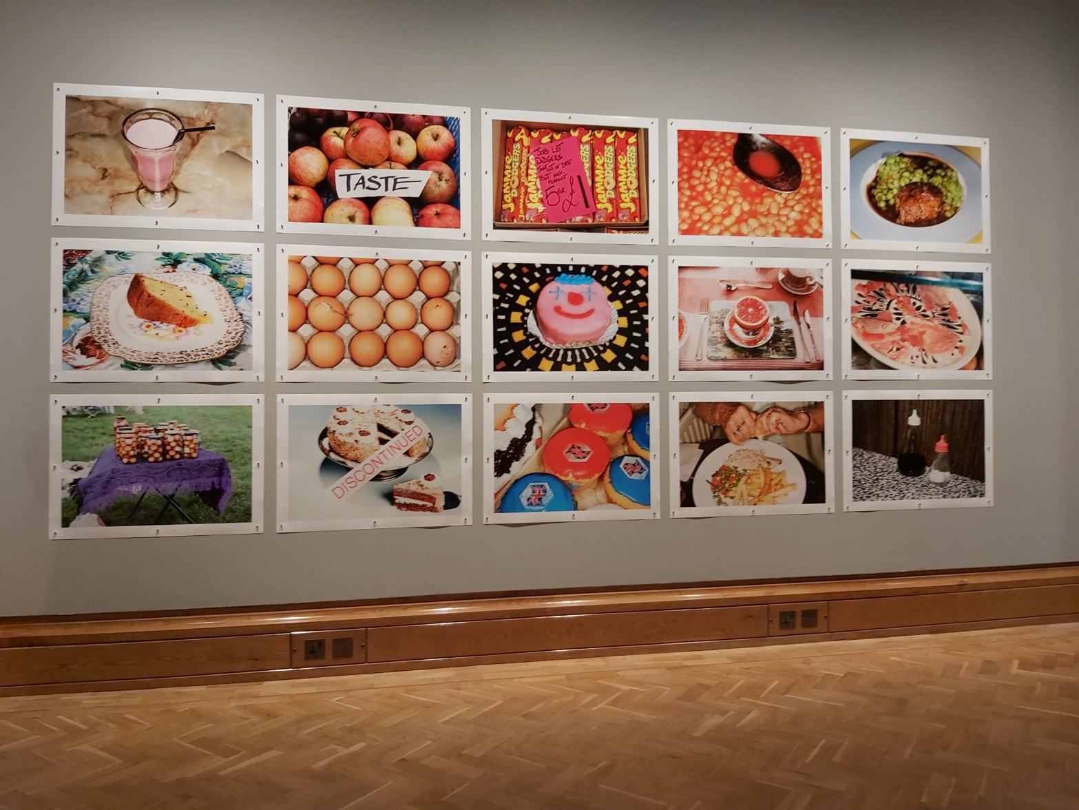
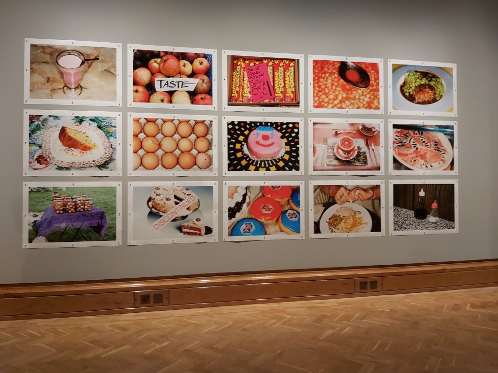
The last thing I want to touch upon with regards to Martin Parr’s exhibition is the series of food photographs that adorned one of the walls. Each one was of a perfectly, ordinary item of food that can be found in Wales, as well as anywhere else in the UK. The thing that I found interesting about them was that they were taken over a period of time.
Looking at the photos I could not help but wonder if Parr set out to produce a series over a number of years or just found that he had gathered enough images to make a series.
If the latter then it goes to highlight how photographs that you take at one point in time, but decide not to use, may come handy at some future point.
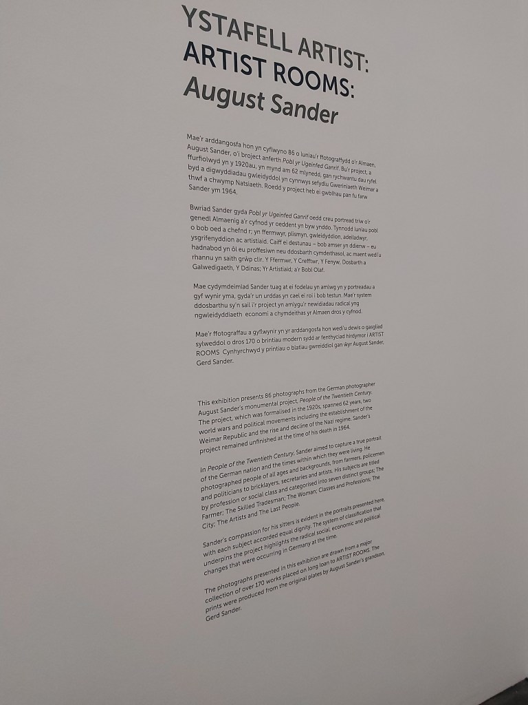
August Sanders
The section PPortfolio of Archetypes within the exhibition was reminiscent of the racial by Francis Galton Illustrations of Composite Portraiture, the Jewish Type and also Alphonse Bertillon’s Synoptic Table of the Forms of the Nose. See Hacking (2014) pages 140 and 146 respectively. All of the photographs were taken in this section of the exhibition were taken pre-World War 1 but weren’t systematically arranged until the 1920s.
The photograph above was one that stuck out particularly for me. My background is in software development and so I am familiar with the engineering and advertising disciplines. Although companies are always happy when their staff are looking out for opportunities to sell existing products or develop new ones, the roles of engineering manager and advertising (business development) manager are performed by separate individuals. Today, both these roles, are very different, with somewhat different skillsets. It is also a reflection of the way the world has changed since the 1930s where businesses had smaller markets in which to sell their products compared to today’s global market place.
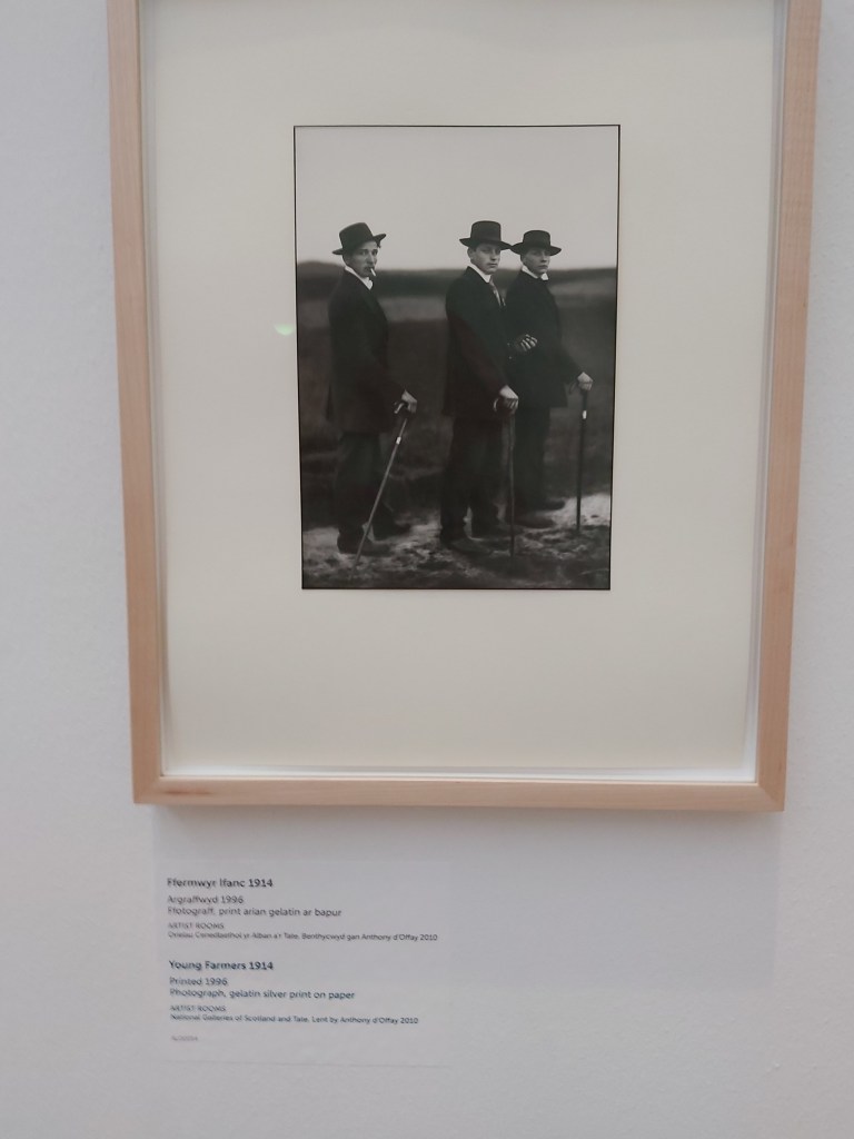
Young Farmers
The Young Farmers portrait reminded me of photographs I have seen of young farmers from the late 20th century, going off to dances and events. The clothing may have changed but there is something timeless about this image.
The other thing about this particular image that I found myself wondering is concerning the date it was taken. 1914. World War 1 had just about to start, or had started. Did these young men, go off to fight in the war, did they stay home and farm exempted from serving their country. Did they survive the war? For all we know this may be the last record of these three young men.
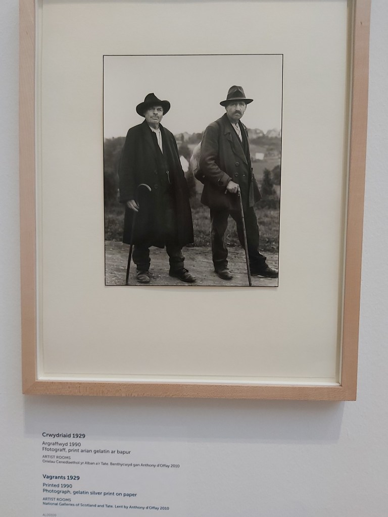
Vagrants 1929
How important is the title you give an image? Very I think. Take away the title of this print and you could be looking at anyone. Two gentlemen out for a walk in the countryside, two farmers tending their fields, shepherds tending their flocks. Change the title and you change how people see an image.
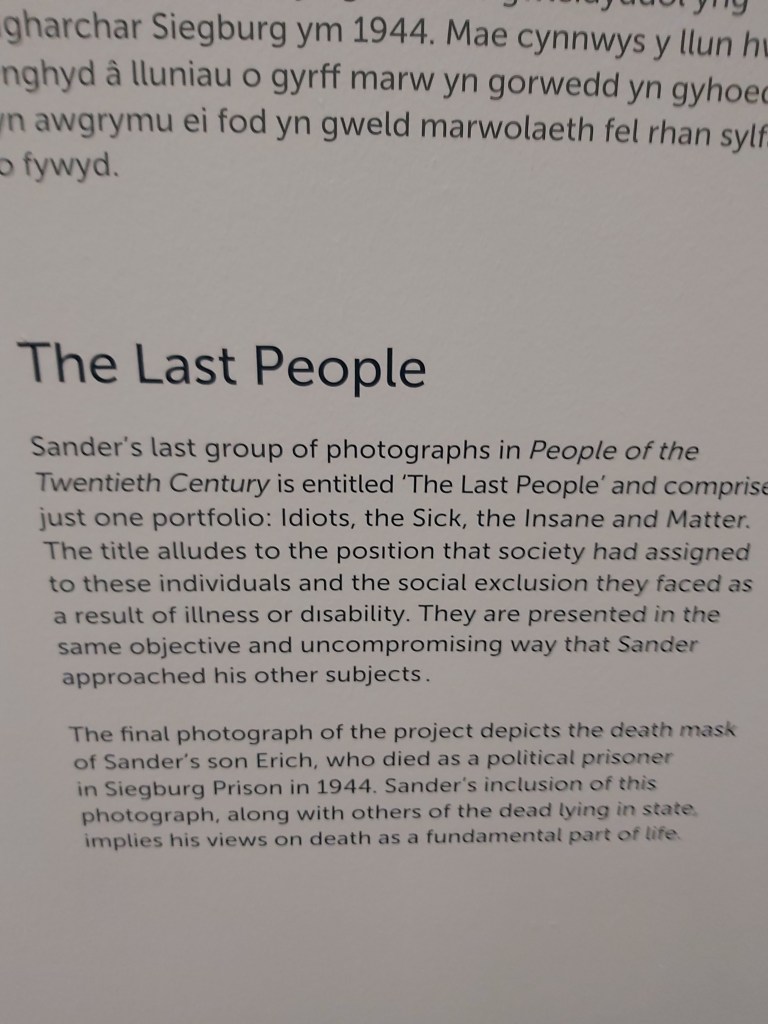
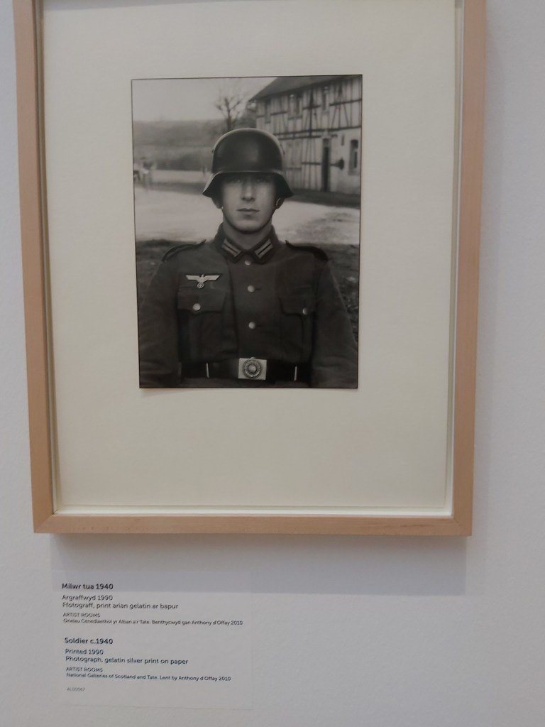
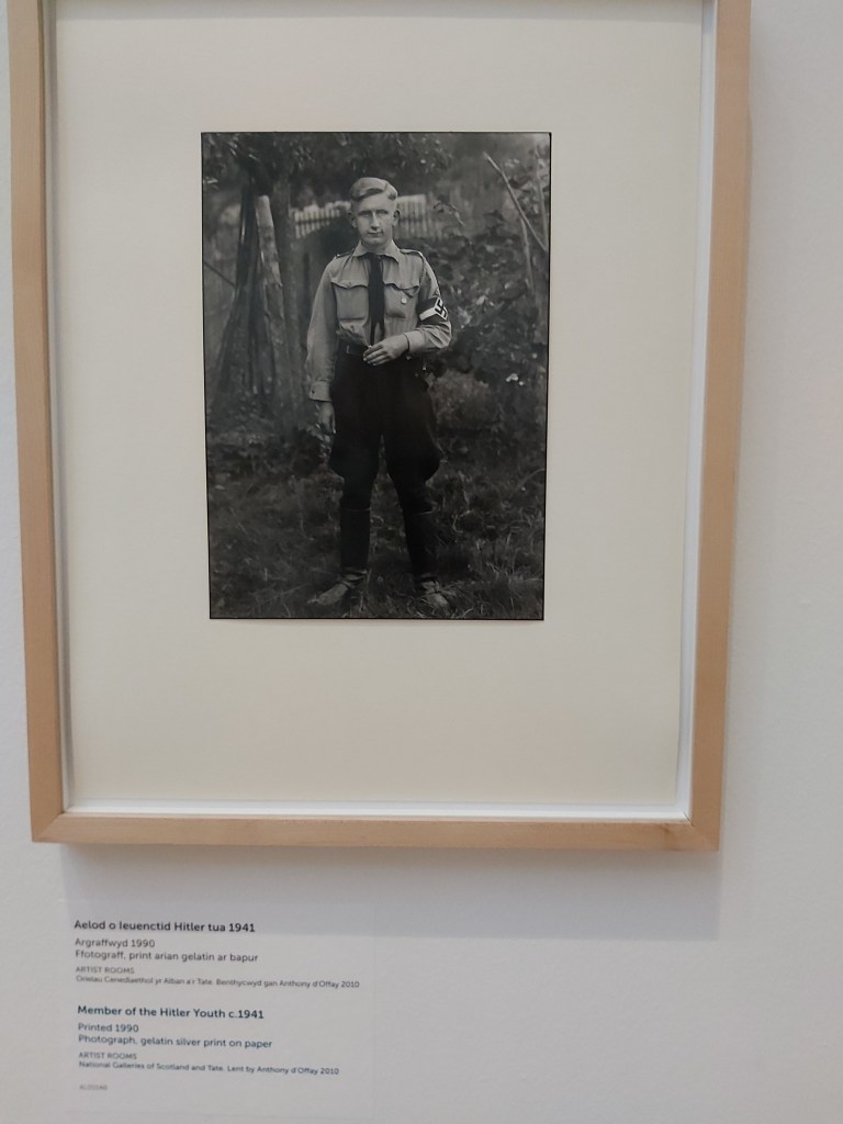
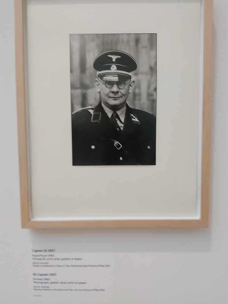
I was surprised when I saw the three images above as they don’t fit with the other images which are of ordinary people going about their lives. These portraits do, however, reflect the times that Sanders was living in and the fact that even ordinary people can do things for, their country, that we would think terrible, even horrific now.
Bernd and Hilla Becher
I don’t intend to go in to a lot of detail about the exhibition of the Becher’s work here. This was the primary reason for my wanting to visit the museum.
Bernd and Hilla Becher are reknowned for their industrial images and as assignment 1 for the course could be reworked to have an industrial architectural feel to it, I wanted to look at their work more closely. I’ll therefore be writing up that part of the exhibition separately.
References
National Mueseum of Wales (2019) Martin Parr in Wales. 1st edn. Gomer Press.
Juliet Hacking editor (2014) Photography: The Whole Story. London: Quintessence
The brief for this exercise is to find a subject in front of a background with depth. Take a very close viewpoint and zoom in; you’ll need to be aware of the minimum focusing distance of your lens. Focus on the subject and take a single shot. Then, without changing the focal length or framing, set your focus to infinity and take a second shot.
As you review the two shots, how does the point of focus structure the composition? With a shallow depth of field the point of focus naturally draws the eye, which goes first of all to the part of the image that’s sharp.
Again without moving the camera, select a very small aperture (perhaps one stop above the minimum to avoid diffraction) and find a point of focus that will give you acceptable sharpness throughout the entire field, from foreground to infinity. Take a third shot and add it to the first two to make a set.
Initial Attempt
Image 1 – Focus on subjectImage 2 – Focus to infinityImage 3 – initial attempt
All of the images above were taken using a lens set to a focal length of 35mm. Images 1 and 2 used f/11 while image 3 used f/5.6.
I realised as I started writing this up that I’d used the wrong aperture and should have been using something around f/25. An initial retry at the required 3rd image was made, but light levels were such that a tripod and extended exposure times were needed to capture an image with it being very difficult to confirm that the image was in focus. This initial try did show a greater depth of field in the images as can be seen below.
Experimental attempt – Exposure time 15 seconds at f/25Experimental attempt – Exposure time 30 seconds at f/22
Final Images
Image 1 – Focus on subject ISO-400, 35mm focal length, f/11, 1/20 second, auto focus Background is out of focus Image 2 – Focus to infinity ISO-400, 35mm focal length, f/11, 1/25 second, auto focus Foreground is out of focus Image 3 – Acceptable sharpness ISO-400, 35mm focal length, f/25, 1/4 second, manual focussing It’s difficult to obtain absolute sharpness throughout an image and so acceptable is the key term here.
The key takeaway for me with regards to this exercise is, to remember which way round the apertures go, i.e. larger numbers are smaller apertures which give greater depth of field. Smaller numbers are bigger apertures and give shallower depth of field.
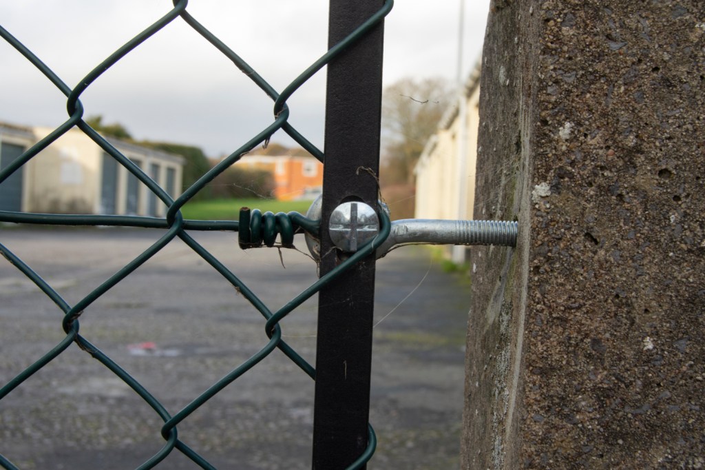
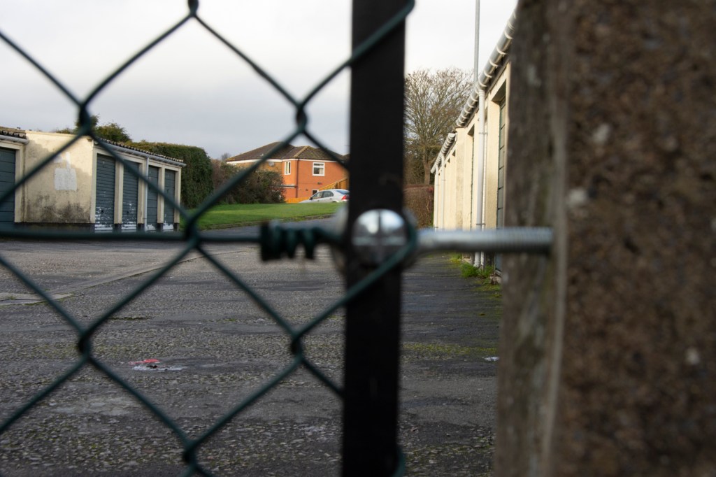
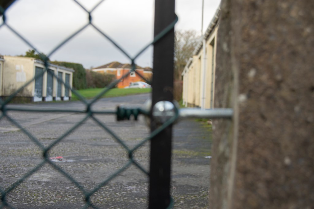
The brief for this exercise is to select you longest focal length and compose a portrait shot, fairly tightly within the frame, in front of a background with depth. Take one photograph, then walk towards you subject while zooming out to your shortest focal length. Frame the subject in precisely the same way in the viewfinder and take a second shot.
Compare the two images and make notes in your learning log.
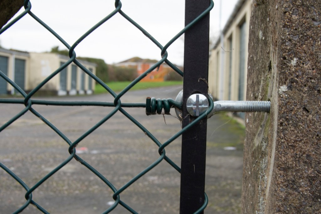
The left hand image was taken using a focal length of 55mm, the right hand a length of 18mm. Both used and aperture of f/5.6.
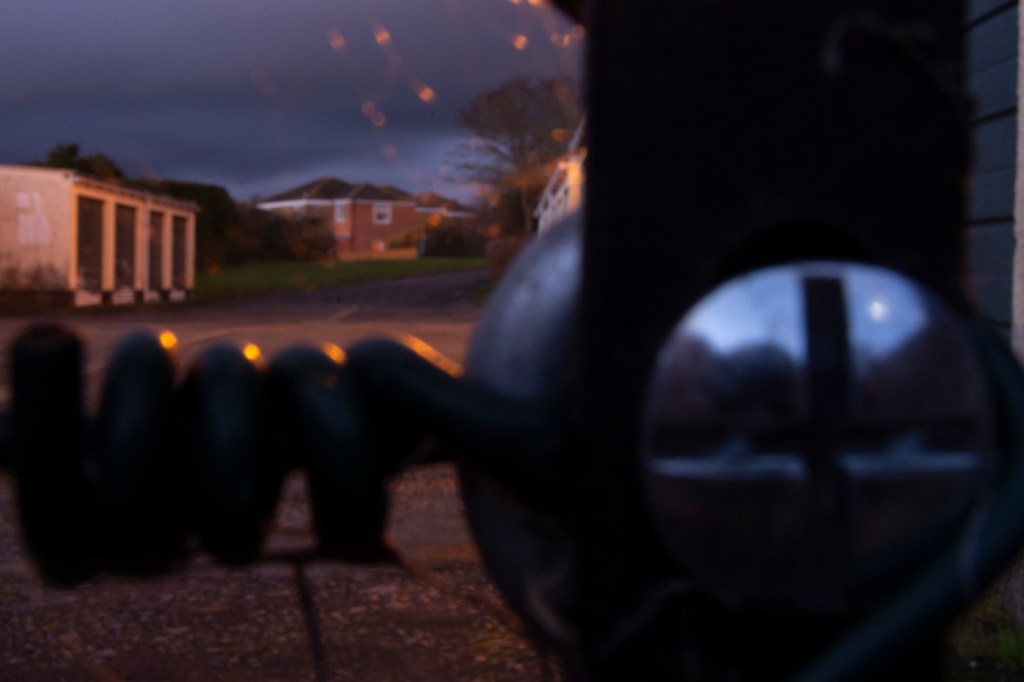
In the right hand image it is possible to see additional features. More of the bungalows and the railings appear in the shot. Additionally, part of the gates to the school entrance can be seen.
At the same time parts of the left hand image have disappeared. The yellow banner attached to the fence is now ofscured by the model.
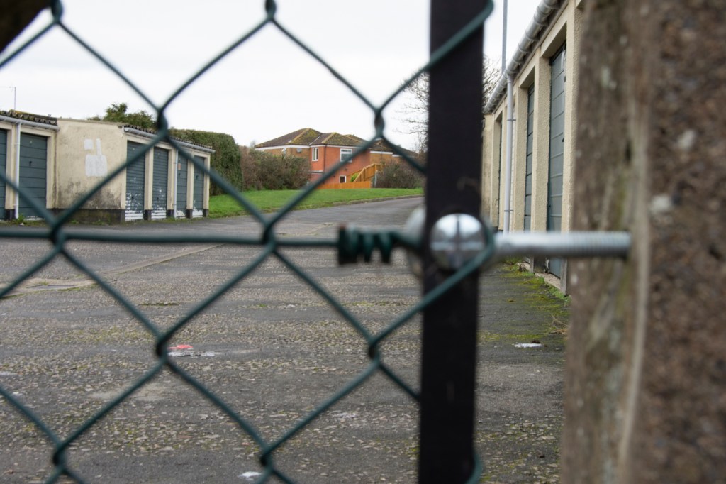
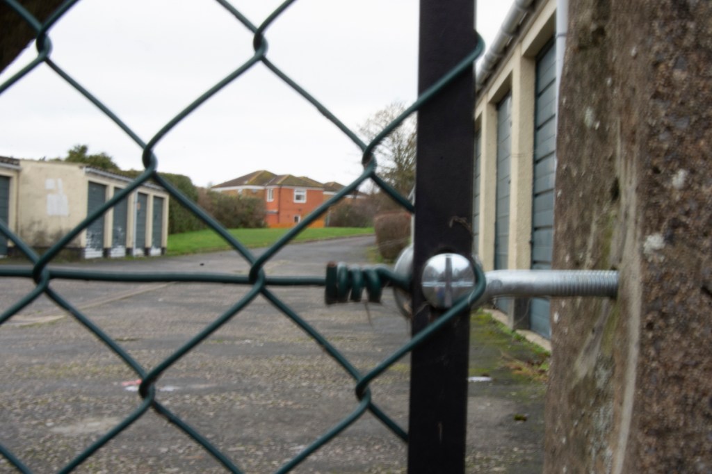
As for the previous pair of photos, the left image was taken ith a focal length of 55mm, the right at 18mm. Both images have been edited in Lightroom as they were initally overexposed. In addition the white balance has been adjusted using the grey in the pavement as a midtone. Some adjustment of the red hue and saturation was made to the right hand image.
As with the previous pair of images, the second image shows more of the background. The bungalow is obscured while a house and wall that backs on to it are now visible. In addition more of the car that can just be seen in the left image is visible in the right one.
The wooden bollard that is visible in the left image has disappeared in the right image. This was due to the distance from the model that was needed in order to achieve the second shot. The bollard at this point was right below the camera position and so out of view.
The brief for this exercise was to find a scene with depth and from a fixed position, take a sequence of five or six shots at different focal lengths without changing viewpoint.
A number of examples of how zooming in on images has been used in film were provided in the course notes as well as the suggestion that we research Hobein’s The Ambassadors’s found at Google’s Arts and Cultures website.
After examining The Ambassadors’ and noticing the cracks and dust motes when maximum magnification of the painting was used I went on to look at a number of other images to see what the result of zooming in on these paintings would be.
Zooming in on this image, around the area of the throne in
the centre and the figures appear to have distinct faces. Continuing to zoom in
on some of the figures results in the faces resolving themselves into brush
strokes that give the rough shape of eyes, noses etc. but without any real
detail.
Zooming in on this image allows you to see the individual brush strokes. Some things in the painting resolve into just blocks of colour but other items like the telegraph poles can still be made out as what they are. The wires running between them also resolve into individual lines when viewed close up.
When you zoom in on parts of the image you can clearly see
cracks and dust. You also lose any level of detail. For instance the faces of
the people in the background turn into blobs of colour.
However, if you zoom in on the two main figures the level of
detail is incredible.
When examining the figure of the man it is possible to see
individual hair on his head because of the brush strokes.
When zooming in on the girl, if you look at the tear in her
top you can see the frayed edges of the material, even at the maximum zoom. Her
eyes are also very clear with the points of light shining in them having very
similar shapes, almost as if you can see the reflection of a horse in them.
The description that goes with image highlights that the
artist had painted a reproachful look on her face but as I zoomed in on the
image I felt that the look was not so much reproachful but sorrowful.
Zooming in on this image does result in the image resolving
to colour and lines (the grass) but does show glints of light on the cherries
in the tree at the front of the picture.
For me the interesting thing was the level of detail in the slaves attending to the cherry tree in the background. Zooming in on the male, it was possible to see enough detail to get an idea of how the painter visualised his hair would look.
Reflecting on the images of the paintings above I’m reminded of the TV programme Fake or Fortune and the lengths that art experts will go to in order to verify the authenticity of a painting. Brush strokes, pigments, even cracks in canvas are signs that help identify whether a painting is by a famous artist.
Looking in detail at film photographs would eventually break down to just being able to see the grain of the film.
Digital photographs break down to individual pixels. Modern image manipulation software allows us to make changes at this level. The possibilities that this offers are, while not endless, are varied.
Response to Brief
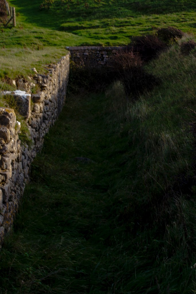
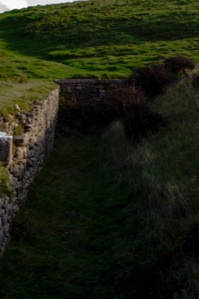
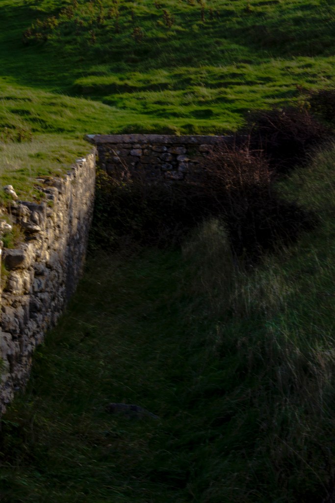
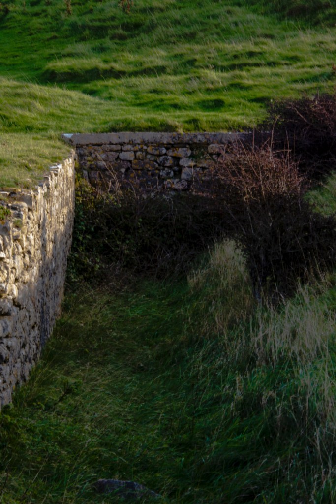
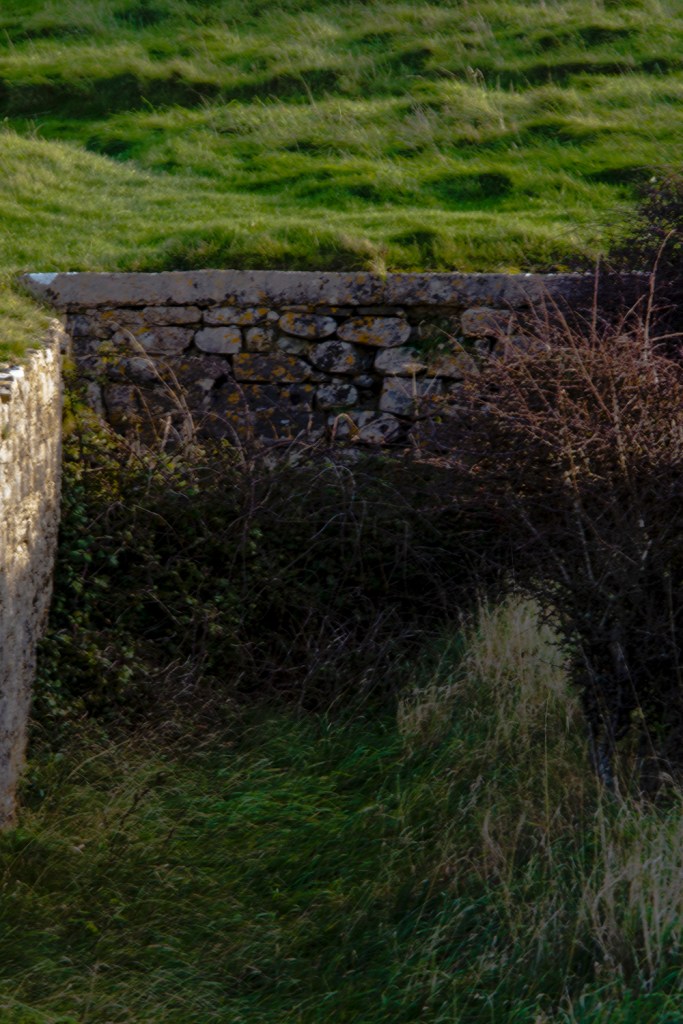
While away for a weekend in Porthcawl, South Wales, we paid a visit to the village of Southerndown. On the headland are the ruins of a castle. One area provided the opportunity to capture some photographs in a way that meets the brief for this exercise.
While trying to take the photos a number of blurred images were immediately discarded. The blurring occured as a result of attempting to hold the camera without using a tripod in a windy location.
All photographs were taken using aperture mode. This resulted in the images being a lot brighter than I would have liked because of the aperture selected.
Each of the images have been processed in Lightroom using the same settings, which included changing the white balance to Daylight and then darkening the image using the Tone Curve.
ISO 400, 70mm, f/16, 1/15sec ISO 400, 85mm, f/16, 1/15sec ISO 400, 102mm, f/16, 1/15sec ISO 400, 135mm, f/16, 1/13sec ISO 400, 200mm, f/16, 1/13sec
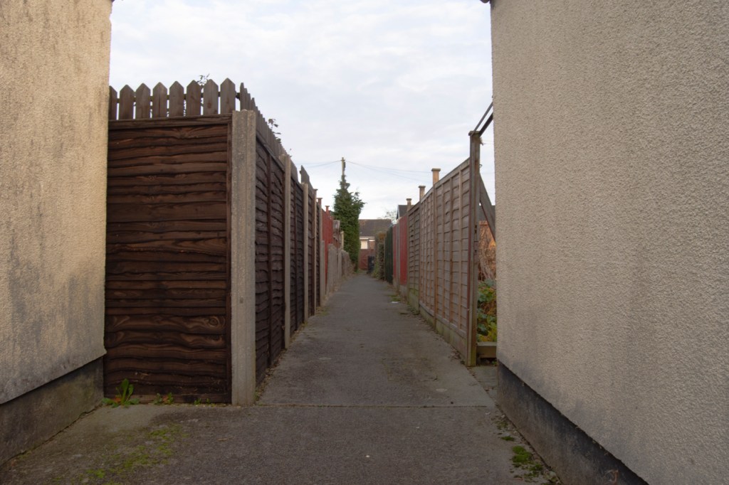
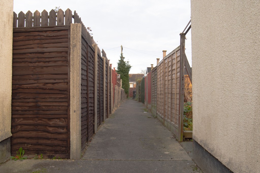
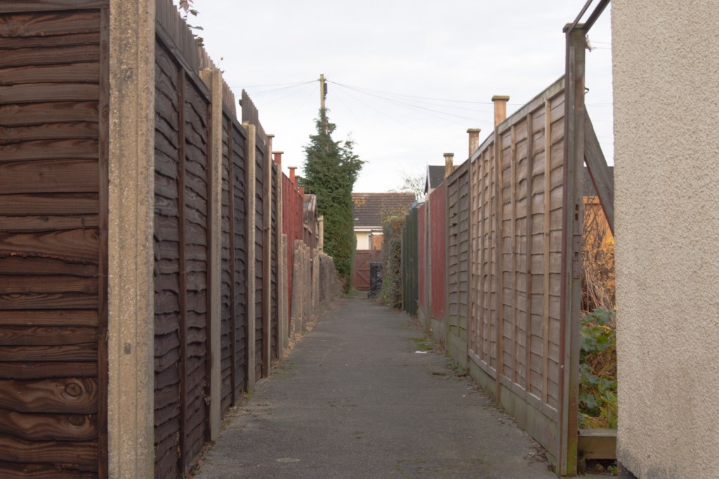
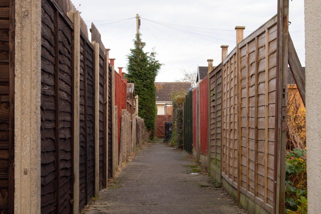
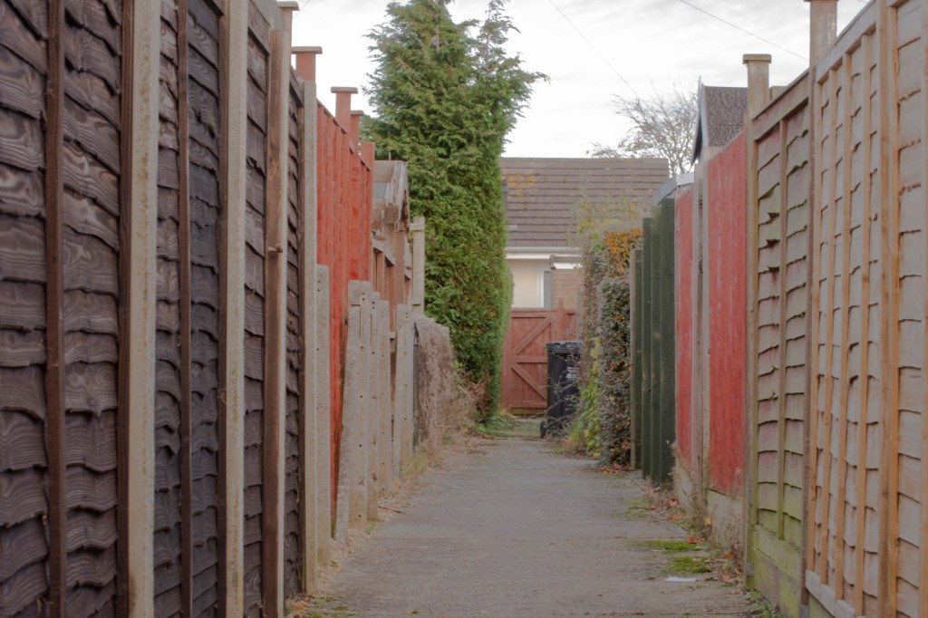
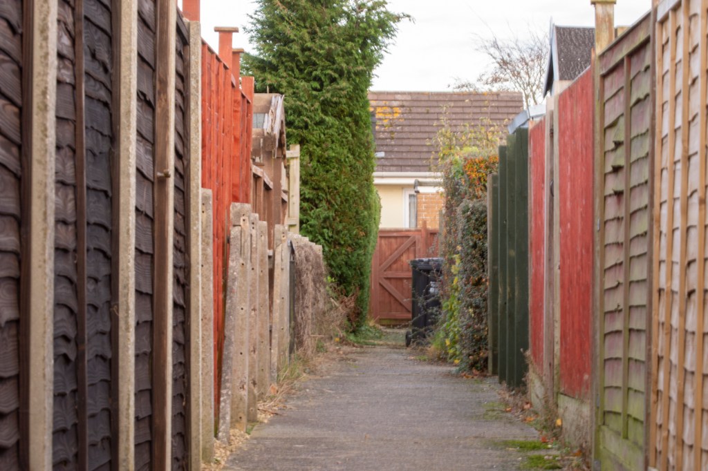
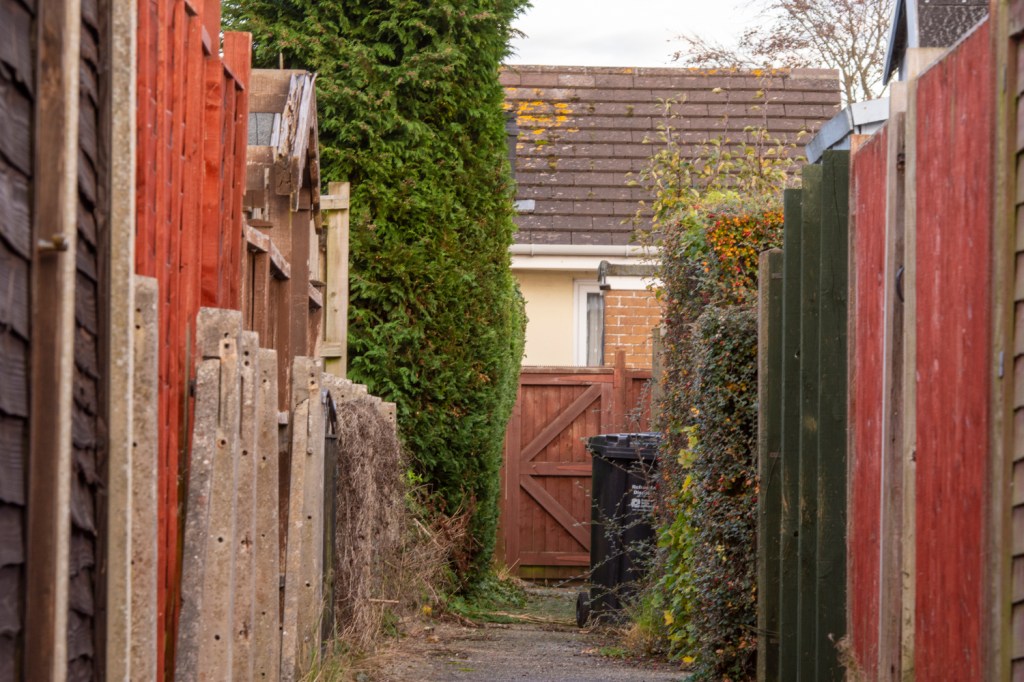
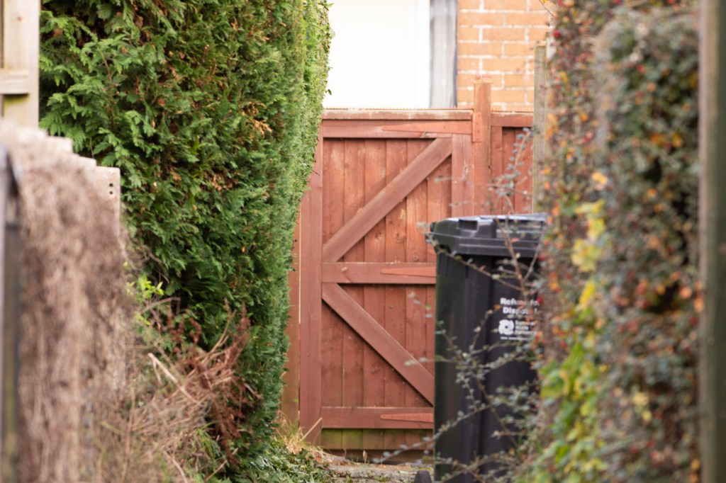
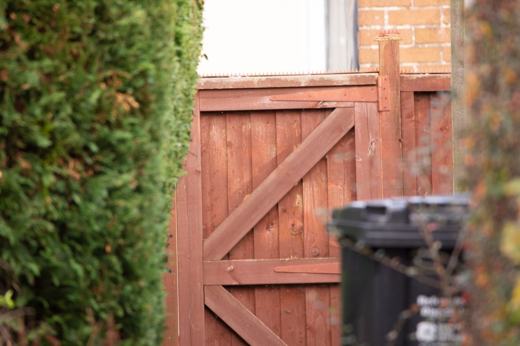
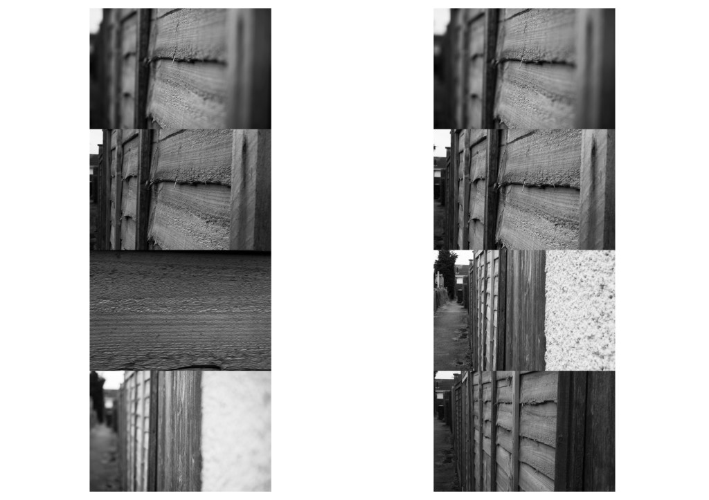
The second set of images below were taken in the alleyway running behind my house. This time I used a tripod to provide stability for the camera, as well as using 3 different lens allowing a range of focal lengths from 18mm up to 600mm to be used. Again a number of images were discarded during the editing process because of blurring. This time as a result of the weight of the longer lenses not being easy to support.
ISO 400, 18mm, f/11 1/50sec ISO 400, 24mm, f/11 1/30sec ISO 400, 35mm, f/11 1/25sec ISO 400, 46mm, f/11 1/20sec ISO 400, 70mm, f/11 1/8sec ISO 400, 85mm, f/11 1/10sec ISO 400, 130mm, f/11 1/15sec ISO 400, 300mm, f/5.6 1/30sec ISO 400, 400mm, f/6 1/30sec ISO 400, 500mm, f/6 1/25sec
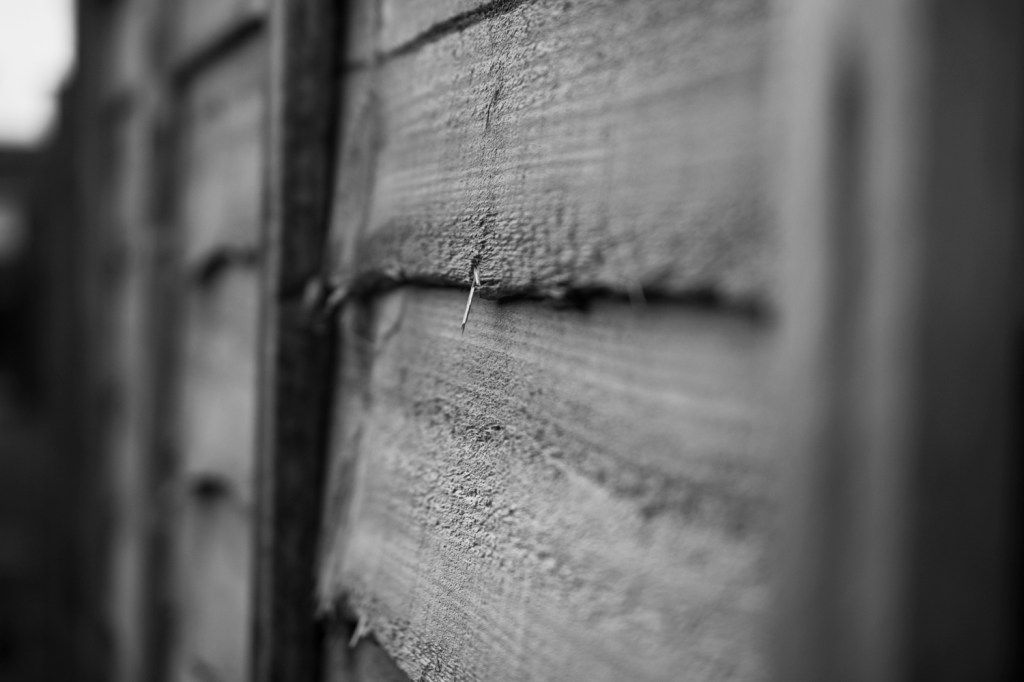
Final image
Taking inspiration from the examples or your research, create a final image for your sequence.
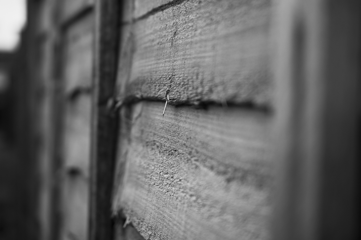
The reason I chose this image as the final for my sequence is because the single splinter of wood captures my attention. The texture on the wooden fence allows a viewer to zoom in and see finer detail. Although the image is black and white, unlike the previous images, I think that removing colour from this image helps remove distractions and allows the texture of the fence panels to come through more.
The photograph was taken using a 40mm macro lens which is why the depth of field is so limited. I tried going for a larger range, which would have allowed other parts of the image to be looked at it greater detail but those images just didn’t evoke the same feeling in me as this one does.
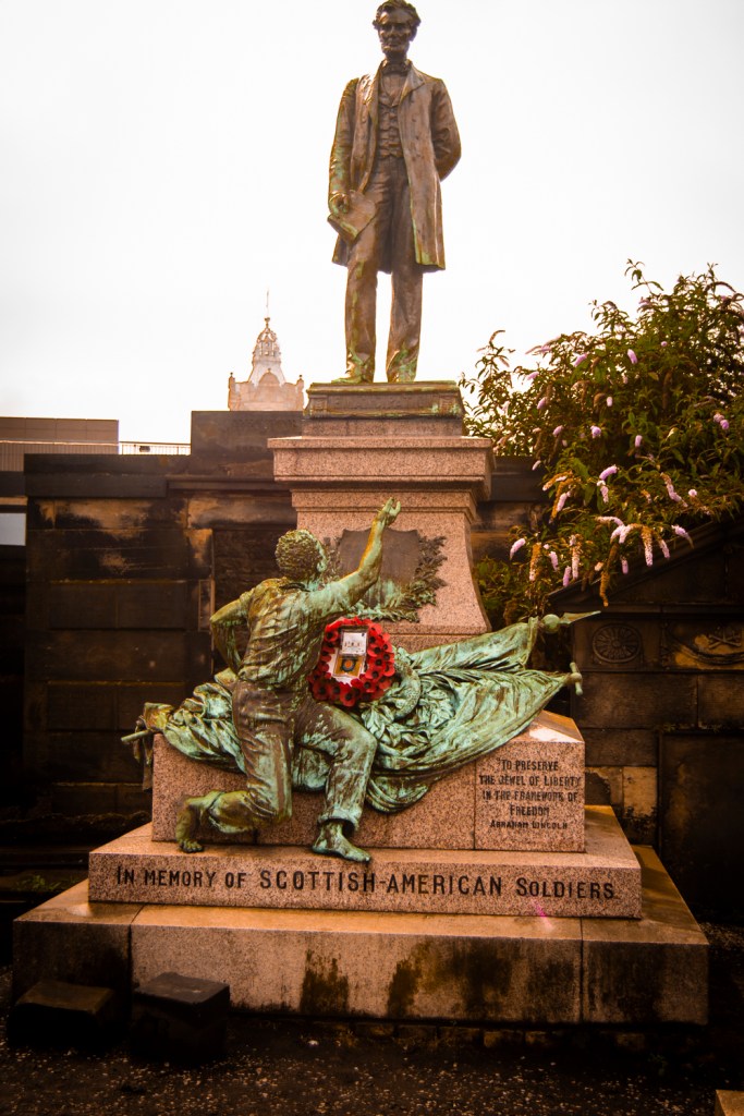
“Those who deny freedom to others, deserve it not for themselves” – Abraham Lincoln
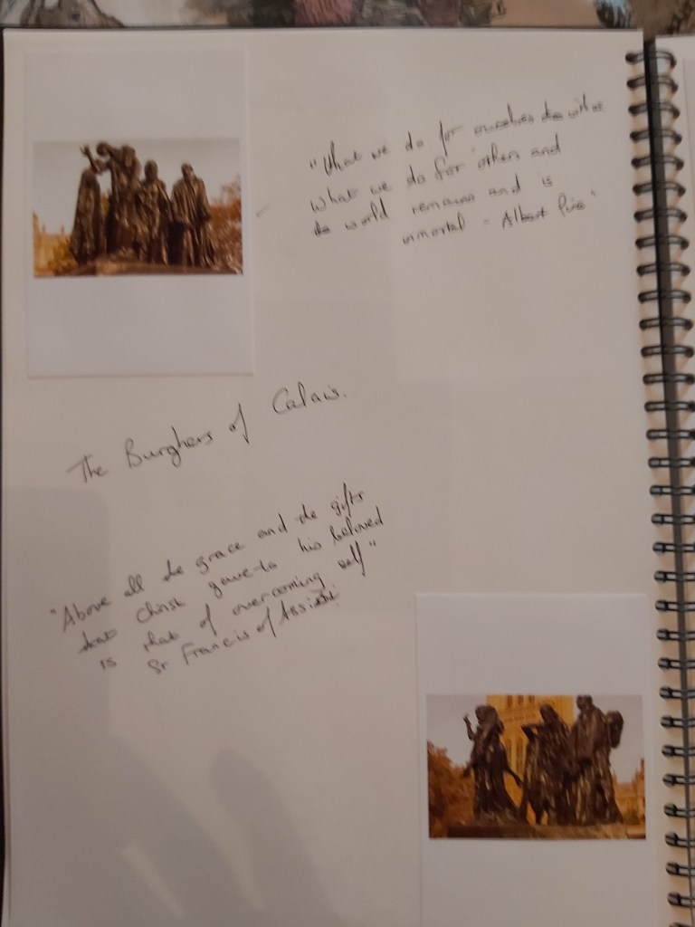
“What we do for ourselves dies with us. What we do for others and the world remains and is immortal” – Albert Pine
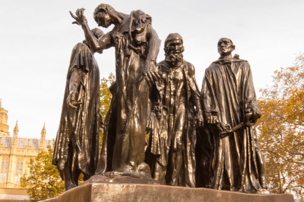
The Burghers of Calais
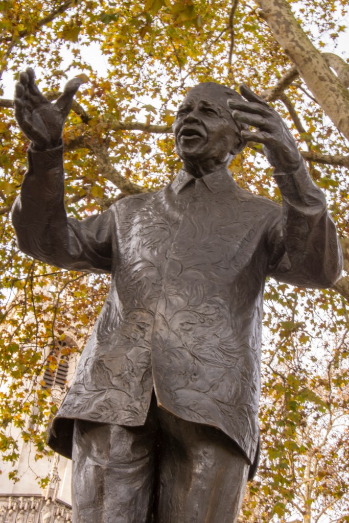
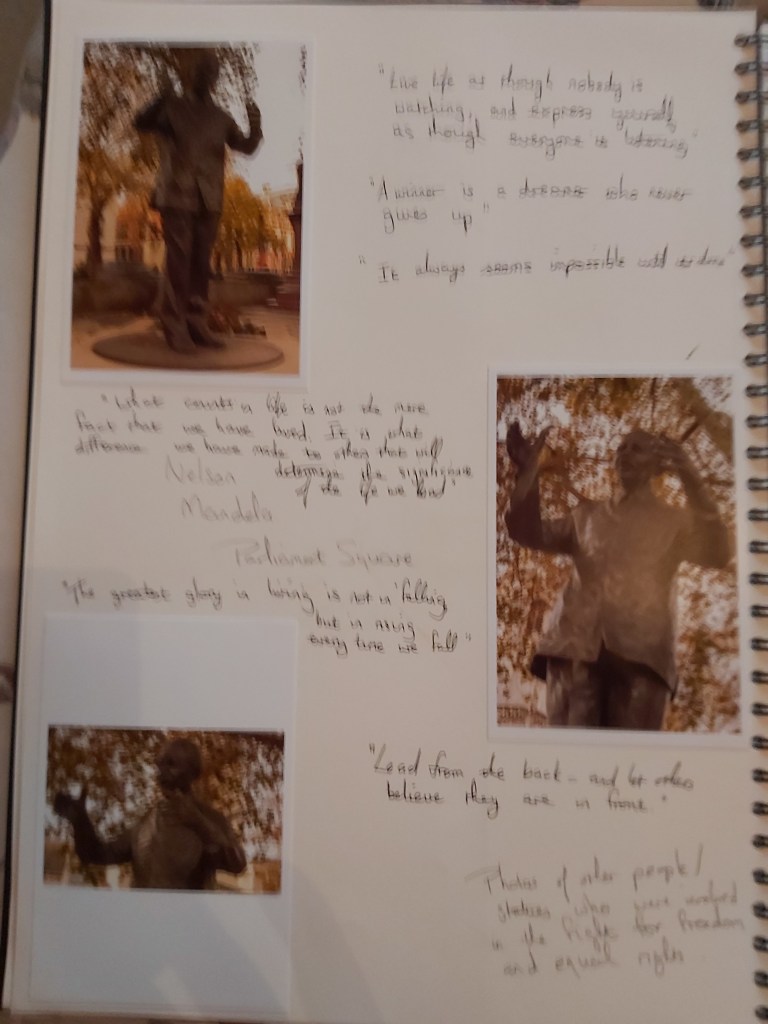
“Live life as though nobody is watching, and express yourself as though everyone is listening” – Nelson Mandela
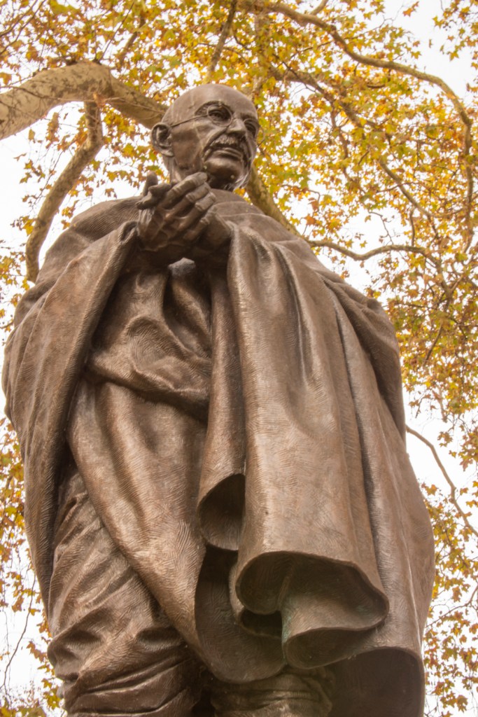
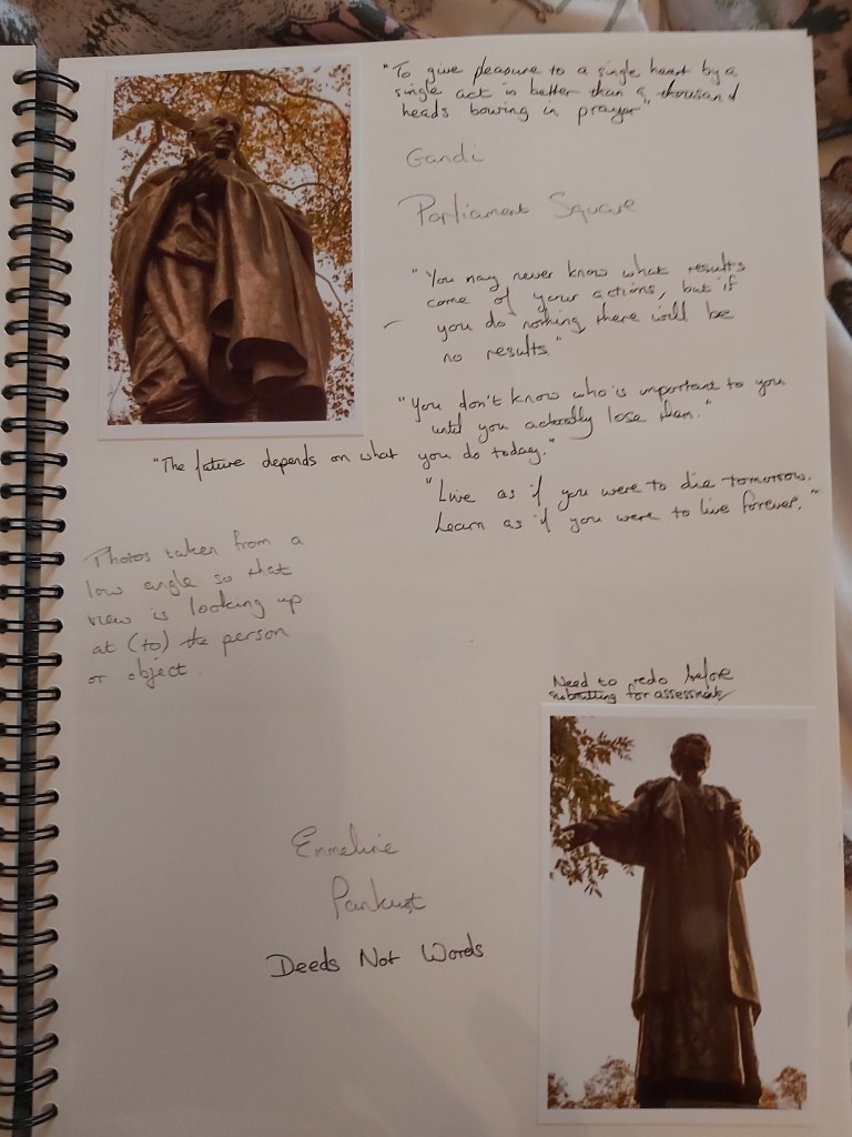
“Live as if you were to die tomorrow. Learn as if you were to live forever” – Mahatma Gandhi
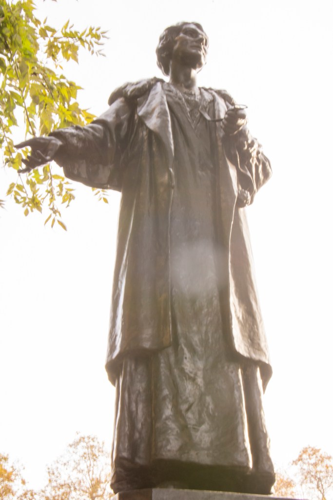
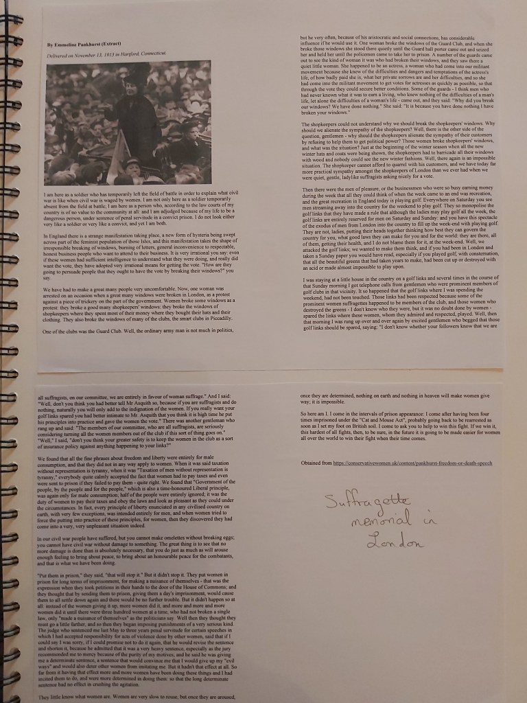
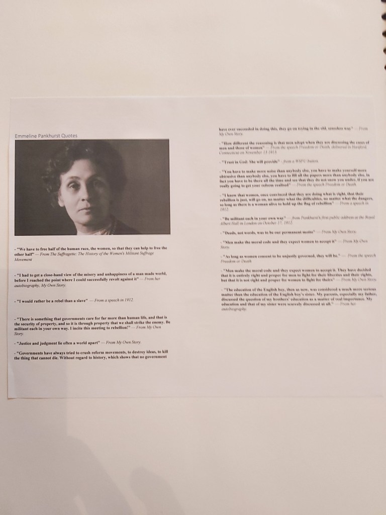
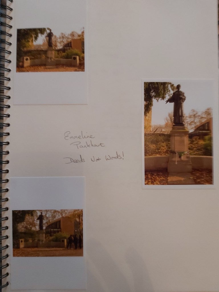
“Deeds Not Words” – Emmeline Pankurst
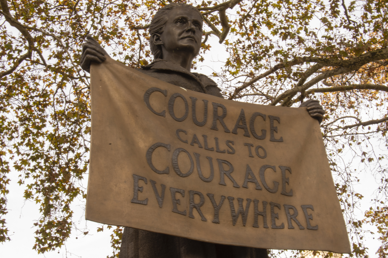
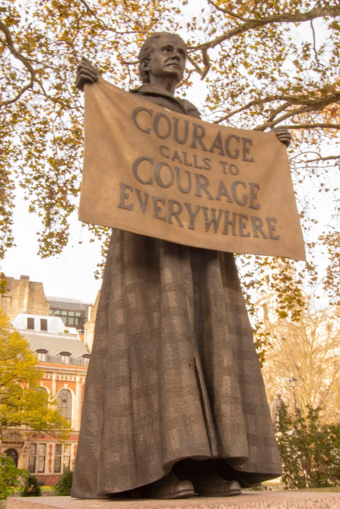
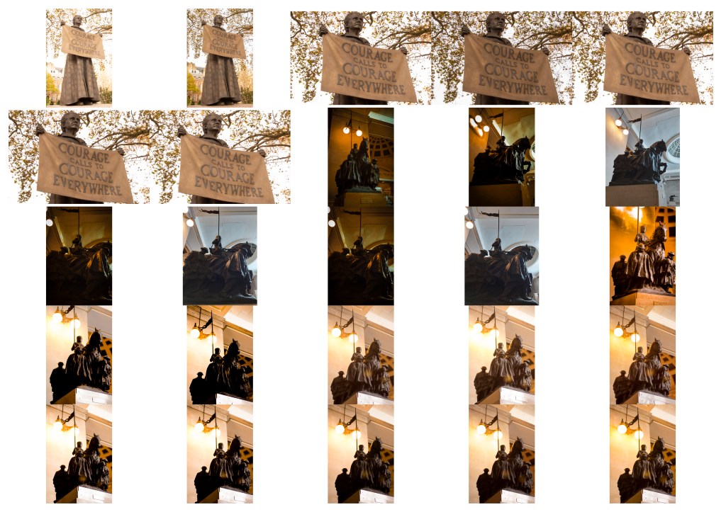
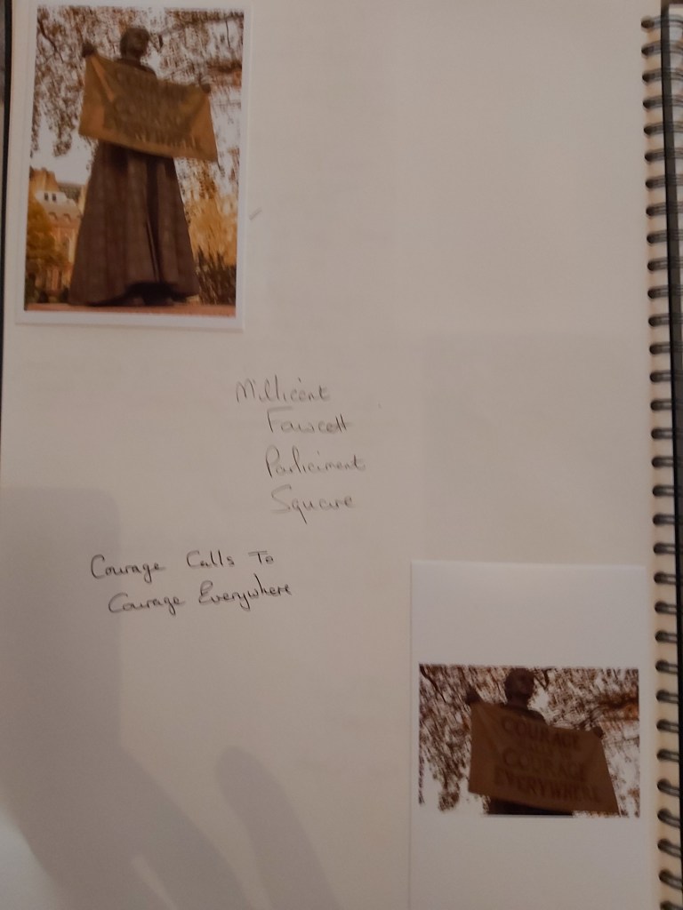
“Courage Calls to Courage Everywhere” – Millicent Fawcett
“Great achievement is usually born of great sacrifice, and is never the result of selfishness” – Napolean Hill
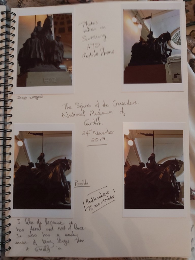
The Spirit of the Crusaders – Gertrude M Williams (National Museum of Wales)
Contact Sheets
Assignment Notes
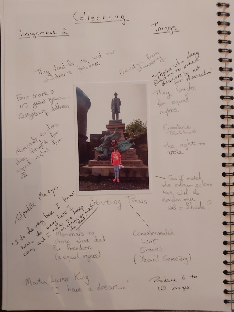
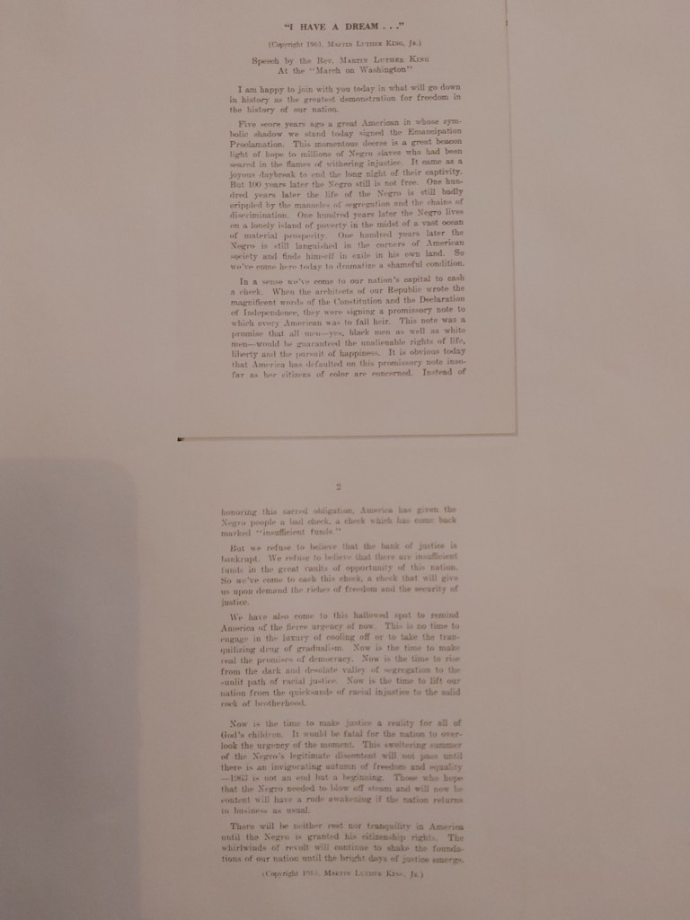
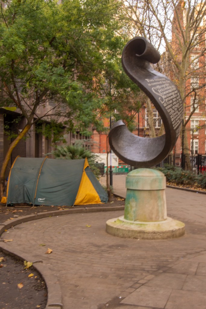
My initial thought for this assignment was the result of two ideas. The first was a photograph of my niece taken in Edinburgh at the memorial to Scottish-American soldiers who fought in the American Civil War. The second idea arose after noticing a sign for Commonwealth War Graves at the local cemetery.
From this starting point I began to brainstorm people and groups that fought for the freedoms and rights that we have today. People like Martin Luther King, Emmeline Pankhurst, the Tolpuddle Martyrs came to mind.
To capture the images I wanted I began looking at Manchester and London as locations as I was going to be visiting both cities in the run-up to the assignment deadline.
Sackville Gardens in Manchester has memorials to Alan Turing and LGBT people. London has memorials related to slavery and the suffragette movement.
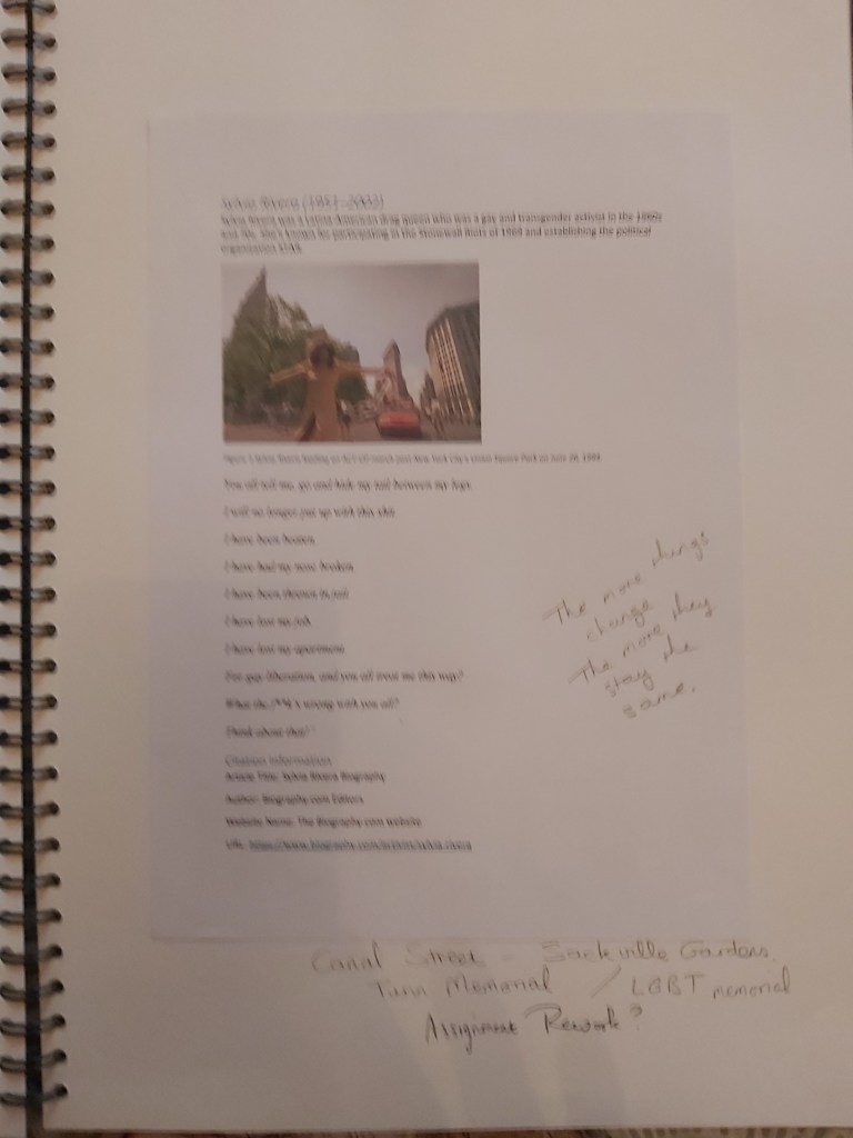
With these areas as themes I begain looking for quotes from people linked to each of the possible themes. I found a poem by Sylvia Rivera who was involved in the 1969 Stonewall Riots, Martin Luther King’s I Have a Dream speech, a copy of a speech by Emmeline Pankhurst and a number of quotes from Millicent Fawcett.
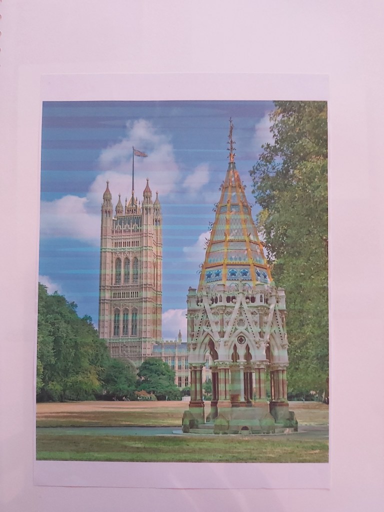
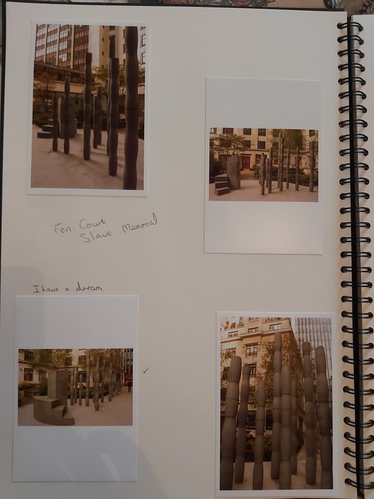
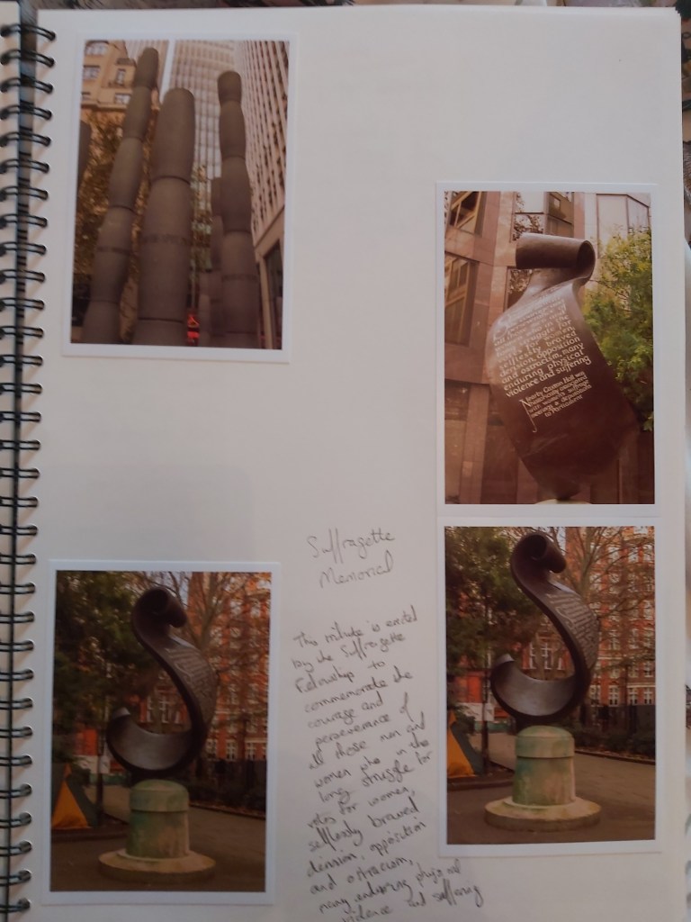
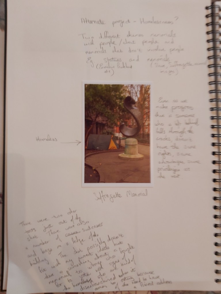
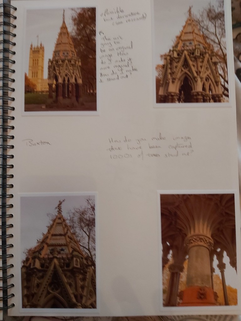
Unfortunately the Manchester trip had to be cancelled and so I spent a morning wandering around London visiting a variety of memorials including the Slave Memorial in Fen Church, the Suffragette Memorial in Christchurch Gardens, the Buxton Memorial Fountain, as well as the memorial to Emmeline Pankhurst and the statue of Millicent Fawcett in Parliament Square. The last location provided the opportunity to take photographs of Nelson Mandela and Mahtma Gandhi, both individuals who fought for people’s freedom.
The majority of the images were taken with an aperture of f/20 or f/22 where it resulted in a well exposed shot. Some images needed an aperture of f/11 or less because of the available light.
Reviewing the images it became apparent that the best way to proceed was to put together a sequence of images that involved people, which excluded the Slave Memorial, Buxton Memorial Fountain and Suffragette Memorial.
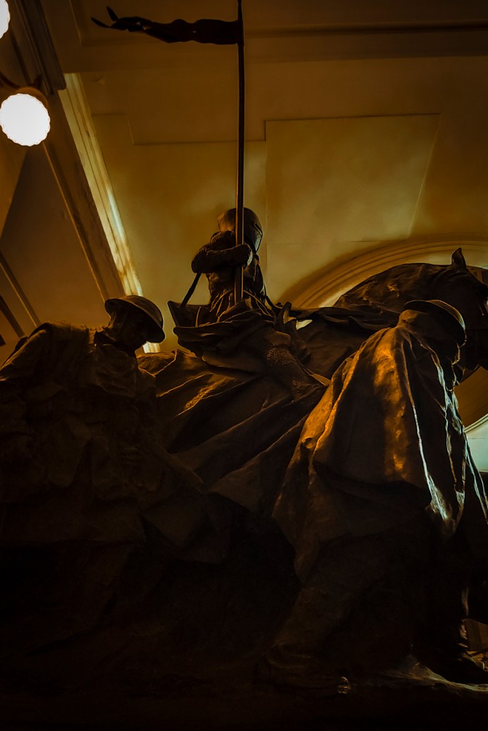
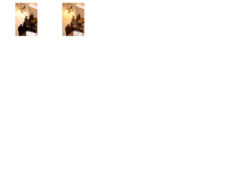
At this point I was still short of an image but a trip to the National Museum of Wales provided the chance to photograph The Spirit of the Crusaders memorial. This is a much smaller memorial than the others and so in order to get a similar sense of scale I photographed the memorial from a low angle, aiming to fill the viewfinder with the memorial as much as possible.
What I have aimed to develop is a set of images of representing groups who have fought for the freedoms and rights that we have today but which weren’t available to certain groups at some point in history.
Freedom from colonialism
Inability to vote
The fight to abolish slavery
Sacrificing your freedom in able to gain others their freedom
The willingness to fight for what is right and to stand up to those who would take away our freedoms.
Each of these I hope can be seen in the images, and the chosen quote that is associated with them.
With regards to presenting these images I would envisage a short description about the person or group depicted and what they were standing up for.
Going forward I would like to add to the sequence by including Alan Turing, I know that there is statue of him at Bletchley Park. Turing represents the way that the LGBT people in this country were treated and how people have fought for the freedoms that community currently as. Turing is seen as one of the fathers of the modern computer ages as a result of the work that he did decoding the German Enigma code during World War 2. As a gay man, after the war he did not get the recognition he deserved, was convicted under the countries archaic homosexuality laws and eventually took his own life. Similarly I would like to add something that depicts the Civil Rights Movement.
In parallel with this series the images of the Slave Memorial, Suffragette Memorial and the Buxton Memorial Fountain could be developed into a similar set of images with the inclusion of the Sackville Garden’s LGBT memorial and the memorial to the Tolpuddle Martyrs.
With both series of images I aim to get viewers to realise that there are people who aren’t lucky enough to have the freedoms and rights that the majority take for granted, that there are still battles to be fought, and that it is the normal, ordinary person in the street that can enact changes, if they have the will to do it.
Reflection
Demonstration of technical and visual skills
I think that these images show a good level of composition. The addition of the Nelson Mandela and Mahtma Gandhi figures, the Burgers of Calais and The Spirit of the Crusaders demonstrate a good level of observational skills and visual awareness as it would have been very easy to have missed these opportunities.
Quality of outcome
At the moment I think that the images demonstrate the realisation of my ideas from concept to execution. I’m not totally happy with all of them, the Emmeline Pankhurst image I plan to revist when I next have an opportunity to visit London and have some spare time. The image is slightly blurred and there is a spot of lens flare that stands out.
Demonstration of creativity
My sketchpad and contact sheets show a good level of creative thinking with regards to this assignment. I feel there is a clear indication of how the work developed and the impact of decisions made that resulted in the end series of images.
With regards to personal voice I feel that it is developing. I feel that there is a social aspect to how my photography is developing. Whether that is with regards to our impact on the environment or societies impact on our fellow human beings, my photography is drawing upon topics in these areas.
Context
I think that with regards to my research I am getting better and finding out about the suggested photographers, as well as finding out more about areas that I wish to include in my photography. I feel that my own personal interests and causes, and my photography are slowly aligning. My knowledge of photography is growing and I am trying to develop my critical thinking/analysis skills, which I hope have improved since assignment 1.
I do feel that I still have a long way to go in all of the assessment areas and there is plenty of scope for improvement.
Sketchpad
Research
The results of my research reading can be found in my learning log at Collecting – Research
There is something about Von Zwehl’s (2019) work that draws me in. Is it the simplicity, the use of silhouettes or having her models where black clothing. There is a flow to her work which makes you want to dive in and see more.
Meditations in an Emergency I found that, despite the fact that all the images are is of the head and shoulders of people lying on their back with their eyes closed as if meditating, there were elements that caught my attention. For instance a number of the images have what could be described as a heat signature effect. The sort of appearance you get when looking at a person or object with an infra red camera or sensor.
Meditations in an Emergency
My initial thought on noting it was that it was my monitor but as the effect changed with different images I can only conclude it is part of the image itself. Almost like you are seeing the person’s ethereal body.
The fact that this effect is black means it doesn’t stand out from the rest of the image and you have to look closely to see it.
Bloodlines is another interesting series because it features young girls posing with snakes. There is a biblical feel to the images with the young girls being reminiscent of the innocent Eve in the Garden of Eden and the manipulative Serpent who would eventually pursuade her to break one of the rules that God gave to her and Adam.
Bloodlines
Von Zwehl’s use of similar background colours to those worn by her models is like a signature theme or her way of expressing her artistic voice.
The simplicity of the images and the consistent colour scheme across the images is what appeals to me about her work.
Ishiuchi Miyako
When watching the YouTube video Presenting Hiroshima by Ishiuchi Miyako (2011) which shows Miyako’s photobook of items gathered after the atomic bomb dropped on Hiroshima at the end of World War 2, several things leapt out at me.
The first thing was that if you are going to photograph something with such historical importance then doing it simply without distractions means that you get the full impact of the item itself.
The second thing was that you don’t always need words, the images can be enough as they stand. Words can detract from images, unless they are tied to the object in some way, like being from the person that owned an object or being the thoughts of a person who the image concerns.
Finally, the unexpected can have a huge impact. In Miyako’s book there are a number of images of items of clothing, and then there is one of what appears to be a false tooth. The juxtaposition of every day items of clothing to something intimate like a person’s tooth causes you to stop, to pause, and to think, rather than simply turn the page.
One of the photographs I took for this assignment is of a Suffragettre memorial in London. I took several of the memorial but then took some of the memorial with its surroundings. In these images you can see several tents used by homeless people to sleep in. With those images I was trying to highlight that although we achieved something amazing just over a hundred years ago by giving a disenfranchised part of the population a chance to have their say, we still have a part of the population who are disenfranchised even today. A part of the population who don’t have a voice through circumstances that may be beyond their control, just like being a female and not being able to vote was beyond women’s control up until the start of the 20th century.
Mårten Lange
In Citizen, Lange (2015) has produced a series of images of birds that gel together. The monotone colour scheme brings the whole together, as does the way that the birds have been photographed so they are standing in similar, but not identical, ways.
The eyes are what draw you in to each image, even when they are missing. It is as if the birds are looking back at you, the viewer. Especially in #4 and #16 where the birds gaze is quite intent.
Citizen #4
Citizen #16
Photographing a series of similar items and using the same colour scheme and positioning helps bring the series together as a whole.
Andrew Langford
When describing his work Series Langford (2020) states “The aim was to create a collection of new symmetrical specimens of uncertain origin and scale that could allude to both the familiar and everyday and the unfamiliar and the out of the ordinary. “
Langford has achieved this by his use of a background that removes any means for a viewer to gauge the scale of the items. In the image below these items could be any size from microscopic to macroscopic. In addition without an indication of what the items are, the viewer has the opportunity to visualise them in ways that are personal to them. For me, at first glance, these items are reminiscent of Christmas tree decorations, something that has to do with it being the festive season as I write this. At another time of the year I might see them differently, as pieces of jewellery or shells or something else. Something familiar to me but which is different to what they actually are.
Similarly with the images on the walls below, my experiences and background make me think of samples from microscope slides, stained so parts of them stand out but blown up 100s and 1000s of times.
The nature of the objects that I’ve decided to photograph doesn’t easily lend itself to what Andrew Langford has done in this series. Background will be different and enlarging something that is already life size doesn’t seem like an easy task.
Edward Ruscha
Tate (2013) shows a copy of Ruscha’s book ‘Twentysix Gasoline Stations’ held by the Tate Museum. Ruscha’s idea has been copied several times over the year, using different themes, such as Fire Stations, Publishers and coach seats.
Ruscha’s series of images shows that anything can be the subject for a photographic project, even things that we take for granted.
In someway Twentysix Gasoline Stations is also a historical document as it records buildings that may still exist but also could have been taken over by other companies, been demolished to make way for something else that the local community needs, been repurposed, or may still exist but in a delapidated form.
Albert Renger-Patzsch
Tate (s.d) and Fulston Photography (2015) have examples of Albert Renger-Patzsch’s The World is Beautiful. The Tate reference contains a single example while the Fulston reference contains a number of examples.
Looking at these images the use of monochrome provides a coherency to the series as a whole. Beyond that the lines and repetition of things in the man-made structures highlights that, as advanced as we are, we copy from nature when it suits us.
We may not, as a species, respect nature as much as we should, but we learn from it, after all nature has been creating things for millions of years without our input and done a good job of it.
Renger-Patzsch’s book shows that we can find things in both the natural and man-made worlds that have similarities.
‘ The most political decision you make is where you direct people’s eyes. In other words, what you show people, day in and day out, is political… And the most politically indoctrinating thing you can do to a human being is to show him, every day, that there can be no change. ‘ (Wim Wenders (1997) / Quoteman (2019))
As photographers we see things and then try to capture them in a way that reflect that vision and share that with other people. A lot of the photographs that people take are for family albums or to share online with family and friends. In most of these cases, little thought is given to positioning of the subject within the image, or where the eye might be drawn.
Photographs taken outside a church at a wedding, for instance, will primarily focus on the bride and groom but when family and friends are included then that focus will change depending on who is viewing the image and even what the individuals in the photograph are doing.
A photograph that came up on my Twitter feed recently showed an older white American couple wearing “Blacks for Trump” t-shirts. The photographer has focussed on the couple. However, some people’s comments on the photo resulted in the eye being drawn away from the couple to a trio of coloured women in the background, two who can be seen smiling, while the other appears to be doing something on a phone. That particular image is very political, just by the nature of its content, however, it does highlight the fact that even when we make a decision as to where we want the viewer’s eyes to go in an image, we have to be aware that other people may decide that they still want to focus elsewhere. We also need to be aware that sometimes the message we are trying to get across can be interpreted differently. Further comments on the photo have suggested that maybe the couple’s surname is Black and that there is a level of irony by having other people in the photograph.
Several books I have read in the past try to show how the eye can be made to flow through an image in particular ways depending on how a scene has been composed. All these techniques while good to know have one thing in common. The photographer has decided as to where they want the viewer’s eyes to be directed.
Andre Bazin
‘Deep focus give the eye autonomy to roam over the picture space so that the viewer is at least given the opportunity to edit the scene himself, to select the aspects of it to which he will attend.‘ Bazin (1948)
Deep focus cinematography brings everything that can be seen in the foreground, mid-ground and background of a frame into focus at the same time. To achieve this, the cinematographer must manipulate lighting, composition, camera lens and depth of field. The depth of field refers to the distance from the object or character at the front of the image to the object or character at the back. To achieve deep focus there is usually a large depth of field, which refers to a large distance between the foreground and the background. The use of deep focus means that the mise-en-scène is more significant and meaningful, as everything can be seen very clearly. CCEA Reward Learning (2016) GCE AS Level Moving Image Arts – Andre Bazin and Realist Techniques Accessed: 09 November 2019
The human eye does not naturally focus from close to infinity at the same time. The eye focuses on certain things while allowing other things to lose focus, to blur. It would seem natural then for photographs to show scenes in a similar way, which would also allow the photographer to direct people’s eyes as indicated in the quote by Wenders above.
However, that is not how the world exists. The world around us does not drift in and out of focus as people look at it. Instead, it is constants. It is the way our eye focuses and interprets the light that hits our retina that governs how we see it.
Presenting a viewer with an image that has sharp focus throughout is not the most natural of things to do but it does allow them to focus on any part of the image and see it clearly. That is not to say that by giving a person the chance to focus anywhere in an image that we do not want them to focus where we want, but it provides them with the chance to see what we have seen while also observing things that we might not have noticed and thus adding a different interpretation to our work.
F/64 Group
The name of this Group is derived from a diaphragm number of the photographic lens. It signifies to a large extent the qualities of clearness and definition of the photographic image which is an important element in the work of members of this Group. The chief object of the Group is to present in frequent shows what it considers the best contemporary photography of the West; in addition to the showing of the work of its members, it will include prints from other photographers who evidence tendencies in their work similar to that of the Group. Group f/64 is not pretending to cover the entire of photography or to indicate through its selection of members any deprecating opinion of the photographers who are not included in its shows. There are great number of serious workers in photography whose style and technique does not relate to the metier of the Group. Group f/64 limits its members and invitational names to those workers who are striving to define photography as an art form by simple and direct presentation through purely photographic methods. The Group will show no work at any time that does not conform to its standards of pure photography. Pure photography is defined as possessing no qualities of technique, composition or idea, derivative of any other art form. The production of the “Pictorialist,” on the other hand, indicates a devotion to principles of art which are directly related to painting and the graphic arts. The members of Group f/64 believe that photography, as an art form, must develop along lines defined by the actualities and limitations of the photographic medium, and must always remain independent of ideological conventions of art and aesthetics that are reminiscent of a period and culture antedating the growth of the medium itself. The Group will appreciate information regarding any serious work in photography that has escaped its attention, and is favourable towards establishing itself as a Forum of Modern Photography. (Group f/64 Manifesto , 1932)
The f/64 Group consisted of several photographers of the calibre of Ansel Adams, Edward Weston and Imogen Cunningham. Their aim was to produce images that were sharply focused, carefully composed and which did not rely on any of the techniques associated with art prior to the development of photography, and especially those techniques that were related to painting.
There are ideas, techniques and rules used in painting that are useful to photographers who are starting out. The Rule of Thirds, Golden Ratio, the use of light and shadows, these have been explored and refined over centuries in order that artist can produce works that are pleasing to the eye and invoke emotions in the viewer.
Learning these rules and techniques is extremely useful. Knowing how to do something correctly is the first stage in being able to break the rules.
For instance, fan dancers are taught to keep their fans parallel to the audiences and not at an angle when performing. Once you are familiar with this, then can consciously make the decision to do something completely different, because if challenged you can reply that you are aware of what you should do but you are making an artistic decision to do something else.
The same applies with photography, once you are aware of the techniques then you can move away from them in an informed manner that will enable you to produce works that fit with your vision.
Images where most, if not all the image, is sharply focused are good but images that are softly focused or make use of blurring of elements can equally produce results that are pleasing to the eye.
Fay Godwin
Godwin is a British landscape photographer, born in Berlin in 1931, she passed away in 2005.
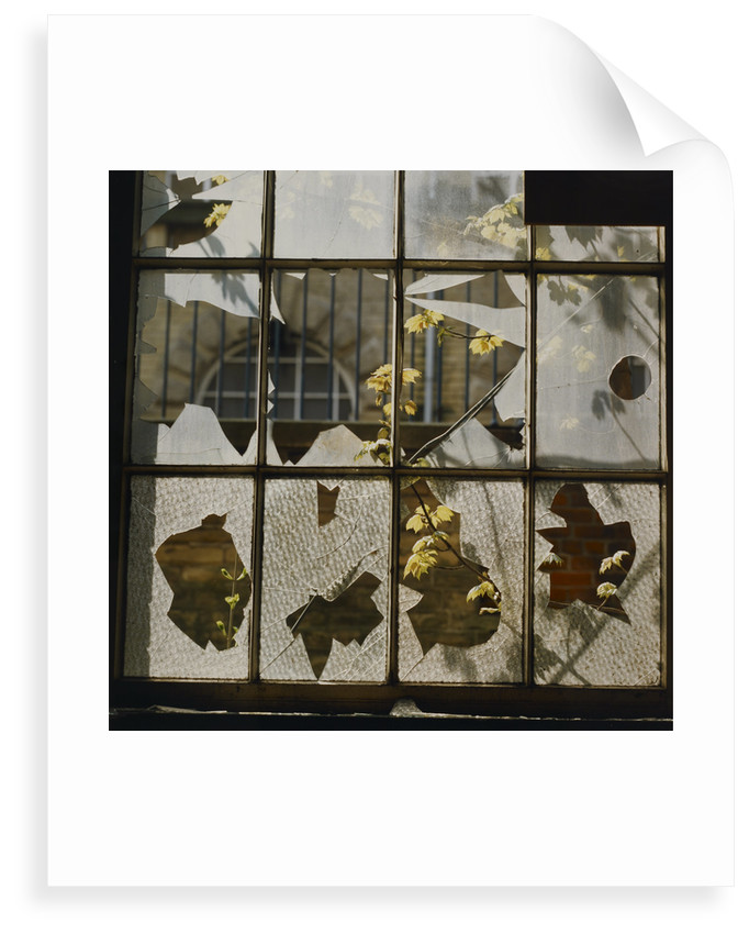
When I first looked at Fay Godwin’s work at the British Library (2019) archive there were so many landscape photographs. First impressions were therefore that she only did landscapes and that having a large depth of field was integral to her work. Even with some of her close up work like Broken window (https://prints.bl.uk/collections/fay-godwin-archive/products/broken-window-c13527-64) her use of depth of field ensures that parts of the background are clearly visible.
Broken Window (Copyright Fay Godwin and British Library)
In Broken Window, Godwin has used a depth of field that allows the window and the plants just outside it to be seen clearly but also the bricks in the wall visible through the bottom half of the window to also be seen clearly. The size of the bricks seen implies that there is a reasonable distance between the wall and the window.
At first glance the broken glass, in the bottom part of the window, looked like leaves stuck to the glass. Even after realising they were not the way that the plants visible through the window intersect with the broken sections the feeling that these are leaves remained and with it a sense that what we build now, continues to link to the natural world around us, as much as we do our best to try and make it so that this isn’t the case.
Exploring the image further other things start to leap out. The figure in a crinoline dress at the top left of the image. The angry, oriental face in the bottom left of the image, the leaves visible through the broken glass helping to give the appearance of eye, nose, and mouth. The bloated, Nefertiti-like face in the third pane from the left at the bottom. Again, the visible leaves giving the appearance of eye and a mouth.
Finally, there is the face at the bottom right of the image. A figure wearing a floppy top hat whose mouth is open showing sharp teeth.
What started out as an ordinary photograph of a broken window, has a much more sinister appearance the longer you study it.
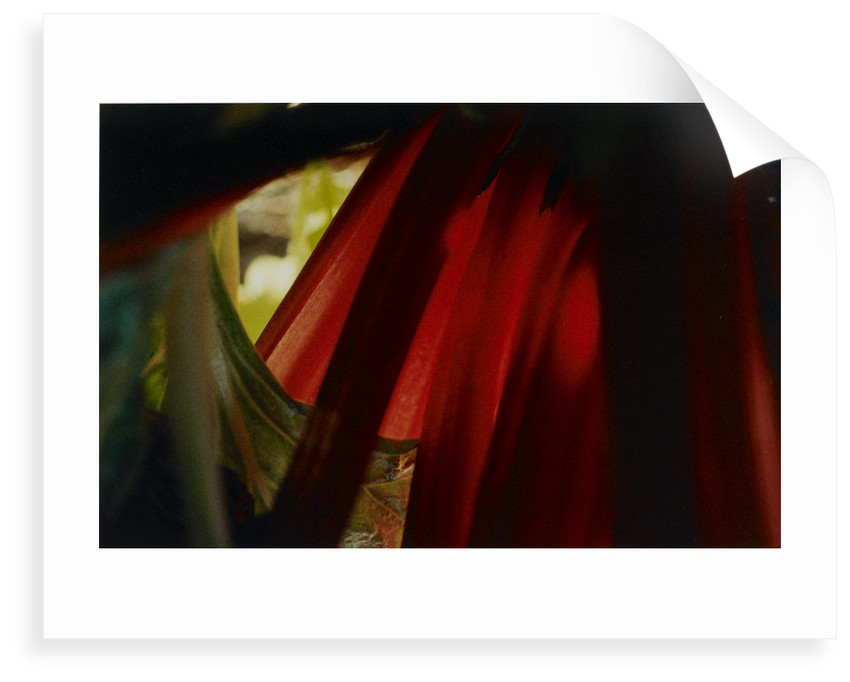
untitled (Copyright Fay Godwin and British Library)
Untitled is an interesting image because it appears to be a close up of some plants. The reason I think it is that is because of the green leaf on the left-hand side of the image. The veins are clearly visible and provide a sense of proportion for the image. However, Tian (2018) and the National Museum of Natural History (s.d), provide examples of leaves that are 45cm thick and 810 square centimetres in area, respectively. With the knowledge that plant leaves can be quite big, it is possible to see this image as not quite as close up and on a similar scale to Godwin’s landscapes. Without something to give an accurate idea of scale, perspective becomes subjective rather than objective. Although what the camera sees is recorded accurately, what the viewer eventually sees is partly down to what the photographer wants them to see.
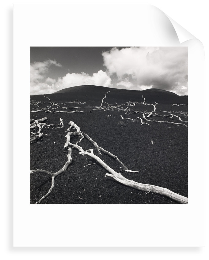
Devastation (Copyright Fay Godwin and British Library)
Devastation is a bleak image and Godwin’s use of a large depth of field adds to the bleakness. The sharpness and clarity of the bleached branches in the background adds to the sense that this is not a small area but a large one.
There is a sense with the branches in the background, from the way that they are pointing up to the sky, that they are pleading, that the ground and planet is calling out, for help.
The branches are the forefront of the image add a sense of desperation. They are reminiscent of images from places like Pompeii where the bodies of people caught in the eruption of Mount Vesuvius lie as they fell, fleeing from the death that was about to engulf them.
They are reminiscent of images of the skeletons of creatures that have died while trying to reach life giving safety.
A fitting image for a planet that, if the scientists are correct, is heading towards the point of collapse.
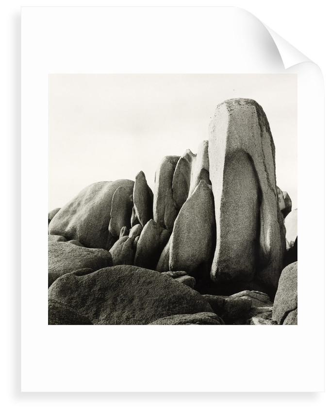
White Rocks (Copyright Fay Godwin and British Library)
On a lighter note, this image just makes me see penguins. Lots of penguins. Grey, speckled penguins huddled together.
Gianluca Cosci
Panem Et Circenses, Cosci. G (2019) is at the other extreme to Fay Godwin’s landscapes. Gianluca Cosci as produced a series of images from a restricted viewpoint and where the depth of field is shallow, rendering the background and some of the foregrounds out of focus but still recognisable.
I like these images because they depict things that people do not normally see, certainly not from these perspectives.
Cosci says that his work has a political element to it and that he is interested in the restricted view of the marginalised, and that is a subject that I can relate to as someone who is part of, and has many friends and acquaintances with, the LGBT+ community. How we see things is not always the same way as others see them. For some people within this community, their view of life is from the bottom, looking up at everybody else. Cosci’s use of low angles and shallow depth of field gives a sense of what it feels like to not be seen, to be ignored.
Cosci’s use of things like benches and railings highlights that feeling of being ignored. We all see items like these every day but how many of us stop to look at them properly, how many of us even notice them in our rush to get where we are going. A lot of the time we only notice them when we need them for some reason, and that reflects the feeling that minorities have when attention is focused on us for a while in order that people can feel like they have done something to support us.
Several years ago, I was in London for a training course. I had travelled on the Underground to the nearest tube station to the venue and was walking along streets filled with commuters. As I walked, I noticed several people sleeping rough in doorways. As someone who was not used to seeing people sleeping rough this was a shock, but not as much of a shock as watching the people around me walk by these homeless people, without giving them a second glance. Almost as if their eyes had adjusted to a shallow depth of field so that they only saw what was of interest to them.
Mona Kuhn
Kuhn’s (2019) website displays 12 images from her Evidence series.
In ten of these twelve images people can be seen. In the others there is a noticeable absence of a person but there remains evidence of their existence which tells something about the person.
The image Closer has a voyeuristic edge to it, as a figure, that I assume is Kuhn, can be seen reflected in the window taking the photograph. The eyes of one of the figures looking directly at the photographer, and the partially turned head of the second figure, give the impression that something private has been interrupted.
Although all the figures in the images are naked, as far as can be told with regards to those images where the whole figure cannot be seen, Kuhn’s use of depth of field provides them with a level of privacy while also sharing intimate moments.
Kim Kirkpatrick
I found when searching for both the website that was linked to in the course notes and using online search mechanisms that finding out about Kim Kirkpatrick was difficult, especially when it came to examples of his work.
Guy Bourdin
Tate (s.d) and ICP Search Results (s.d) show quite different examples of Bourdin’s work. The Tate examples are in black and white, while the International Center of Photography examples are all colour and from a series called Sighs and Whispers. These latter have the feel of a magazine fashion shoot to them, in particular for a more high-end fashion magazine or label.
Each of the ICP images has an intensity to it, whether that is from the looks that the models appear to be giving the viewer, a sense that the figures are waiting for something to happen or, in the case of plate 9, the shadowy figure in the background who lurks like a Svengali figure who has the ladies in his control.
The Tate examples are from an earlier period in Bourdin’s career. Even so it is possible to see some of what would be used in his later fashion work. An image of bleached bones and carcasses on a floor looks menacing as does an image of a rusted door lock.
In other images figures look directly at the viewer or seem to be waiting for something. All techniques that can be seen in his fashion photography.
David Campany
‘I’m inclined to think that there is no such thing as a photojournalistic image, only a photojournalistic use of image.’ David Campany
The above quote is in response to a comment on an article that Campany (2013) wrote in May 2013.
The discussion was the result of an article that Campany had published that discussed the work of Eve Arnold and Don McCullin that had appeared in The Sunday Times magazine. In contrast with the McCullin piece, which used some of his images captured in Vietnam, the Arnold piece used images captured in North Carolina at a facility built to replicate a North Vietnamese village that could be used to train American troops before they embarked for a tour in Vietnam. McCullin’s piece showed how things were in country, while Arnold’s piece was a step removed from this and the dangers soldiers, journalists and photographers faced while in the war zone.
Whereas McCullin photographs were more immediate and could not be planned out easily. Arnold had the luxury of being able to take more time over her shots and to achieve results that could be influenced by other areas of photography, for instance fashion photography.
In response to the comment Campany argues that all images can be seen as forms of different genres of photography, for instance fashion, portrait, landscape, architectural etc. It is the use of the image to report on events that makes them photojournalistic.
With the use of mobile phones to capture images and video as events play out, by members of the public, who are by their very nature not journalists but either bystanders, or actual participants, in the events they are capturing, Campany’s point is a lot easier to understand. It is not the actual image but how it is used that defines how we see it.
Personal Archive Photo
Is it too early for a drink?
OLYMPUS E-M10 ISO-400 150mm f/7.1 1/20sec Taken 10th May 2016 06:11am